


![]()
The Karlovy Vary International Film Festival (KVIFF), the biggest film festival in Central and Eastern Europe, has revealed a fresh new logo and visual identity for its 58th edition. Designed by the Czech design studio Studio Najbrt, the new look blends the festival’s rich history with a modern, bold aesthetic. Studio Najbrt has been working with KVIFF for years, and once again, they’ve delivered a design that breaks from traditional festival branding with something sleek and abstract.
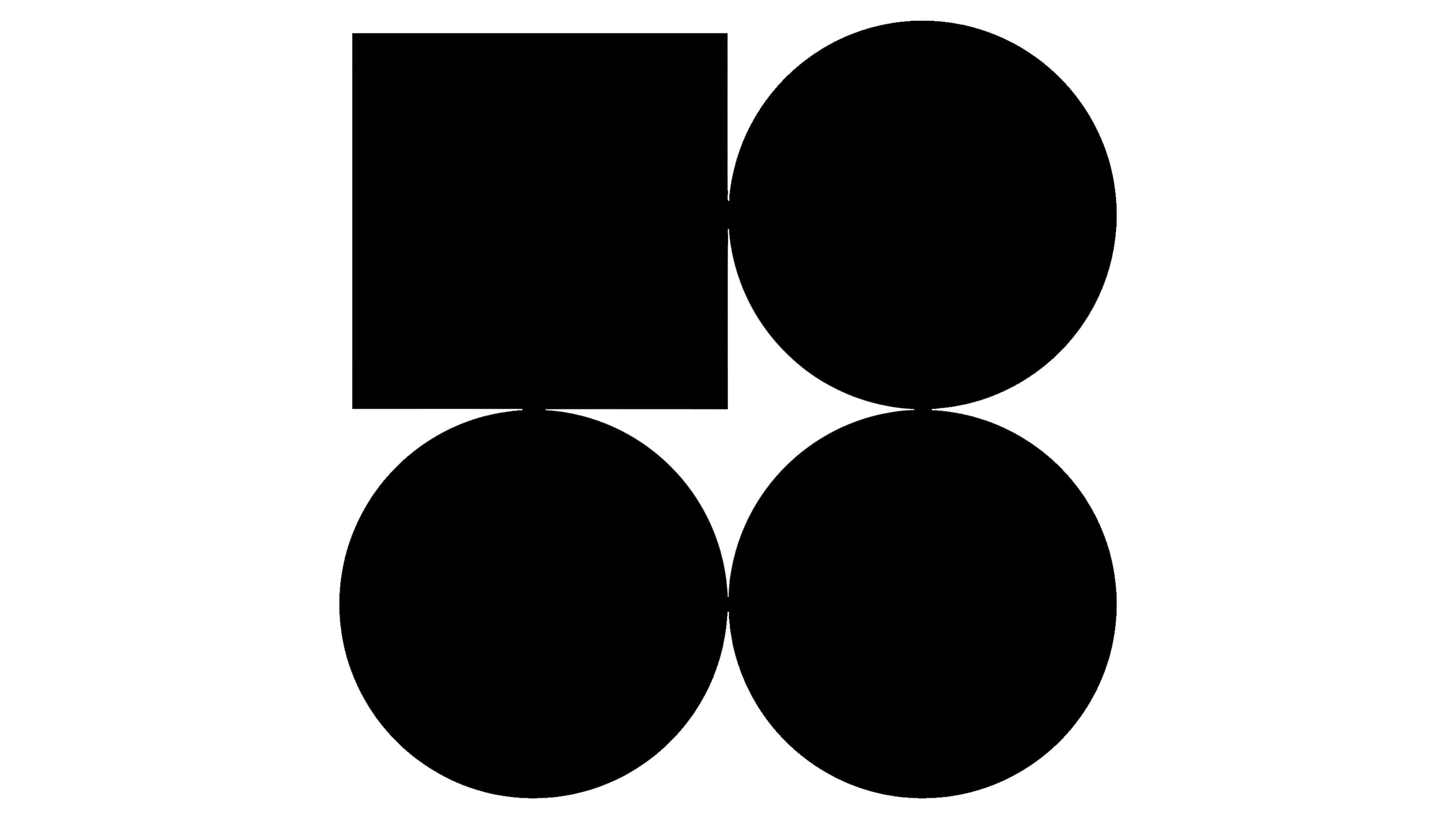
The new logo is simple yet striking. It comprises four basic geometric shapes—one square and three circles—arranged in a clean black-and-white layout. At first glance, it might seem purely abstract, but the shapes cleverly represent the number 58 in a stylized way. Unlike previous logos that showed numbers more literally, this design leans into minimalism. The inspiration behind the shapes comes from the floor plan of Hotel Thermal, the festival’s main venue, known for its Brutalist architecture. The geometric design mirrors the bold, structural style of the building, grounding the festival’s identity in its physical and cultural roots.
![]()
This is a big shift from past logos, which featured colorful, flowing lines symbolizing film reels and the diversity of cinema. The new black-and-white palette emphasizes contrast and clarity, giving the festival a timeless, sophisticated vibe. The choice to go monochrome reflects a broader trend in design: simplicity speaks volumes, offering a sense of elegance and authority.
The festival’s name is written in Helvetica Now, a modern take on the classic Helvetica font. This clean, precise typeface pairs perfectly with the logo’s geometric shapes, adding structure without distracting from the bold simplicity of the design. Its straightforward, neutral style ensures the text is clear and consistent, whether on a poster, website, or merchandise.
What’s cool about the new design is how versatile it is. Those basic shapes aren’t just static—they’re adaptable. Studio Najbrt has found creative ways to integrate them across festival materials, from banners and digital screens to merchandise. Depending on how they’re arranged, the shapes can resemble film reels, camera lenses, LED screens, spotlights, or even the festival’s iconic seating. This modular approach keeps things fresh and interesting while maintaining a cohesive look.
One of the most powerful aspects of the new logo is the emotion it evokes through its simplicity. The minimalist forms create a sense of openness and modernity, while the layout suggests movement and transformation—core themes in cinema. The design’s abstract nature invites people to interpret it their way, making it feel personal and dynamic.
![]()
Beyond aesthetics, the rebrand reflects what KVIFF stands for today. It’s a festival that honors the legacy of classic cinema but is also a space for experimental, cutting-edge films. The minimalist design signals a forward-thinking attitude, showing that KVIFF isn’t afraid to evolve while respecting its history.
Ultimately, the new visual identity for the 58th Karlovy Vary International Film Festival is a bold departure from traditional festival logos. Its clean, geometric design and monochrome palette capture the festival’s spirit—dynamic, evolving, and deeply connected to cinema’s past and future. Studio Najbrt’s work gives the festival a fresh look and reinforces KVIFF’s reputation as a major player in the global film community.