For each person, comfort and coziness in their own home are especially important, the opportunity to fully relax, sleep well, and enjoy spending their time. This is what Australia’s Koala, which offers high-quality home furnishings on the Internet, delivers with its products. An important distinction of the company is a convenient “smart” platform that allows you to become the owner of the necessary interior item in just a few clicks. The use of modern technologies and the formation of an assortment based on an analysis of the needs and preferences of the client with comfortable and efficient service is the basis of Koala’s successful activities.
To change the situation with the purchase of furniture on the Internet for the better, allowing the client to get only pleasure from the process and convey to him its offers and advantages, the company began to create a modern and original design on its own. With the new design, Koala wants to showcase its products’ unique beauty and aesthetics by its creative and professional designers, drawing inspiration from the unique beauty of Australian nature and the unique lifestyle of the Torres Strait Islanders.
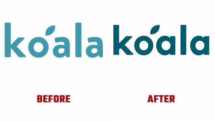
To achieve this goal, it was decided to abandon the Brandon Grotesque font, choosing an option more closely matching the basic design principles of the company’s furniture products. The new font became a combination of Quincy CF and Sofia Pro, whose symbiosis allowed us to talk about creating a unique font for the logo. A feature of the new performance is the use of a completely new performance of the letter “a” the roundness of which echoes the shape and shape of the letter “o,” providing visual unity of the composition. At the same time, the straight line “a” is in harmony with the same element of the letter “K” and is identical to the spelling “l,” only in a reduced version. This symmetry is pleasant for the perception of the text by the human eye, provides simplicity and ease of memorization at the subconscious level.
The leaf above the letter “o” symbolizes the environmental friendliness of products and the company’s desire to fight for the preservation of the unique nature of the continent, its constant participation in various activities related to the fight for the cleanliness of the environment. This trend is confirmed and enhanced by the use of the Keep it Wild sign in the design.
The color palette was chosen quite original – a soft dark blue hue concentrates attention on the text, without repelling and without causing oppressive sensations, which would be natural for a deeper and more saturated color.


