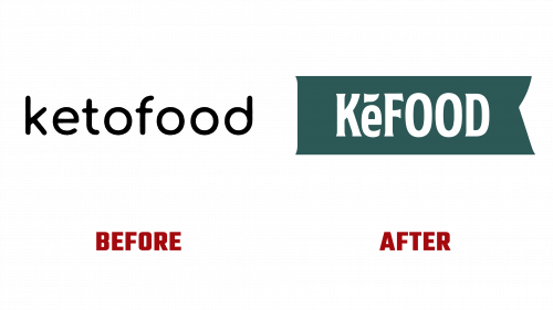
Since its 2021 inception, Kefood, initially known as Ketofood, has introduced a new brand identity and logo, signaling a fresh direction for the company. This update underscores Kefood’s dedication to offering healthy, low-carb, and ketogenic options that merge Italian culinary authenticity with a commitment to nutritious eating.
The redesigned logo transitions from a generic, geometric sans serif to a more unique, condensed flared serif typeface. This new typeface gives the logo a snug, balanced appearance, enhancing the overall visual appeal of the brand. An interesting feature of the logo is the addition of an accent on the letter “e,” which, while not a standard diacritical mark, integrates well into the design, adding a touch of flair and sophistication.
The logo’s ribbon-like boundary echoes the contours of the “K,” adding a subtle asymmetry that contributes to a dynamic and balanced design. This shape is not overly complex but effectively complements the logo’s new aesthetic.
Kefood’s packaging redesign significantly improved over the previous version, which many found too clinical and reminiscent of typical diet brands. The new packaging employs a soothing color palette and playful typography, making the products more visually appealing on store shelves. Central to the packaging design is the innovative arrangement of the brand name, broken into two-letter segments across three lines in the Rodfat typeface. This is paired with silhouetted images of the products, such as cookies, crackers, or nut butter, creatively integrated into the letter “O.” This design varies with the product’s shape, whether round, angular, or otherwise, creating an engaging visual impact.
The packaging features type badges and a flexible application of the logo’s ribbon design, which extends variably to adapt to different packaging forms—from long labels on jars to subtle curves on box corners. This adaptability ensures a consistent and dynamic presentation across all product lines.
With these changes, Kefood targets those following ketogenic or low-carb diets and appeals to a broader audience looking for tasty and healthy food options. The new branding communicates that choosing Kefood means choosing health and flavor without compromising the joy of eating.


