“Using individual elements of the system, the service allows you to create websites,” explains the Kentico logo. The emblem conveys a user-friendly visual display of content in a finished prototype and various design variations.
Kentico: Brand overview
| Founded: | August 1, 2006 |
| Founder: | Kentico Software |
| Headquarters: | Brno, Czech Republi |
| Website: | xperience.io |
Meaning and History
After the launch of the first version of Kentico, considerable attention was paid to creating a positive image among the target audience and visual brand recognition. Naturally, an important component in this process was the logo. It was updated only once all the time, but the main details have remained unchanged to this day.
What is Kentico?
First of all, this is an opportunity for any webmaster to create their website without special skills in programming and knowledge of languages. Built-in CMS tools allow you to develop any complexity.
Old
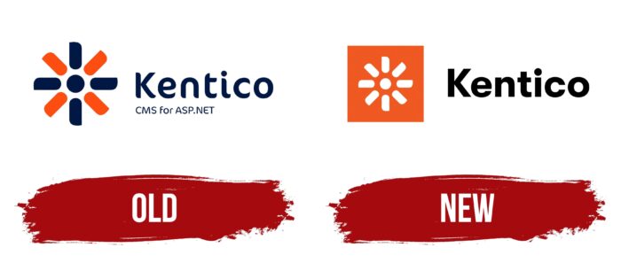
The first version of the logo appeared immediately after the release of CMS. In addition to the brand name, it also features the Kentico logo. For the verbal inscription, the author’s font was used. Except for the “K” character, all letters in the name are lowercase. They are in bold type with minimally noticeable rounding at the edges of the letters. The dark blue color brightly highlights the inscription against the emblem’s background. At the same time, it evokes warm, positive emotions in a potential CMS client, aimed at positive work on creating a site.
The emblem visually resembles a flower; in the center, there are a circle and eight petals emanating from it. Each petal is visually similar to a rectangle, orange or dark blue, identical to the verbal inscription. Each rectangle has pointed corners. As a result, users may have associations with the sun or a windmill that is in motion in addition to the flower.
New
This variation of the logo looks more formal when compared to the previous version. The main color has been changed from dark blue to black for the word inscription. At the same time, it is made in a classic font, with bold letters without serifs. Thus, the brand name contrasts with the emblem, which has also undergone certain changes.
Now all the elements are made in white on an orange background. Also, on the emblem, there was a circle and eight rectangles. At the same time, the dot above the “i” symbol in the name is completely identical in size to this circle, which creates the feeling that this is the same element. The distance between the logo and the Kentico name has been increased, making each element independent despite belonging to the same brand.
Font and Colors
The first version of the logo is made in the author’s font, while the new variation uses a classic font close to Times New Roman. Bold lowercase sans-serif letters were used for the name, except for the capital “K.”
In the original logo, the color palette consists of navy blue and orange. At the same time, the main name is completely made in blue. The brand is displayed in black, and orange and white are used for the emblem in the updated version. Minimal changes have a minimal impact on the visual recognition of the Kentico logo and brand as a whole.
Kentico color codes
| Tangelo | Hex color: | #ef5a20 |
|---|---|---|
| RGB: | 239 90 32 | |
| CMYK: | 0 62 87 6 | |
| Pantone: | PMS 1655 C |
| Black | Hex color: | #000000 |
|---|---|---|
| RGB: | 0 0 0 | |
| CMYK: | 0 0 0 100 | |
| Pantone: | PMS Process Black C |


