Almost all the older generation in the world always recalls the times when games were still board games with pleasant nostalgia. They gathered the whole family around them on warm evenings, forcing them to plunge into the gambling euphoria of family competitions, bringing together and uniting each family member with each other. Today, such a family tradition, but in a completely new interpretation, is being restored by the American company Keymaster Games from Athens, Georgia, which launched its first Control game in early 2016, which immediately brought in 10 times more than expected profits.
The company founders, Mattox Schuler and Kyle Key decided to create the company due to their great love for board games. Thinking over its name, they wanted to reflect in their brand a direct connection with the product and convey their emotional attitude to it. This was succeeded by applying the title and then placing the main word “key” in the logo. The key is to create family warmth and comfort. The key – as an essential element necessary to open the way for new adventures, a treasure chest or to decipher a secret record, image, secret, the discovery of which will lead to an unexpected ending.
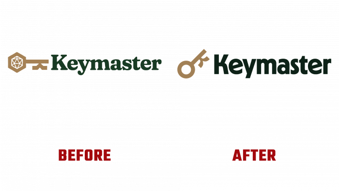
Already on June 1, 2021, on its website in the news section, the company posts a post about its rebranding, which was caused by the need to move on, change in the light of changes in the world around it strives to create something new constantly. This required updating its image, but preserving its history, the primary identity, from which such a successful start into the future was made that it was possible to do it while maintaining the overall composition of the brand sign.
The image of the key has undergone dramatic changes in its appearance and location. It was created from Kyle’s sketches. Now the head of the key has become round, and its inner space is hollow. This is a symbolic interpretation of the gathering of game participants around the table. He was given an inclination of 45˚ above the horizontal, which made it possible to more clearly distinguish the letter “k,” with the help of which the key bit was formed. The color of this element is gold.
Changes were also made to the font that makes up the name of the company. For him, an option was chosen that ensured the clarity and objectivity of the combination with the direction of the brand’s activities – the Nichrome type. Each letter has undergone an artistic design by Focus Lab with the direct participation of the brand owner. The font is in black.


