Kili, a premier labeling platform for data, has recently unveiled a strikingly distinct identity, thanks to the creative expertise of the London-based design agency Ragged Edge. Founded in 2018 and headquartered in Paris, with an operational hub in New York, Kili offers a comprehensive suite of tools for data labeling, issue identification, DataOps simplification, and speedy development of reliable AI. The company underscores the importance of source data in AI applications.
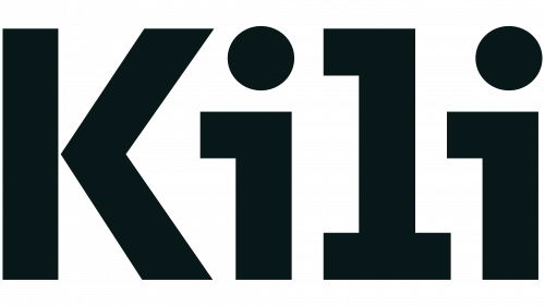
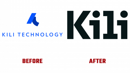
Kili’s former logo, seemingly an abstract, decomposing “K,” possessed an eccentric aesthetic that hinted cryptically at its AI connection. While not objectionable, its accompanying wordmark failed to create a visually compelling impact. The redesigned logo, devoid of profound hidden meanings or high-concept designs, is a testament to typographic brilliance. The logo’s four letters harmoniously merge, filling potential voids in negative and counter spaces.
One might interpret the “i”s as representing humans. The skillful manipulation of the slabs in the “i”s and the “l” ensures seamless kerning across all characters. The “i”s upper slabs ingeniously extend into neighboring letters while preserving consistent baseline spacing. The new Kili logo deceptive simplicity masks the rigorous attention to detail, a challenge expertly tackled by Ragged Edge.
Accompanying Kili’s rebranding is a peculiar yet endearing mascot. The character is oddly intriguing, a dot with legs resembling tree trunks, armless, with a floating round head sporting a single hair curl. Its 3D representation features a matte body finish and a glossy curl, while its flat version comes alive in various unexpected animations, lending it a lively personality. While the mascot’s concept and emotional resonance might divide opinions, its quirkiness evokes charm.
The headline typography comes from Klim Type Foundry’s National 2 Condensed, offering a striking contrast to the wider, squared-off letterforms in the logo. Atipo Foundry’s Archia, a supporting slab serif, exudes a monospace coding-like appeal, subtly hinting at the platform’s technological roots. It also appears to have inspired the logo design. The typographic arrangements and hierarchies are flawlessly executed, integrating seamlessly with the mascot and other graphic elements.
Kili’s revamped identity signifies a major stride forward, reflecting its steadfast commitment to excellence in AI data management with a distinct and meticulously crafted aesthetic.


