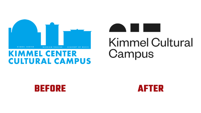
The Kimmel Cultural Campus, a cultural community structure located in the heart of Center City, Philadelphia, introduced its new identity and emblem to guests and residents. Its creation was caused by the need to meet the visualization of time and modernity requirements. Its main mission is to attract various regional communities to art; the brand realizes it through performances and educational events. This center includes many communities and cultural structures and organizations, including the Performing Arts, the Academy of Music, and the Merriam Theater, which has a 160-year history of performing arts, located on Philadelphia’s Avenue of the Arts. It is also home to the Philadelphia Orchestra, Opera Philadelphia, Pennsylvania Ballet, The Philly POPS, PHILADANCO, The Chamber Orchestra of Philadelphia, The Philadelphia Chamber Music Society, and the Curtis Institute of Music. At the same time, Kimmel educates the region’s youth, providing access to a rich artistic history, supporting artists and those who wish to take their first steps in the field of art. The new visualization has become an effective way of declaring internal and external changes and changes that have occurred over the years of existence.
One of the important reasons behind the reorganization of the visual identity was the lack of awareness of current changes; in particular, it was rather weakly reflected that the Academy of Music and the Merriam Theater were part of Kimmel. An effective and organic visual integration of the site was carried out, bringing to life the variety of experiences that guests, visitors, and students can get. This was done using simple geometry, which accurately conveys each campus object’s unique features, properties, and characteristics. A bold identity was created, celebrating the center’s cultural focus as the premier place for diverse communities to experience transformative art and culture.
The new logo was built using the main characteristics of the minimalist principle. It features geometric shapes that abstractly showcase three important campus locations, reimagined in geometric shapes that create a visual perception of objects as a whole. This new sign has an abstract display of Morse code, which makes it especially unique, having a personality that is different from the traditional ways of forming logos. The wordmark that composes it is set in an easy-to-read Founders Grotesk font, which is lightweight and contrasts well with bold icon shapes.


