New York-based Design Bridge communicates caring and emotional connection.
KinderCare is one of the most renowned early childhood education companies in America. Just think about these numbers: 1,400 centers across the country, 161,000 children are cared for, and quality education every day; 35,000 employees aim to make learning both productive and fun. KinderCare Education consists of many schools and programs, such as KinderCare training centers, Knowledge Beginnings and Grove Schools.
The main goal of the rebranding is to convey brand value, drawing attention to the company’s extensive experience to support parents and improve the learning process of children. Due to the large scale of the activity, it was necessary to carefully study the audience and create a design that would respond to each consumer.
Design Bridge completed the assignment and created designs based on simple shapes. First of all, you need to build an emotional connection with your children. The whole rebranding is based on five geometric shapes that are easily combined. With their help, you can create simple drawings and then add some details drawn with a marker. The designers took inspiration from how children learn to write and chose the Castledown font.
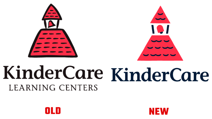
The KinderCare logo is based on the signature shapes of the already famous bell tower. The image has hardly changed. The designers chose soothing colors and removed the black lines, making the logo friendly and simple. Children have unlimited imagination, applying it to creativity and create unique drawings. With this idea, Design Bridge conducted drawing workshops for the children of their employees to highlight the main ideas and analyze the possibility of learning through play.
The result of such a small experiment is a visual identity that KinderCare’s creative team, company employees, and even children can easily use over the years. Images with details made of felt became a highlight of visual identity – they look unusual and fresh.


