In 2012, the social platform Kinema was created to provide the opportunity to screen films anywhere, to everyone. In early November, the platform unveiled its corporate identity, developed with design studio Mucho in San Francisco, CA. The external identity very accurately reflected the essence of the brand, its mission, and its features. By providing free or paid screening, the brand allows its films to be shown to filmmakers, empowering filmmakers, enabling online and offline management, especially for independent creators. There are no restrictions on genres for the show. Still, this proposal is most popular among documentary filmmakers, which makes it possible to implement the idea of forming a close creative community of users of the service. To attract attention, Kinema runs its virtual screenings, with the help of which it calls on producers and directors, actors, and filmmakers to participate in its program.
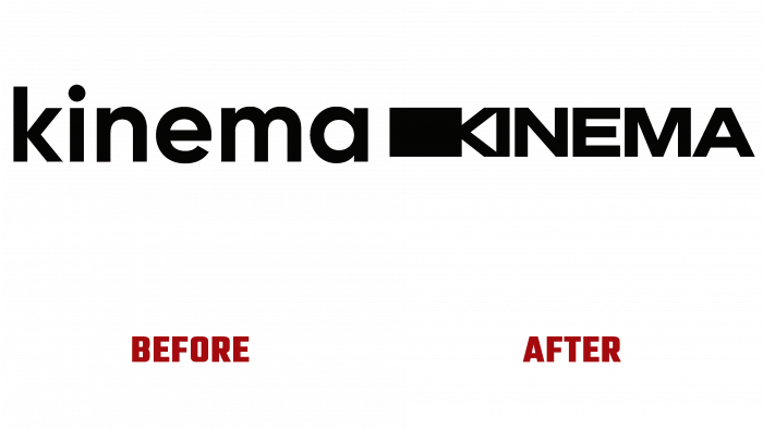
Mucho designers have developed an efficient and attractive digital look through a creative approach to creating a visual brand identity. The style was based on the use of bold text graphics and symbolic execution. The original solution is a combination of the first two letters of the Rorschach text with a black block located first to create a movie camera’s visual perception. This solution effectively creates an appropriate atmosphere and understanding of the brand’s relationship to entertainment technology, film production, and demonstration. At the same time, the combination of letters “KI” acquires symbolism – it can be effectively used separately from the text as a symbol of the brand display. Several messages have been created to educate viewers about Kinema’s mission to help expand the way people experience cinema and democratize accessibility and why the brand was founded.
The laconism of the image in its holistic perception turns out to be quite informational. A created animation effectively reflects the idea, but the identifiers are chosen at random, demonstrating the absence of restrictions on the use of platform services. The accent on the black color, in which the font and the background are made, creates the atmosphere of the cinema. The use of a dark lilac shade on various elements of the images is due to its clear contrasting expression on black. It symbolizes the light of the duty lighting devices located in the showroom above the entrances/exits, marking the location of the doors.


