Established in 2005, Klarna is a leading Swedish fintech company providing online financial services, mainly for e-commerce. Klarna offers payment options like direct payments, pay-after-delivery, and installment plans, including the popular “Pay In 4” program. Based in Stockholm, Klarna employs over 5,000 people and collaborates with more than 500,000 merchants across 45 countries, facilitating transactions for over 150 million users. After entering the U.S. market in 2015, Klarna has grown, partnering with brands like Nike, Instacart, Walmart, and Costco. Ahead of an IPO, Klarna has unveiled a new brand identity, which has been developed in-house.
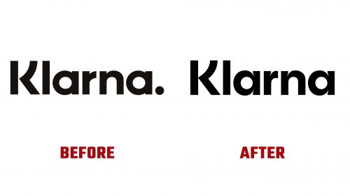
The previous logo, introduced in 2017, featured a geometric sans-serif typeface with a distinctive “K” and an unnecessary period, which has been removed. The new logo is designed to perform better at small sizes, which is crucial for its frequent appearance in checkout carts online. The refined design incorporates subtle ink traps, enhancing clarity and sharpness at reduced scales. These adjustments make the logo feel more polished.
The reimagined “K” in the logo has been subtly widened, and the gap between its stem and leg has been closed. This modification gives the “K” a stronger presence, especially when used alone. These enhancements ensure the logo maintains its visual integrity across various applications, from digital interfaces to printed materials.
Klarna’s new brand identity is encapsulated in its “Curiously Bold” ethos, which defines its visual and verbal style. This mood is expressed through three creative principles: Offbeat Optimists, Strikingly Relevant, and Straight Up. These traits guide Klarna’s branding approach, emphasizing optimism, relevance, and straightforwardness.
The typography has changed significantly with two custom typefaces: Klarna Title and Klarna Text. Klarna Title, used for headlines, is bold and full of character, featuring an offbeat energy aligning with the brand’s playful nature. Klarna Text, the workhorse typeface, comes in various weights and clarifies longer texts. These typefaces, created by Colophon Foundry, reflect Klarna’s quirky style. Despite being unconventional, the tilted “o” in Klarna Title fits the brand’s aesthetic.
The color palette has been updated. Moving away from a desaturated and broad range of colors, the new palette is more focused and vibrant. The slightly brighter pink is the primary color, accompanied by nuanced shades of not-fully-black and not-fully-white, offering a refined contrast. The secondary colors complement the primary hues, enhancing the overall visual appeal.
Klarna’s new brand identity communicates its core values and vision. The fresh design elements reflect the company’s commitment to innovation and customer satisfaction. This rebranding sets a new standard in the fintech industry, positioning Klarna as a leader in providing accessible, customer-friendly financial solutions.


