Logo unveiled by Sri Sri Ravishankar on his 65th birthday.
The Koo platform has become an alternative to Twitter only in India. The app appeared in March 2020 and enabled 90% of the Indian population to communicate fluently in their native language, as only 10% of Indians understand English. In terms of functionality, the application resembles Twitter.
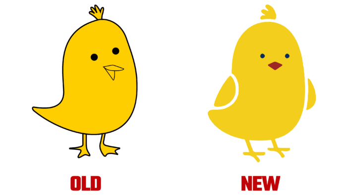
The new logo is the same chicken that has become a little brighter. According to the developers themselves, the Koo symbol has transformed from a baby into an adult bird. The designers removed the black outline, selected the wings, and changed the color of the beak. The changes also affected the main color, which became richer and more cheerful. The logo conveys positivity and belief in a bright future. Additionally, the bright bird symbolizes the opportunity to discuss many topics in a positive tone.
The platform has over 6 million registered users. The app gained particular popularity when Indian officials and ministers joined in and called on their other supporters to do the same: the Indian government and Twitter conflict with the deletion of certain posts. According to a Bloomberg report, the number of daily users of the Koo app has grown 20-fold since creating government profiles.
The Koo app and a new logo have also introduced a new voice function, “Talk to Type.” Thus, you can record messages using your voice, which significantly speeds up typing.


