The Kraft Foods logo symbolizes the stability of food production. It embodies the company’s strong position, high professionalism, adherence to technical standards, and reliable product quality. At the same time, the minimalist emblem highlights customer focus and readiness to embrace new technologies. Representing trust and tradition, the logo resonates with generations of consumers who recognize Kraft Foods as a household staple, symbolizing enduring quality and reliability in the global food market.
Kraft Foods: Brand overview
1903, James L. Kraft started something big in the Chicago cheese-selling business. His big idea to make cheese last longer with pasteurization in 1914 was a game-changer, and it helped make Kraft cheese a big deal.
By 1916, his company got an official name, J.L. Kraft & Bros. Company, and started making cheese. They introduced things like salads, mayonnaise, and the famous Kraft Dinner, the mac and cheese everyone loves.
The years that followed were all about growing bigger. In 1930, Kraft joined forces with Phenix Cheese Company, bringing us favorites like Velveeta, Miracle Whip, and Kraft Chocolate. The company didn’t stop there; it grew by adding companies like Bunte Brothers and Nabisco to its family.
Kraft stayed in the U.S. During the ’80s and ’90s, it went global, buying companies like Duracell and Jacobs Suchard. Then, in 1988, Philip Morris (which is now called Altria Group) bought Kraft, pushing it into even more places around the world with acquisitions of chocolate companies Freia, Terry’s, and Lacta.
A big milestone came at the turn of the millennium when Philip Morris merged Nabisco with Kraft, creating a super big deal worth $19.2 billion. This was big news for Kraft as it expanded its global reach.
In the 2000s, Kraft grew by acquiring Danone Biscuits in 2007, becoming the top cookie maker worldwide. Then, in 2012, Kraft split into two: Kraft Foods Group for the North American market and Mondelez International for snacks worldwide.
Another big moment was 2015 when Kraft Foods Group and H.J. Heinz Company merged, thanks to Warren Buffett and 3G Capital. This made The Kraft Heinz Company one of the biggest food and beverage companies, with famous brands like Kraft, Heinz, and Oscar Mayer under its belt, pulling in about $25 billion a year.
Through all these years, Kraft’s story has been about being bold, innovative, and smart about growth. It’s been a long journey, but Kraft’s commitment to making food people love has never changed, and it serves millions worldwide daily.
Meaning and History
What is Kraft Foods?
Kraft Foods, part of the Kraft Heinz Company, is a significant force in the global food industry. It is recognized in the United States and internationally for its wide range of popular products, including Kraft Macaroni & Cheese, Jell-O, Oscar Mayer meats, Philadelphia Cream Cheese, and Planters nuts. To meet consumers ‘ tastes and preferences worldwide, the company offers diverse items, from cheeses and mayonnaise to juices, snacks, and confections.
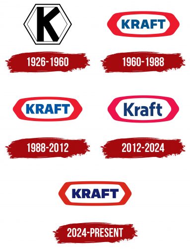
1926 – 1960
From 1926 to 1960, Kraft Foods used a logo featuring a large “K” inside a pentagon. The pentagon shape resembled a cheese head, showcasing cheese as the company’s main product. The “K” represented the initial of the company founder’s surname, J.L. Kraft, highlighting his dedication to the business.
The large size of the “K,” which barely fit within the Pentagon, was a design choice meant to reflect the company’s ambitions and its goal to grow and expand. Every element of the logo was thoughtfully designed to capture the brand’s essence and history.
1960 – 1988
In 1960, Kraft Foods introduced a new logo featuring a red oval with uniquely faceted edges inspired by a cheese head’s side view. This design reinforced the brand’s connection to high-quality cheese products and became a globally recognized symbol. The logo includes a thick red border that symbolizes protection and reflects Kraft Foods’ commitment to the safety and quality of its products. This border reminds the company of its safety, quality, and reliability principles.
The name “Kraft” is displayed in large, clear blue letters, which boosts brand recognition and represents the company’s professionalism, reliability, and extensive experience. The red and blue color scheme was selected to catch consumer attention and convey stability and trust.
1988 – 2012
As part of its strategy to update its visual identity, the brand used lighter shades in its color palette and significantly enlarged the letters in its name. These changes aim to make the product more appealing and give it a fresher look, helping it to stand out to consumers.
The lighter shades create a feeling of lightness and airiness, making the product seem more friendly and accessible. This style reflects the company’s innovative approach and efforts to stay current with design trends and consumer preferences.
Enlarging the letters in the name has significant marketing value. It signals an expansion of the product line and underscores the brand’s ambitions for growth. The larger text also enhances brand recognition, making it more expressive and memorable, which helps the company’s products attract a wider consumer base.
February 2009 (Kraft Foods, Inc.)
The company unveiled a new corporate logo, distinct from its consumer-facing image. According to their press release, the logo aims to evoke the idea of “delicious” with a red curve resembling a smile, suggesting happiness from delightful foods and experiences. It also features colorful shapes to depict a burst of flavors, adding a dynamic element to the design.
The new logo received mixed reviews. The Brand New blog, known for its critical design reviews, described it as overly simplistic and immature. They particularly criticized using the Tekton script, claiming it detracted from the desired sophisticated corporate image. This feedback highlights companies’ difficulty balancing new designs with maintaining a professional appearance that appeals to a broad audience.
2009 – 2012
The company again revamped its logo, making several impactful changes. The “smile” feature now appears in bold blue and is positioned below the logo’s initial word for greater prominence. Previously, as background detail, the “flavor burst” element has been repositioned behind the letter “K” and redesigned to resemble an eye—a new feature not previously indicated. The tagline has been streamlined into a straight, horizontal line to improve visibility and readability.
Despite the intent to modernize, the redesign received significant criticism, especially from the Brand New blog, known for its thorough design critiques. The blog dubbed the updated logo “the logo Titanic,” indicating a disastrous redesign attempt. The critique emphasized that the new elements, such as the “eye,” did not add meaningful symbolism to the logo, reflecting a missed opportunity to deepen the brand’s visual message.
2012 – 2024
Kraft has refreshed its visual identity while preserving elements like the familiar cheese head shape, which stands for high quality and rich flavor. The brand changed its color scheme from red to raspberry to give its products a new and attractive appearance. This alteration helps products stand out more on store shelves and advertisements, enhancing brand recognition. Kraft also adopted a new blue font for its corporate identity, suggesting professionalism and a commitment to ongoing improvement. Blue is associated with reliability and expertise, reinforcing Kraft’s focus on enhancing its products and sales approach.
2024 – today
The American food industry giant revamped its emblem to demonstrate its seriousness and aim to reach a broad audience. The new Kraft Foods logo consists of strict lines that are straight and without any hint of a decorative outline. This approach by the well-known food producer emphasizes:
- Precise standards
- Flawless adherence to recipes
- High professionalism
The emblem’s shape is perfectly balanced, aligning with the company’s pursuit of perfection. The uneven thickness of the lines does not disrupt the harmony. Instead, narrow and wide lines add dynamism, making the logo a lively and engaging element of visual identity. This graphic technique balances both sides of the elongated rectangle, representing consumers and the producer.
The clear edges of the geometric figure depict a complete food production process and convey its perfection, aligning with the brand’s concept. The frame is colored red, highlighting the boundaries of standards and signaling a prohibition against exceeding them. This time, a classic shade of red is used—bright but rich, almost cautionary.
The central part is entirely dedicated to the company name—the dark blue contrasts well with the white background, enhancing text readability. The letters are clear, straight, geometric, and extra-wide, resembling massive monolithic glyphs. This signifies the company’s importance in the country’s food industry and its significant weight in the international market. They symbolize stability, reliability, and strength.
Kraft Heinz
Two thousand fifteen, the Kraft and Heinz companies merged, creating The Kraft Heinz Company. Their new logo keeps the familiar colors but changes the design a bit. The “Kraft” part resembles the old Kraft logo, so people still recognize the brand. They dropped the red border and added “Heinz” with its style, which makes the logo look new but still shows respect for both company’s histories.
The bold red and blue logo shows the company’s strong place in the food business and its American roots. It combines the history of Kraft Foods and H.J. Heinz Company, covering various products from ketchup to cheese. The logo represents the company’s quality, history, and new food-making ideas.
Font and Colors
The Kraft logo features a bold sans-serif font that conveys simplicity, reliability, and accessibility. Its clean, strong lines are similar to the Gotham font family, known for its geometric precision and modernist simplicity.
The bold lettering adds uniqueness, making the logo distinctive and helping enhance brand recognition and memorability.
The font is designed for excellent readability, with significant spacing between letters (kerning), ensuring clarity up close and from a distance. This readability is particularly important for a brand that sells a wide range of consumer products viewed on store shelves from different distances.
Color plays a key role in the Kraft logo. The combination of dark blue letters and a bright red background creates a striking contrast. Blue conveys professionalism and trust, while red adds energy and boldness. This color scheme is typical for food brands, as red stimulates appetite and attracts attention.
The memorable color palette and the modern, accessible font style make the Kraft brand recognizable and appealing to a broad audience.
FAQ
What is Kraft’s brand?
Kraft Foods is a major part of The Kraft Heinz Company, a leading company in the food and beverage industry worldwide. The company reached this position after Kraft Foods Group and H.J. Heinz Holding Corporation merged in 2015, combining their strengths and diverse product lines, including cheese, dairy, quick meals, sauces, and dressings.
The merger with H.J. Heinz enhanced Kraft Foods by leveraging Heinz’s global presence and expertise in condiments and sauces. As part of The Kraft Heinz Company, Kraft Foods now offers a broad selection of famous food products recognized worldwide. Kraft Foods prioritizes introducing new and better products, focusing on quality, taste, and health.
Is Kraft Foods American?
Kraft Foods Group, Inc. became a significant part of Kraft Foods Inc. and a separate entity on October 1, 2012. Located in Chicago, Illinois, a hub for delicious food and major food businesses, Kraft Foods Group maintained a strong connection to the American food sector. On July 2, 2015, Kraft Foods Group merged with H.J. Heinz Holding Corporation to form The Kraft Heinz Company, which became a leading force in the global food and beverage industry. Despite these changes, the company’s influence on American dietary preferences remained profound. Kraft’s products, including cheese, dairy items, quick meals, and sauces, continued to reflect and shape American culinary habits.
Is Kraft still a company?
In 2015, Kraft Foods Group and H.J. Heinz Holding Corporation merged to form The Kraft Heinz Company. This big move joined their strengths and a wide range of products, like sauces, cheeses, and meals, to suit different tastes and health requirements. The Kraft Heinz Company is known for its tasty, high-quality, healthy food options. By merging, they could better meet customer needs, work more efficiently, and grow their market presence by pooling Kraft’s and Heinz’s resources, creativity, and networks. The Kraft-Heinz Company is still expanding, building on the well-loved brands from both Kraft and Heinz.
Kraft Foods Group no longer exists as a standalone company; its legacy and products continue through The Kraft Heinz Company. This keeps them leading in the food industry and greatly shapes our eating habits and culture.
What is the new name for Kraft Foods?
Kraft Foods underwent several significant transformations to evolve into its current form. Initially, it was renamed Mondelez International, shifting its focus towards global snacks and foods, a departure from its original grocery business in North America. A new company, Kraft Foods Group, was then created to concentrate on the North American grocery market, maintaining the essence of the original Kraft Foods in this region.
2015 Kraft Foods Group merged with H.J. Heinz Holding Corporation, forming Kraft Heinz. This merger combined their strengths and created a large corporation with many global food and drink brands.
These strategic moves led to the emergence of two major entities: Mondelez International, focusing on global snacks and food, and Kraft Heinz, which emerged as a powerhouse in the food and drink industry following the merger of Kraft Foods Group and H.J. Heinz.
What is the strategy of Kraft Foods?
Kraft Heinz is working to improve its position in the food industry, with a plan to complete it by 2024. They intend to save $2 billion by making their operations more efficient and adopting new technologies to eliminate waste and enhance productivity.
Kraft Heinz’s strategy for revitalization includes:
- Streamlining operations to save money.
- Investing in brand development to enhance consumer loyalty and sales.
- Adopting a holistic view of its product range to satisfy consumer demands better.
These efforts are designed to reestablish Kraft Heinz as a leading force in the food industry and secure its growth for years.
What happened to Kraft Foods?
On October 1, 2012, Kraft Foods divided into two distinct entities to sharpen its market focus. Kraft Foods Group, Inc. emerged to handle grocery products in North America, striving to enhance its offerings, speed up response to market trends, and innovate new products. The remainder of Kraft Foods, not part of Kraft Foods Group, rebranded as Mondelēz International, Inc. A new name came with a new mission: to excel in the global snacks and confectionery market.
This strategic split in 2012 led to the creation of two focused companies. Kraft Foods Group concentrated on the North American grocery market, while Mondelēz International set out to dominate the snack and confectionery sector globally.
What does Kraft Foods do?
Kraft Foods, a key component of The Kraft Heinz Company, dominates the food and beverage sector. It offers various products, including sauces, cheese, meals, meats, beverages, coffee, and other grocery items. It spans over 200 renowned brands and reaches consumers in numerous countries.
Kraft Foods is committed to providing delicious, nutritious, and convenient food and drink options. With its extensive distribution, Kraft ensures its products are widely accessible in local markets and globally.
