


 Velveeta Logo PNG
The Velveeta logo features smooth contours that symbolize its rich flavor. It combines the simplicity of high quality with maximum elegance. It’s hard to describe a product designed for pleasure and gastronomic enjoyment in words. However, the well-known American brand conveyed all the key points and unique meaning to its audience with just one word: “Velveeta.”
Velveeta began in 1918 in Monroe, New York, when Swiss immigrant Emil Frey, an employee of Monroe Cheese Company, found a way to reuse Swiss cheese scraps that were usually discarded. He developed a processed cheese with a smooth texture, longer shelf life, and reliable melting quality. The name Velveeta was registered in 1923, referring to the product’s soft, velvety consistency.
In 1927, Kraft Foods acquired the rights to Velveeta and brought it into its cheese business. During the 1930s, the brand was promoted as an affordable food during the Great Depression, when many households needed inexpensive ingredients. By the 1950s, Velveeta had become common in American kitchens, used in macaroni and cheese, sandwiches, sauces, casseroles, and party dips.
From the 1960s through the 1980s, the product line expanded to include slices, jalapeño versions, and other formats for everyday cooking. In the 1990s, the brand moved into pasta sauces and ready-to-eat meals, following demand for faster dinners. In the 2000s, marketing focused on comfort food, while new products kept Velveeta visible in the packaged food aisle.
In 2015, after the merger of Heinz and Kraft, Velveeta became part of the Kraft Heinz Company portfolio. Later launches included Cheesy Bowls in 2016, Cheese Bites in 2017, flavor experiments in 2018, snack sticks in 2021, stuffed pasta meals in 2022, and lighter versions with reduced fat and sodium in 2023. In 2024, the brand announced plans for recyclable packaging and food-waste reduction programs.
Meaning and History
The Kraft Heinz Company demonstrates attention to customer demands and holds a leading market position. Having proven the sophistication of its product flavors, the company has become a welcome guest in every kitchen. What is the secret to its success?
The company keeps no secrets and emphasizes its openness with every new product. For many years, it has listed the ingredients of its processed cheese products and highlighted key features of new items on its logos from different periods.
What is Velveeta?
It is a brand owned by Kraft Heinz and specializes in processed cheese. The most famous product is the processed cheese, which comes in a distinctive yellow box. This cheese is known for its smooth and creamy texture, making it a popular choice for recipes that call for processed cheese. The company’s product line includes a variety of cheese products such as cheese sauces, shells, and cheese platters. The brand is known for its convenience and versatility in preparation.
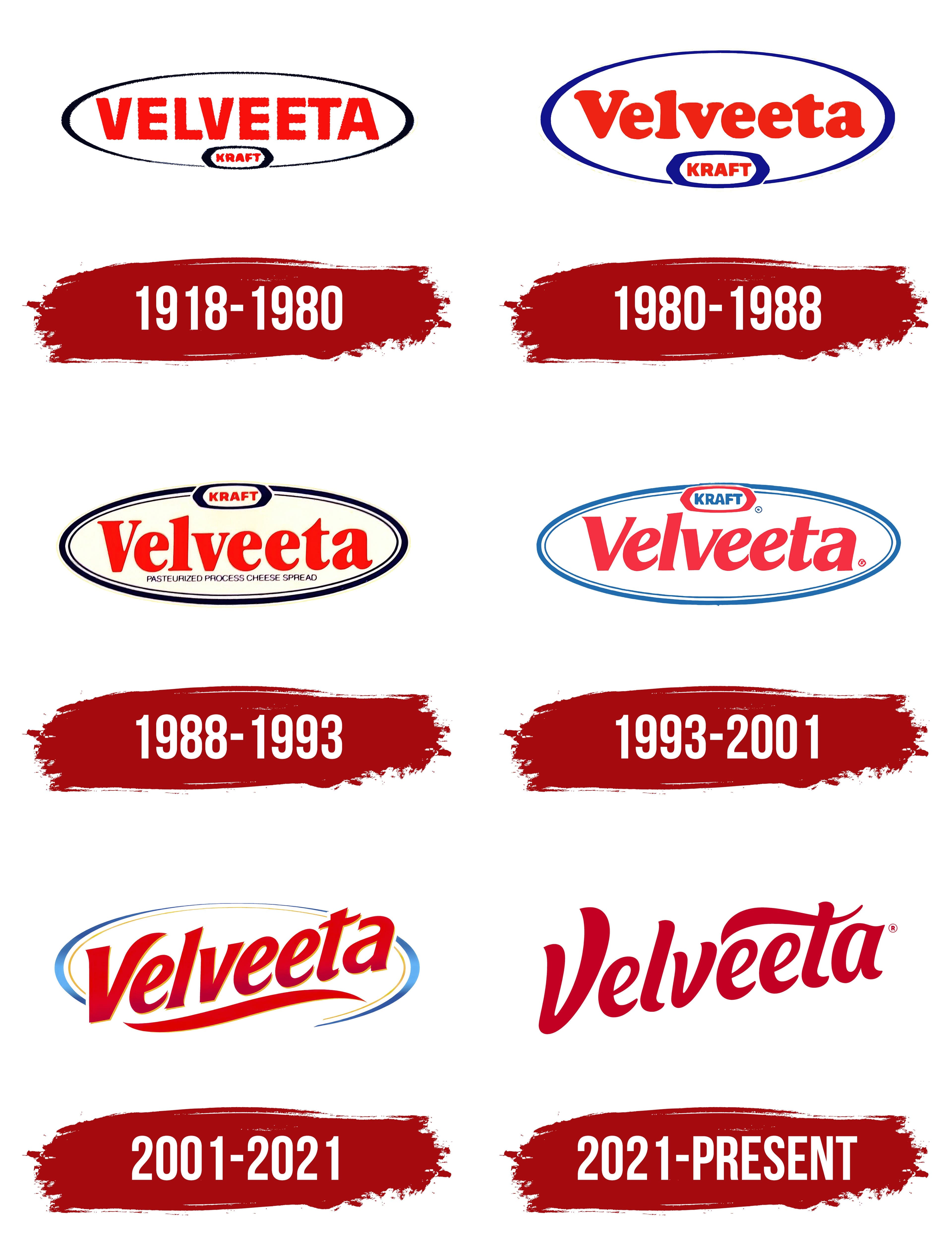
1918 – 1980
The company’s first logo reflected two fundamental points. The goal was to inform potential customers about the introduction of a special product. The logo needed to convey the reliability of the well-known food giant Kraft Heinz and be remembered as the tastiest brand.
To achieve this, noticeable and contrasting colors were used: black and red. Two geometric elements were associated with infinity. Attention was drawn to the concise font, which followed 20th-century rules. The even, symmetrical letters looked expressive. Eight letters on a white background formed the central element, while four below were more detailed. The logo stated the manufacturer’s identity but said little about the product.
1980 – 1988
Over time, trends changed. The principles and traditions of making processed cheese remained, but the products’ presentation took on a new look. The decision to modify the logo was a necessary measure dictated by the times.
The most noticeable innovation was the change in the color scheme. The classic black logo shifted to a clearer and more noticeable blue tone. Rounded shapes in sky or sea hues gave the logo a sense of lightness. Blue ovals of various sizes, from large to small, increasingly drew attention not to the form but to the content. The central elements were still the inscriptions.
The font changed from geometric to soft and rounded. This style was used for the brand name’s lettering. Each letter retained the familiar red tone. The “Kraft” inscription remained an element that clearly defined stability, reliability, and adherence to tradition.
1988 – 1993
If the two previous logos could be called similar, the subsequent one stood out significantly. It represented innovation and transformation of forms, elements, and symbols. This change was natural as the collection of processed cheese flavors expanded.
The product gained loyal followers, and new customers became increasingly interested in the ingredients. For the first time in the brand’s history, the logo included text indicating the product type “PASTEURIZED PROCESS CHEESE SPREAD.”
The central place remained with the text element “Velveeta.” Moving the “Kraft” name from the bottom to the top of the logo symbolized the product’s advancement to a new level. Information about the ingredients was displayed in blue, highlighting their importance, but was placed in the third exposition zone.
Multiple frame levels were used to enhance the visual effect. Light and dark tones interacted, creating a dynamic effect for the letters. Lightness and freedom became the primary themes of the new logo.
1993 – 2001
Dynamism was introduced into the logo, so the words are now italicized. The slant aids in easy reading and brand recall. The frame contours have become uniform in tone, and the primary colors blue, red, and white interplay across different areas.
With the increasing product range under the “Velveeta” brand, it was decided to inform as many customers as possible about the product diversification. This was achieved with the text phrase “SHELLS & CHEESE.” Capital letters were used to attract more attention from the target audience. The deep color palette highlights the product’s multifaceted nature, emphasizing its flavor and uniqueness. Every dish with “Velveeta” cheese products is a true culinary masterpiece. The manufacturer consistently reminds customers of this in its various advertising campaigns.
2001 – 2021
When evaluating the company’s overall competitiveness, it remains consistently high. “Velveeta” products have become a favorite for many and are rapidly gaining the trust of new customers. This is reflected in the logo update. The key aspect is forward movement. Blue and yellow colors create a general vision of motion and depth. The “Velveeta” inscription in red is not rigid but dynamic. The first and last two letters extend beyond the contours, symbolizing freedom and infinity. The infinity element appears at the bottom but is modified uniquely. Sharp angles in the consonant letters and oval curves in the vowels convey the company’s commitment to tradition and its drive toward an infinite future.
2021 – today
In the new era, producing high-quality processed cheese no longer needs detailed descriptions. The Velveeta logo now has less text. Ovals, contours, and lines are absent. Simplicity and dynamism are evident in the modern design of the elegant logo. Only the vibrant red word “Velveeta” remains. The letters interact with each other, spaced evenly, and are as light as quickly melting cheese. Customers only need to spot their favorite brand on the shelves, as the products’ taste and gastronomic qualities are already known to millions.