The logo of Applebee’s represents the restaurant’s dedication to creating a friendly neighborhood atmosphere where people can enjoy hearty American meals. It embodies the brand’s character as a casual dining spot that is welcoming and affordable for families, friends, and individuals seeking a relaxed meal. The emblem highlights Applebee’s focus on community and connection, marking it as a venue where good food and good times converge. This commitment is evident in their diverse menu and the slogan, “Eatin’ Good in the Neighborhood,” which emphasizes their role as a local gathering place.
Applebee’s: Brand overview
In 1980, Bill and T.J. Palmer started Applebee’s in Decatur, Georgia. They aimed to mix great food with fun drinks in a cozy place. They wanted to create a spot where good food was affordable in a friendly setting. The menu featured American favorites like burgers, sandwiches, and salads. By 1983, they were ready to grow and started offering Applebee’s as a franchise. This move helped Applebee’s expand quickly across the U.S., hitting 100 restaurants by 1989.
In 1991, Applebee took a big step by going public on NASDAQ. This helped it grow even more, including in other countries like Canada and Mexico.
In 2007, things changed when IHOP bought Applebee’s for about $2.1 billion. After the buyout, the company was named Dine Brands Global. With new leadership, Applebee updated its menu to include healthier options and refreshed its restaurant designs.
Today, Applebee’s is the largest casual dining chain in the world, with over 1,600 locations. It’s known for many dishes, including steaks, pasta, and signature drinks. It’s also keeping up with times by offering delivery and takeout.
Despite industry ups and downs, Applebee’s is still a go-to for people wanting a good meal in a relaxed place. The brand keeps adapting to meet its customers’ changing tastes, staying true to its roots as a place for great dining.
Meaning and History
What is Applebee’s?
Applebee’s, a well-known American casual dining chain, was founded in 1980 in Atlanta, Georgia. Known for its relaxed atmosphere and family-friendly options, Applebee’s offers a menu that includes a variety of classic American dishes such as salads, burgers, steaks, and pasta, along with a range of beverages and desserts. As of 2021, the chain operates over 1,700 locations in the United States and internationally, making it one of the largest casual dining chains worldwide. Applebee’s is part of Dine Brands Global, which manages the IHOP restaurant chain.
1980 – 1982
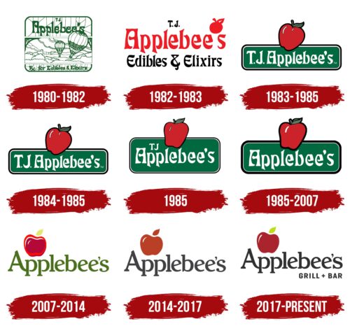
From 1980 to 1982, Applebee’s marketing strategy showcased how a brand’s name and visual identity might not match its actual operations and the atmosphere of its restaurants. The name “Applebee” was randomly chosen from a phone book, and the first logo featured air balloons. Both decisions aimed for positive vibes but ultimately created an unpredictable brand image. These choices created a unique yet illogical visual identity that did not fully represent the restaurant’s activities.
The logo was divided into three sections. The top and bottom parts showed cracked rocks with the restaurant’s name at the top and a slogan mentioning food and “elixirs” at the bottom. The middle section featured air balloons and a cityscape, adding a touch of dreaminess and freedom.
The logo’s green color, images of nature, and mention of elixirs could imply healthy and natural dining options. However, Applebee’s menu mainly consists of fried ribs, burgers, and beer, which contradicts these implications. This results in a mismatch between the logo’s visual cues and the actual menu items, affecting the overall perception of the restaurant’s atmosphere.
1982 – 1983
When Applebee’s opened its second restaurant, it updated its logo to represent the brand better and attract more customers. The new logo featured a large red apple that elegantly replaced the apostrophe in Applebee’s name, making it clearer and more recognizable. This apple symbolized freshness and suggested that the restaurant offered healthy dining options.
However, the menu was rich in traditional American dishes like burgers, steaks, and beer, typically higher in calories. Despite this, the apple in the logo set an expectation of healthier choices. The logo included the phrase “food and elixirs,” highlighting the variety of foods and drinks available at Applebee’s.
The logo’s color scheme used red and black, adding style and making the logo eye-catching and memorable. This helped make the logo a key part of Applebee’s brand identity.
1983 – 1985
Applebee’s parent company was sold, leading to a new phase for the brand, including another logo update. This change was meant to refresh the brand visually and reinforce its identity as the company took a new direction. The logo now featured a ripe red apple against a green background, along with the founder’s wife’s initials, “T.J.,” and the Applebee’s name.
The design continued to suggest health and nutrition because of the red apple and green background. Although these elements might seem at odds with the broader variety of dishes Applebee offers, beyond just healthy options, the new marketing strategy did not slow the company’s growth. Applebee’s kept expanding, opening new restaurants and drawing more customers. This success showed that the brand could maintain popularity by offering a distinctive atmosphere and experience, even if the visual cues did not perfectly match the menu.
1984 – 1985
In the latest update to their brand emblem, management decided to adjust the shade of green to make the logo look fresher and lighter. This change aimed to better align with current consumer preferences, which favor minimalism and design purity. They wanted the new green shade to bring a sense of airiness and dynamism to the logo, highlighting the brand’s focus on innovation and ongoing renewal.
Despite these efforts, the rebranding largely went unnoticed by the public. The minimal nature of the changes, which didn’t alter the design’s key elements, may have been why people didn’t notice the update. The minor adjustments were probably insufficient to impact or change how customers perceive the brand significantly.
1985
In 1985, Applebee’s updated its logo for ongoing development and brand strengthening. The new design made the logo more elongated, enhancing its elegance and visibility, which helped improve brand recognition. The significant update was the switch to a Red Delicious apple image, known for its crispness, juiciness, and vibrant red color, which is very popular in the United States.
The Red Delicious apple was a deliberate choice, symbolizing American heritage and quality. This aligned with Applebee’s identity as a national brand expanding its franchise network. This widespread apple variety in America represents the company’s commitment to providing quality service and food that many Americans enjoy.
This choice directly connected the logo and Applebee’s American identity, strengthening its national presence and emphasizing its commitment to embodying American values in its branding.
1985 – 2007
In 1985, Applebee’s underwent a significant transformation that reshaped its visual and conceptual identity. The founder decided to franchise the brand, a pivotal move that led to changes in the logo. They removed the initials T.J., the founder’s wife, from the logo. This was done to focus more on the Applebee’s name, enhancing the brand’s recognition.
The emblem’s design was also altered to emphasize the brand’s development. The apple and the sign’s outlines became bolder, making the logo more expressive and memorable. These thicker lines symbolized the brand’s strength and stability, showcasing its readiness for further growth and expansion. The enhanced contours also increased the logo’s visual appeal and professionalism, helping it stand out among competitors.
2007 – 2014
In 2007, IHOP Corp bought Applebee’s restaurant chain, significantly changing its visual identity. The logo’s background became more adaptable and easier to recognize, making it easier to remember. They moved the apple figure and its outlines to the left, which refreshed the logo’s look and made it feel more modern and original. They also doubled the apple image and placed it with the double letter “P” in the name, creating an interesting visual effect and deepening the logo’s connections.
The 2007 version of the Applebee’s logo closely resembled Apple Inc.’s well-known emblem, both in the apple and leaf design and the typography. Despite these similarities, the two companies had no legal disputes concerning this likeness.
The logo kept its green color in the lettering, supporting the idea of healthy eating. Green stands for freshness, naturalness, and health, emphasizing Applebee’s commitment to offering food that is good for health.
Despite the name changing to Applebee’s Neighborhood Grill & Bar in 1986, these updates didn’t appear in the logo elements. This shows a preference for keeping the logo recognizable and conservative rather than completely updating it.
2014 – 2017
In 2014, Applebee’s updated its brand colors to align with its menu offerings, such as cider, beer, and grilled dishes. This change improved the logo’s look and made the connection between the brand and its food offerings clearer, highlighting the unique dining experience it provides.
The new design featured a baked apple image in dark gray alongside the restaurant’s name. The baked apple was chosen because it conveys comfort, warmth, and a welcoming feel, enhancing the restaurant’s hospitality atmosphere. The dark gray adds sophistication and modernity, making the logo stand out and memorable.
The new image and colors showcase Applebee’s dedication to high-quality service and creating a distinctive, enjoyable dining environment. This design reflects their commitment to good food and a great dining experience.
2017 – today
Applebee’s recently updated its visual identity to improve sales and attract new customers. They added “grill + bar” to their logo to clarify their offer. This change helps customers know what to expect from their menu and the restaurant atmosphere. It highlights Applebee’s as a great place for family dinners, meeting with friends, or enjoying good food and drinks.
The logo now includes an apple image, which gains new symbolic meaning in the context of “grill + bar.” It suggests the idea of temptation, indicating that the dishes, although hearty and calorie-rich, are irresistibly delicious. This adds a layer of allure to the logo, emphasizing their offerings’ satisfying and high-quality nature.
Font and Colors
The Applebee’s logo embodies the brand’s identity with a font crucial to its visual identity. The exact name of the font is unknown, but it closely resembles Futura Bold—a bold, sans-serif typeface. It’s likely a modified version of Futura, tailored specifically for Applebee’s. The large font size ensures the logo is highly visible and readable from a distance. Its bold weight, clear lines, and geometric shape lend it a modern, friendly, yet assertive character.
The font is large, enhancing its impact and visibility. It is designed in a bold style, which aids in its perceptibility and conveys a sense of stability and reliability. The boldness and simplicity of the characters ensure high readability. The straightforward nature of the font, free of unnecessary flourishes, facilitates its readability across various applications, from signage to digital media.
The font conveys a sense of friendliness and approachability, fitting the casual atmosphere of an Applebee’s restaurant. It is memorable due to its distinctive features, especially the stylized letter “A.” The layout of the font is simple—horizontal and even.
The deep red hue of the apple evokes warmth, appetite, and energy. This color is associated with the food industry due to its stimulating properties. A leafy green accent above the apple complements the contrast, signaling freshness and healthy ingredients. The black font is classic and versatile, ensuring excellent visibility against various backgrounds, which enhances brand recognition.
The font and colors work together to present a logo that is both accessible and memorable. This appeals to a broad audience and strengthens the brand’s position in the casual dining market.
FAQ
Why is it called apple bees?
The story behind the name “Applebee’s” starts with its founders, Bill and T.J. Palmer, who wanted to open a restaurant that felt welcoming and like home to everyone. They were looking for a warm, friendly name, something very American. They found the name “Appleby” in a phone book and liked it because it matched the friendly and homey vibe they were going for.
But they hit a snag when they found out “Appleby” had already been taken. Instead of giving up, they got creative and changed the name to “Applebee’s.” This new name has stuck and has become known nationwide for casual dining.
The change from “Appleby” to “Applebee’s” was more than just a small tweak. It showed the founders’ determination to make their restaurant dream come true, even when things got tough. “Applebee’s” now stands for a place where people can enjoy good food and make happy memories together. It’s all about feeling comfortable and welcomed in a community. Today, Applebee’s is a favorite spot for many, symbolizing what you can achieve with creativity and hard work.
What is Applebee’s most famous for?
Applebee’s is a popular place known for its laid-back vibe and classic American food. They offer many choices like salads, chicken dishes, pasta, and burgers. But what makes them stand out is their signature dish, the riblets. These are small, juicy ribs full of flavor, usually served with fries and coleslaw. People love these and often come back just to have them again.
The atmosphere at Applebee’s is cozy and welcoming. They want you to feel at home and enjoy your meal in a friendly setting. This approach, combined with their variety of American favorites, has made Applebee’s a favorite spot for many.
Applebee also draws people in with special deals and seasonal offers, including menu items. These deals are a big hit because they offer good food at lower prices, appealing to all kinds of diners.
In short, Applebee’s is the place to go for a comfortable dining experience with food that tastes like home. Their success comes from serving good food that brings people together, with the riblets being the show’s star.
How many Applebees are there in the US?
By the end of 2022, Applebee’s had 1,678 restaurants worldwide, showing its big footprint in the U.S. and other countries. Of these, 1,569 are in the U.S., making Applebee a major player in the casual dining scene. They’re known for their American-style dishes and a friendly place to eat.
Outside the U.S., Applebee’s has expanded to 109 locations, showing that people in different countries enjoy their approach to casual dining with an American twist.
Applebee’s is part of Dine Brands Global, which helps manage and grow the restaurant. This support has helped Applebee become a go-to place for many customers in America and internationally. They keep coming back because of the consistent and enjoyable meals Applebee’s serves.
How did Applebee’s get started?
Applebee’s started in 1980 in Atlanta with the name T.J. Applebee’s Rx for Edibles & Elixirs. The founders, Bill and T.J. Palmer, wanted their restaurant to feel warm and welcoming, like an old-time drugstore but for food and drinks. They first considered naming it Appleby’s, but that name was already taken. So, they came up with T.J. Applebee’s Rx for Edibles & Elixirs, which set them on their path.
The Palmers wanted more than just another place to eat; they aimed to create a spot where people felt at home, enjoying good meals and drinks in a friendly environment. They imagined a place that reminded people of the personal touch and community feel of old drugstores.
Since those early days, Applebee’s has grown a lot. It’s become one of the most well-known casual dining chains, not just in the U.S. but around the world. Even though the name and the size of the chain have changed, the original goal of making a welcoming place for people to eat together has remained the same. Applebee’s has moved from being a single restaurant with a unique idea to a big name in casual dining, still focused on bringing people together.
Is Applebee’s only in America?
Applebee started over 42 years ago in Decatur, Georgia, with its first place. It’s not just in America; it has about 1,650 spots in 14 countries and territories. This growth means Applebee’s has spread its casual dining style, known for American grill and bar food, to other parts of the world. It’s popular across different cultures because it adjusts the American dining style to match what people in other countries like. Applebee keeps expanding, planning to reach even more people globally with its friendly neighborhood grill and bar experience.
Why is it called Applebee’s?
Bill and T.J. Palmer, the founders of Applebee’s, needed a good name for their restaurant. They looked through a phone book and liked “Appleby” because it sounded friendly and inviting. But they found out “Appleby” had already been taken. Instead of giving up, they changed the name slightly to “Applebee’s,” keeping the friendly vibe they wanted. This smart move helped make Applebee a big name in casual dining across America. The story shows how the founders were creative and flexible, turning a small challenge into a big success.
What oil does Applebee use?
Applebee cooks with highly refined soybean oil in their fryers, a choice influenced by the FDA’s guidelines, which do not recognize this type of oil as an allergen. This generally makes it safe for individuals with soy allergies. However, because Applebee’s kitchen areas are used to prepare various dishes containing different allergens, including shared fryer oil, the restaurant cannot promise that its menu items are completely allergen-free. This information is vital for guests with particular dietary restrictions or allergies, helping them make safer dining decisions at Applebee’s.
