


 BabyRuth Logo PNG
The BabyRuth logo reminds us that everyone’s life should be sweet. Looking at it, you feel it’s the perfect time for a gastronomic delight. The creator of these delicious bars aims not just to attract attention but to be memorable, and it’s safe to say they succeed!
Baby Ruth began in 1920 at Otto Schnering’s Curtiss Candy Company in Chicago, where a new candy bar was developed for a competitive American confectionery market. It reached stores in 1921 with nougat, caramel, peanuts, and milk chocolate. Its name soon became part of the brand’s story. Curtiss said it referred to Ruth Cleveland, daughter of President Grover Cleveland. At the same time, many consumers linked it to baseball star Babe Ruth.
In the 1920s, Baby Ruth grew through unusual promotion. In 1923, hundreds of bars were dropped from an airplane over Pittsburgh, each attached to a small parachute. The campaign made the product visible beyond regular store advertising. During the 1930s, its five-cent price helped keep it accessible. In World War II, the bar spread further because it was included in American soldiers’ rations.
The change in ownership affected the brand’s reach. Standard Brands acquired Curtiss Candy Company in the 1960s and increased distribution and advertising. In 1981, Standard Brands merged with Nabisco Brands, and later RJR took control of the combined business. In 1990, RJR sold Baby Ruth and other candy brands to Nestle, which added miniature bars, updated packaging, and continued national marketing.
In 2018, Ferrero acquired the U.S. confectionery business that included Baby Ruth. The new owner reviewed the bar’s position and, in 2020, changed the recipe by using roasted peanuts and replacing corn syrup with invert sugar syrup. In 2021, marketing focused on its status as an American classic. Later updates included share packs, miniature versions, limited seasonal releases, social media promotion, and plans for wider international distribution.
Meaning and History
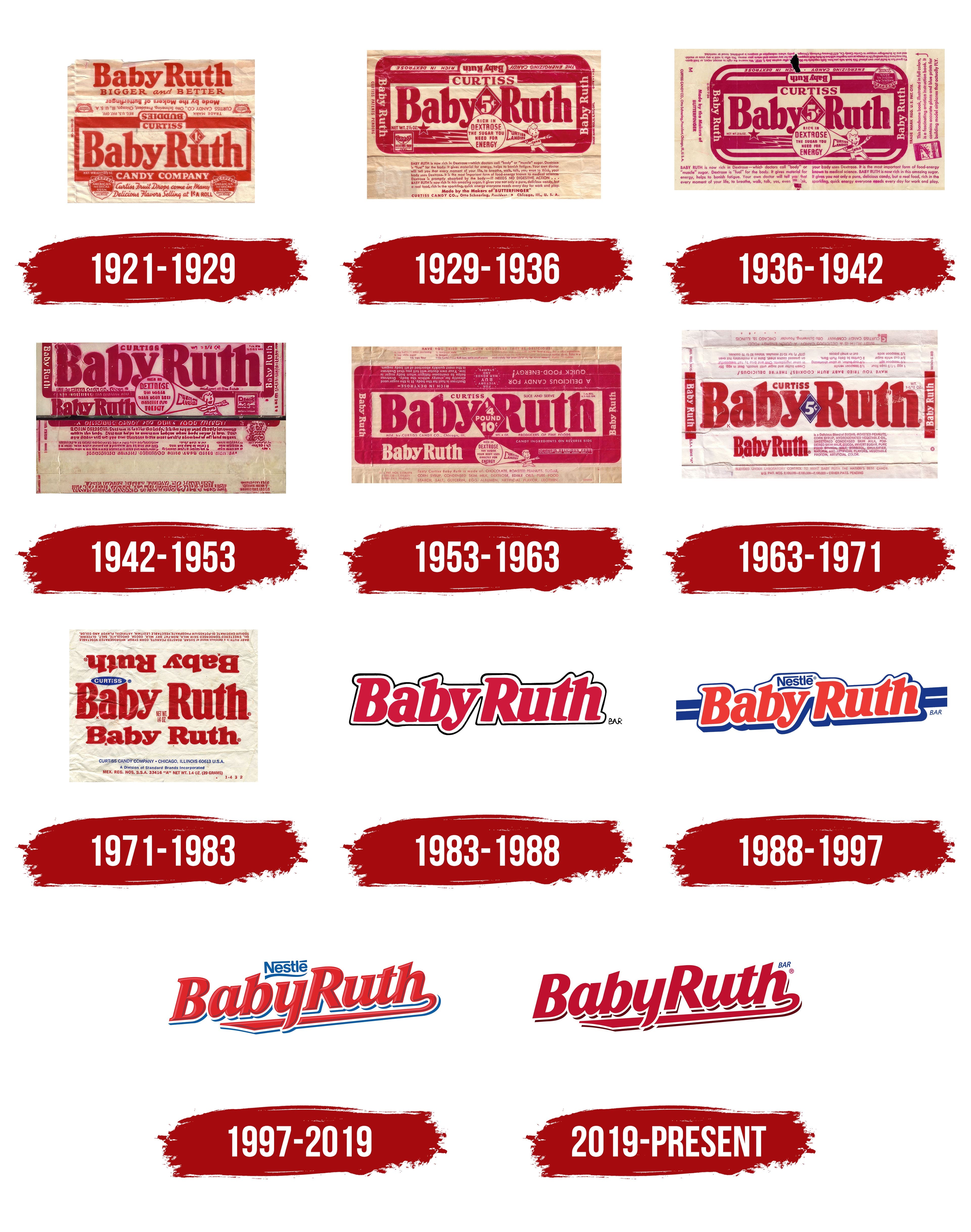
The identity emphasizes simplicity with great attention to graphics. There are no excesses, only beauty and grace, evident in every letter and flourish. The brand name is designed with modern trends and unique capabilities in mind.
The logo contains no drawings or images; it is entirely text-based, which is significant. It is characterized by playfulness and maximum presentability. Red letters on a blue background look stunning. However, it wasn’t always like this!
What is Baby Ruth?
It is a brand of chocolate bars owned by Ferrara Candy Company, a subsidiary of Ferrero. The bar consists of peanuts, caramel, and nougat covered with a layer of chocolate. It is known for its rich, chewy texture and pleasant combination of flavors. The brand has been a favorite among candy lovers for years, offering a classic and non-banana treat. The candy is available in supermarkets, convenience stores, and online stores, making it a convenient option for those looking for a sweet snack.
1921 – 1929
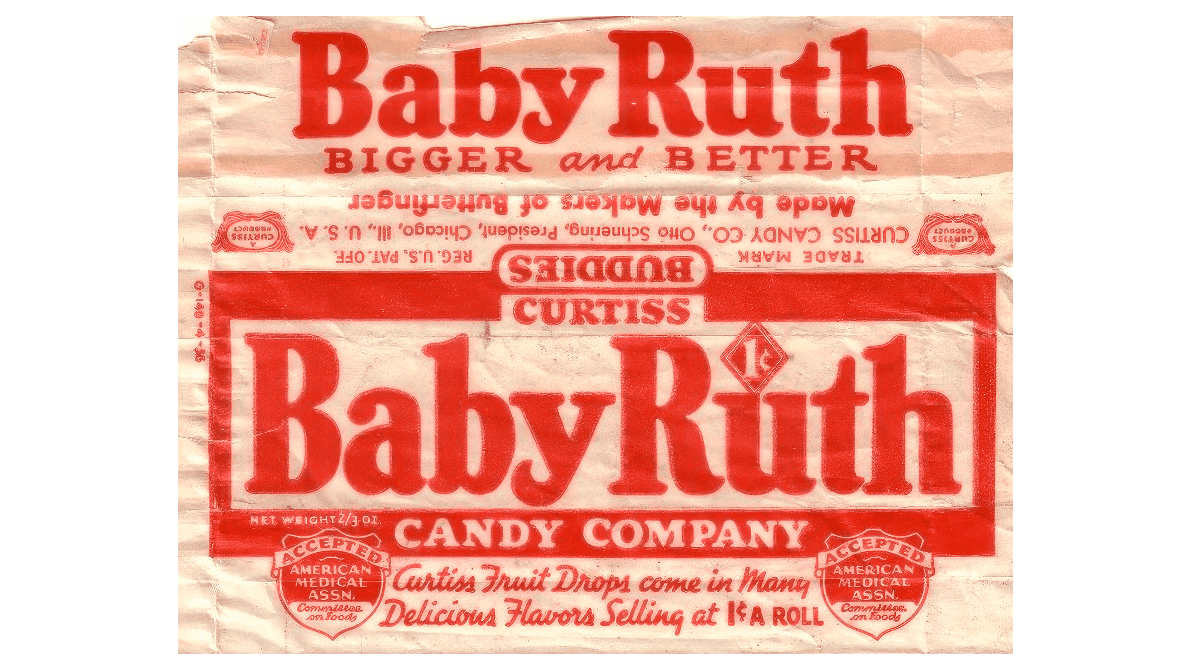
In 1921, an unusual logo emerged alongside the brand’s inception, becoming the company’s primary visual element and positioning it as the world’s most delicious candy bar. Founder Otto Schnering, understanding the high demand for sweets, decided to conduct a confectionery experiment. He offered customers a product combining peanuts, caramel, and chocolate. This surprised sweet lovers and eventually became a favorite treat for all Americans.
This was reflected in the identity. The logo included traditional features of the company’s activities and priority development directions. It was informative and presented the company in the best light. It looked authentic, reminiscent of a newspaper or magazine page, with many red inscriptions in different fonts and arranged in various zones. This created the impression that every word was significant. The logo made you want to read the entire text from start to finish.
Red letters drew key attention on a light background. The logo was large and occupied a central position. A frame in the same shade emphasized the importance of the text, enhancing the visual effect. The logo had a news-like element. The phrase “Bigger and Better” was associated with future surprises the company had prepared.
With just one phrase, “Curtiss Candy Company,” the designers conveyed the company’s authority and reliability. This suggested to sweet lovers that there was no need for a more refined taste and that there was an interesting combination of ingredients.
The recommendation texts were conceptually important additions. BabyRuth bars not only provide pleasure and evoke a storm of positive emotions but also confirm the product’s high quality and naturalness. Caring for potential customers’ health is part of the company’s philosophy.
1929 – 1936
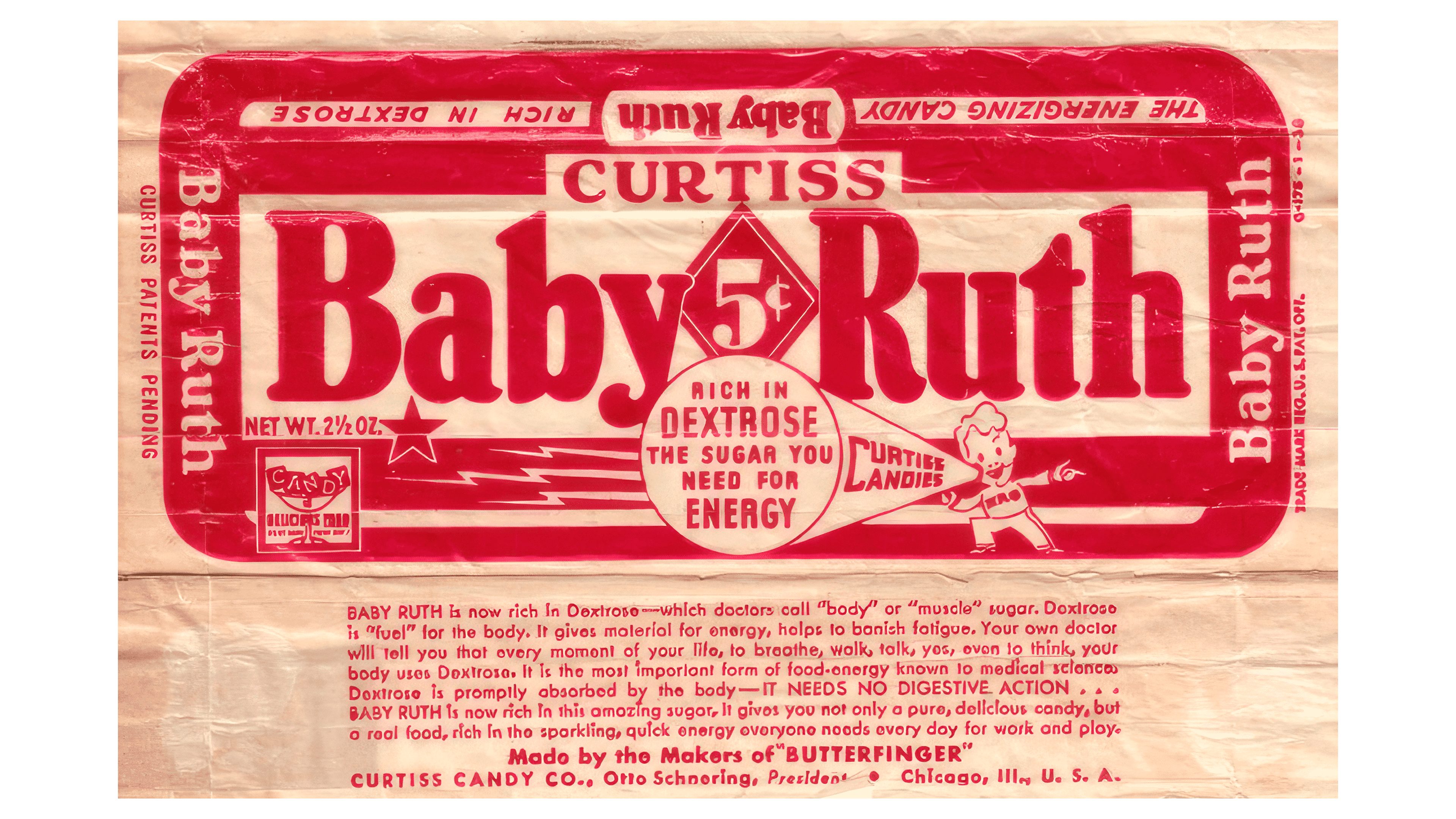
One look at the updated BabyRuth logo, which reflects the fashion trends of the time. The logo became more dynamic compared to the previous prototype. The focus is on brightness and presentability, emphasizing vivid colors and natural tones. Well-readable, bright texts ensure high informativeness.
The brand name occupies the central position, a trend that will continue in subsequent versions of the identity. The name “BabyRuth” is written in one line with uppercase letters in a contrasting red color. Spacing between the letters creates a visual link that attracts attention.
The numerical value indicates the product’s affordability. During the crisis that affected all manufacturing sectors, designers used the symbol “5¢” to emphasize the product’s accessible price. Customer care played a key role in the company’s development. The contrasting white numbers on a red background make the price information more noticeable. This element was enclosed in a geometric diamond shape.
The new logo also features a cheerful boy sharing a secret: the bars are good for your health.
1936 – 1942
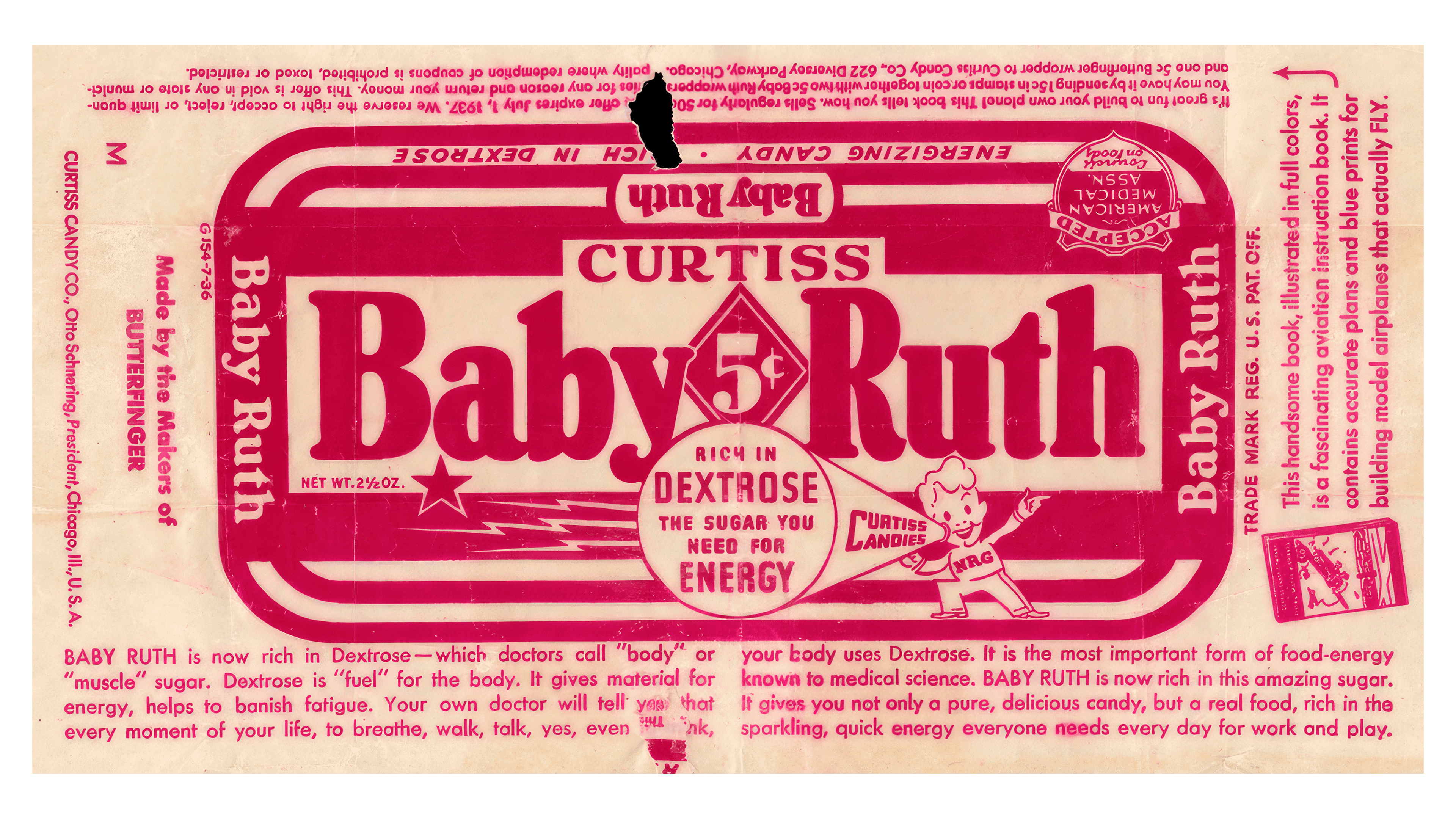
In 1936, designers chose a new direction and introduced a logo with a detailed product description to attract more customer attention.
Many elements, such as the brand name, the founding company’s name, and the cheerful boy, remained but underwent significant changes. The font became more detailed, and the boy’s image was more formal and realistic.
Information about the composition and nutritional value became the identity’s main element, emphasizing the product’s high quality. The logo conveyed that the bars benefited children and adults who wanted to be strong and healthy.
The color scheme became brighter, but the tonality remained consistent. The logo featured many geometric shapes that highlighted important information. The variety of fonts drew attention and encouraged reading even the small print, ensuring no detail was overlooked. This was a significant achievement: the logo became attractive and very informative.
1942 – 1953
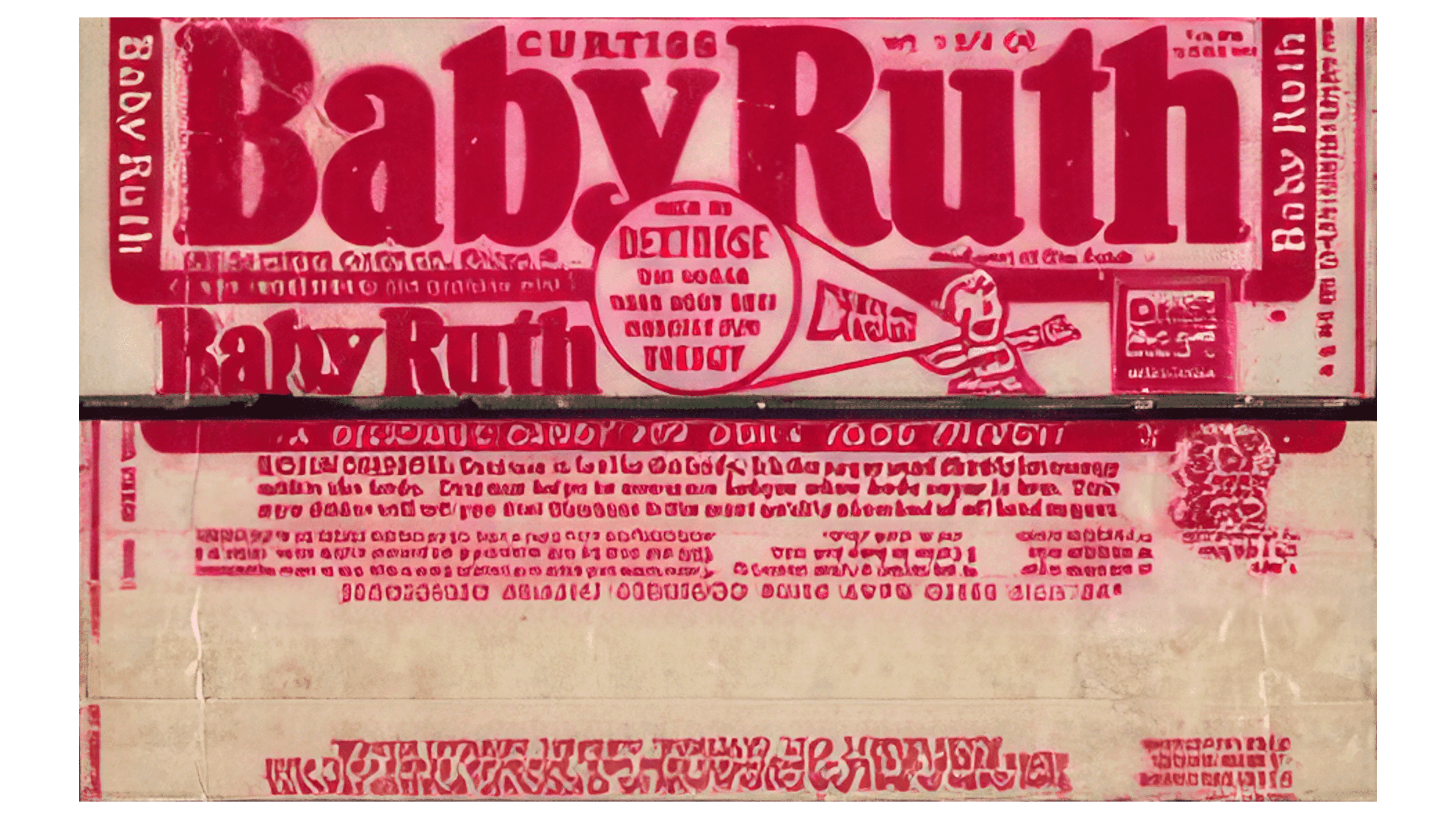
Health and energy become particularly important during a historically challenging period. That is why the medical association’s approval of the presented product takes on primary significance in the updated logo. This information is presented in an accessible, understandable text format.
The color palette has changed in line with the spirit of the times. Noticeable but not bright colors are used. Patriotism fosters resilience and helps maintain faith, so the boy in a sailor suit evokes nostalgia. He symbolizes trust in the product, emphasizing its high quality and ability to provide gastronomic pleasure.
The inscription “CURTISS” instills special trust in the sweets. It indicates the connection between the company and the brand, highlighting the manufacturer’s reliability, authority, and focus on customers first and foremost.
1953 – 1963
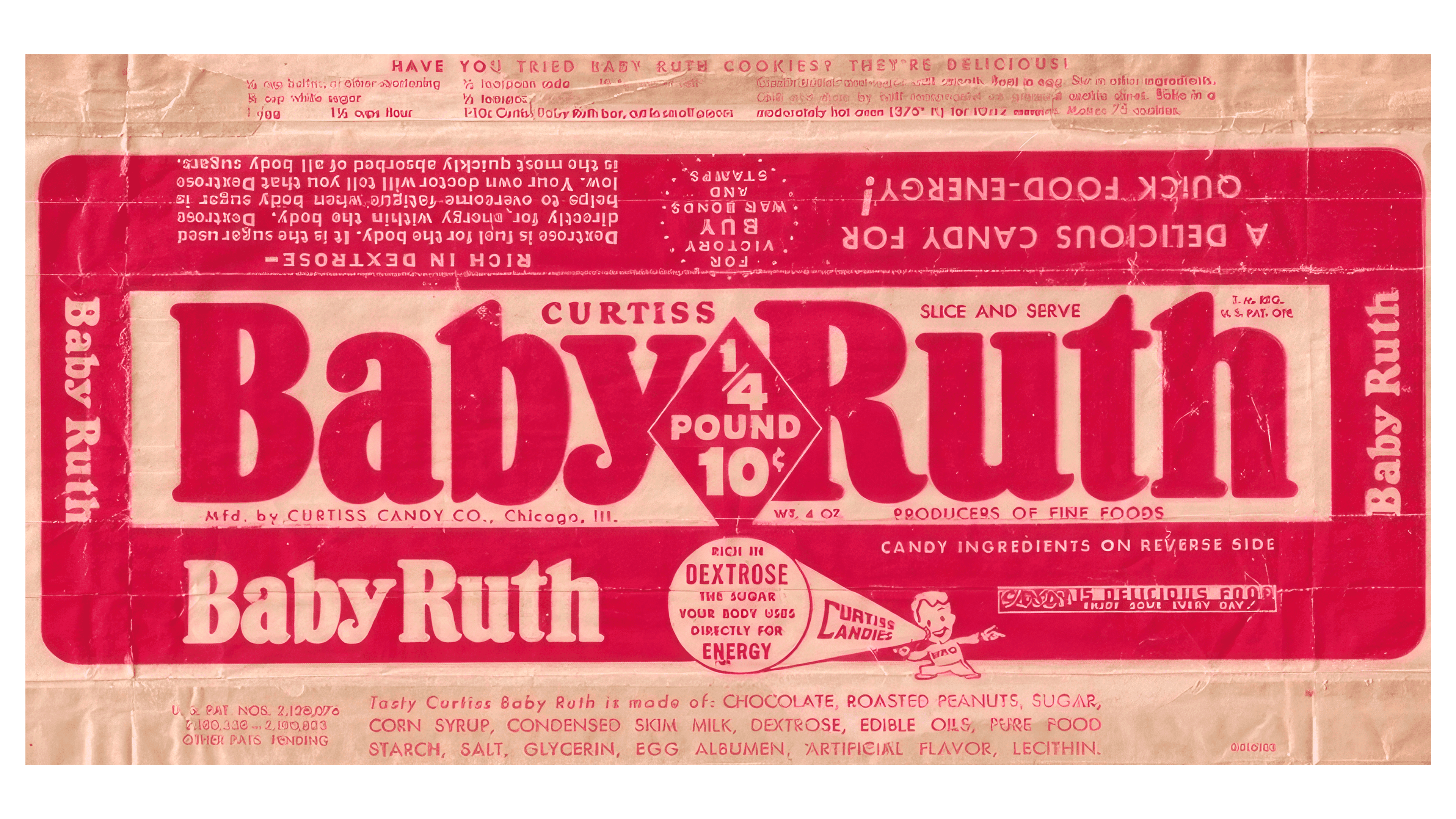
In 1953, designers successfully created a desire to taste the energy bar, to learn about its quality, and to present the brand at the highest level. They introduced a logo with an original design that stood out for its aesthetic beauty and substance.
They used geometric shapes, vibrant colors, and numerical values to emphasize the brand name. The brand name was highlighted in red on a white background, giving it a radiant appearance. The appeal was further enhanced by a rectangular frame with wide edges, making the name even more noticeable. The brand name was used more than four times in two shadow designs, white and red.
The character in the logo consistently conveys the product’s high quality, its ability to satisfy hunger, and its ability to boost vitality. For the first time, the logo included the exact weight of the bar and the phrase “Curtiss Candy Co.”
1963 – 1971
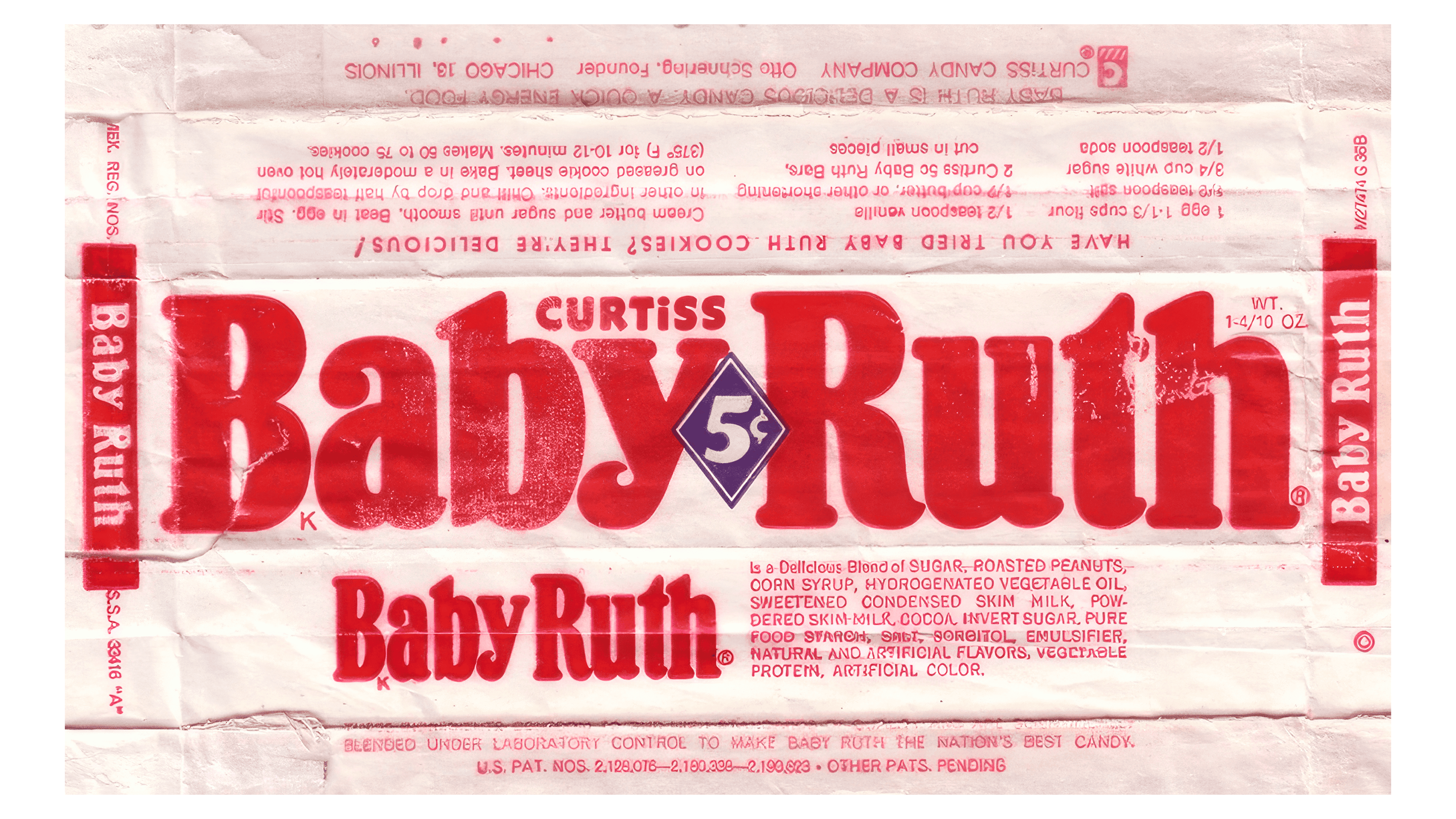
The logo introduced in 1953 remained unchanged for nearly ten years. In 1963, it underwent modifications, accompanying a new phase of the company’s development and aligning with new identity trends. The three elements that were most transformed were color, font, and text types.
The brand name is written in red on a light background and placed on a unified geometric plane. All letters are capitalized and graphically distinctive. Some have rounded corners and elements, while others feature sharp angles. The brand name appears more than five times on a single logo in various styles.
The numerical price, which first appeared on the logo almost 20 years earlier, was reintroduced. It remains in the same place between the words “Baby” and “Ruth.” The price “5¢” is highlighted in white on a blue background and framed in a diamond shape. A curious customer can find the ingredients and nutritional information of the sweets on the logo.
The sailor boy is absent from the new logo, leaving his disappearance a mystery.
1971 – 1983
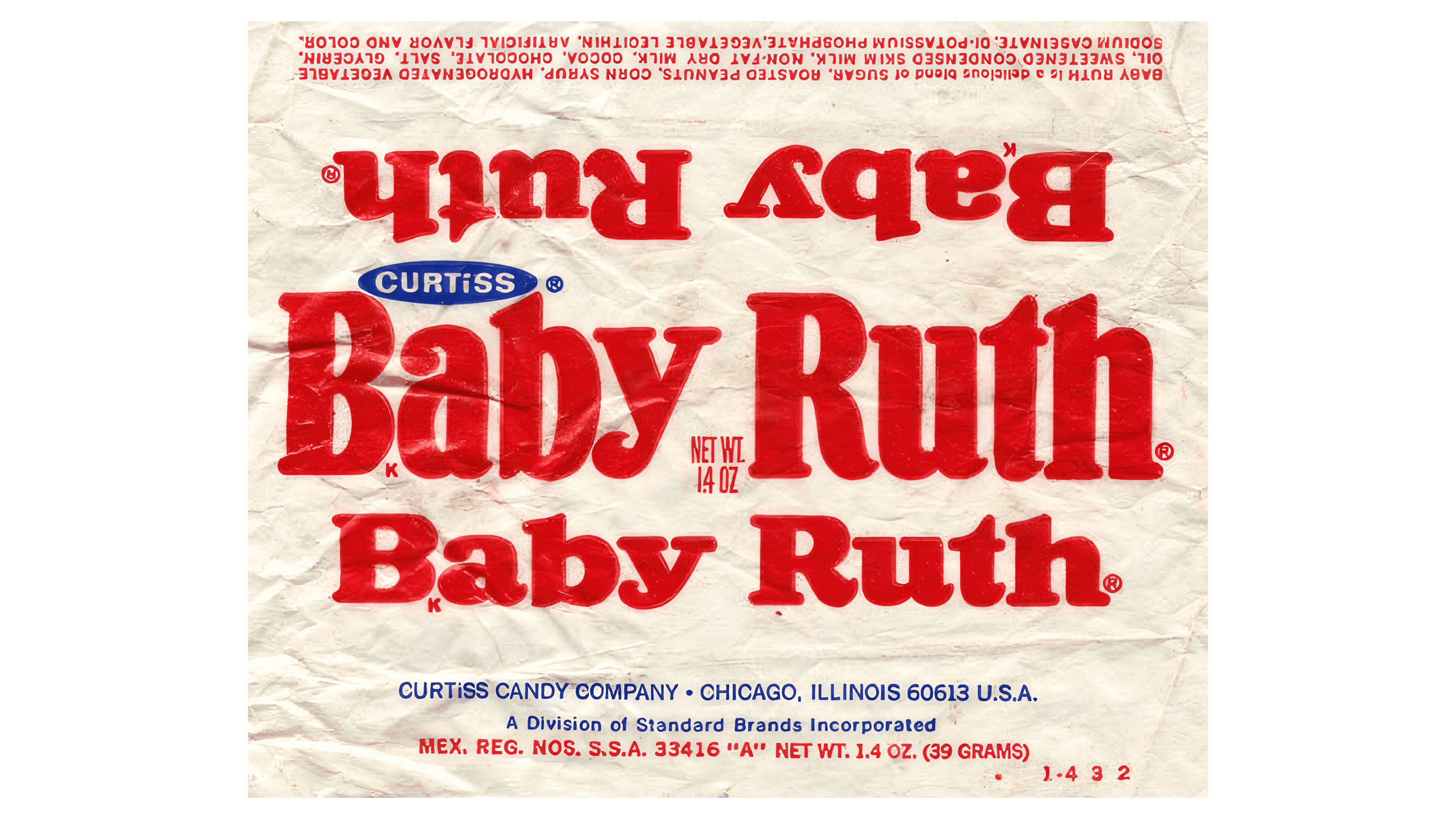
The new logo is distinguished by its graphical restraint, conciseness, and simplicity in presenting information. According to the designers, there is no longer a need to repeat information familiar to customers. Highlighting the brand among competitors brightly and attractively is enough, so the red lettering, chosen long ago, remains. The light background stays the same, with only slightly reduced contrast.
The brand name is written twice in the center of the logo. Each instance is styled on a different scale and with different fonts, creating an effect of global reach and style. In a semicircle on a blue background, white letters indicate the brand’s affiliation with a long-standing company.
1983 – 1988
All graphic elements, word repetitions, product composition descriptions, and characters disappear from the brand’s identity for the new period. Only the beautiful, bright visual design of the phrase BabyRuth remains. There is no longer a need to indicate the price or highlight significant elements on the logo.
The need to present the brand to customers in a way that allows them to quickly find high-quality, familiar-tasting products leads to retaining the red color, which becomes more saturated. The white background focuses attention on the contrasting letters. A dark border frame enhances readability, creating an excellent perception of the two most important words and the background.
The main emphasis is on dynamic and stylish typography. Each letter is large and voluminous, and the bold font gives it energetic fullness, just like the company’s product. The taste and sensations of the Baby Ruth treat are unforgettable and linger in memory after just one bar.
1988 – 1997
The word “Nestlé” appears on the logo for the first time, reflecting the globalization of changes. The well-known American brand now belongs to an international company, as beautifully depicted in the new logo. The word “Nestlé” is positioned at the top, above the brand name. The patriotic color scheme remains: the top text is in a strict tone, while the central one is in red.
The color policy unites the elements, making the logo harmonious. Rounded elements are combined with straight lines, giving volume to each character.
The brand name is displayed in large red letters, rising from the bottom left corner. This creates an impression of the company’s reliability and emphasizes trust in the manufacturer.
1997 – 2019
Red, white, and blue colors dominate the identity, demonstrating patriotism and emphasizing that high-quality products are made in the home country. The contrasting color scheme and the richness of each tone make all the text visible.
Accents are placed to highlight the brand name. The phrase is positioned in the central area of the logo. The word “Nestlé” is easily readable when glancing upward. The blue outline in the lower area under the letters underscores the brand’s and the company’s strong competitive qualities.
2019 – today
A decision to update the brand identity was made closer to 2019. The main goals were to enhance readability and promote the product.
Minimalism is present in every letter and element. This period is characterized by the logo’s simplicity, featuring only the bright and shining brand name. The overall style is dynamic and aesthetically appealing. Large and elegant letters convey reliability, evoking the taste of sweet treats and high-quality products.
There are no outlines, shapes, or frames. They have been replaced by a single, slightly raised vertical line that emphasizes and highlights the brand. This line is part of the last letter of the brand name “h.”