The Tic Tac logo symbolizes safety, freshness, and naturalness—the main characteristics of the brand’s products. It is also associated with mint, the most popular flavor of Italian mini-dragees. The emblem color symbolizes nature and a healthy lifestyle because Tic Tac candies can serve as an alternative to sweets with high sugar content.
Tic Tac: Brand overview
Tic Tac – refreshing Italian mini-dragees with mint, orange, lime, banana, strawberry flavors, etc. The brand belongs to Ferrero SpA Corporation. It is sold in 100 countries. The Tic Tac logo adorns packs in 4 sizes. Lollipops were developed by a Ferrero businessman in 1968, and he began to produce them in his father’s factory. The impetus was the Summer of Love in 1967. The constant close quarters of people in hippie communes they demanded freshness—especially breath.
Ferrero, an Italian company, launched Tic Tac mints in the late 1960s. These mints were unique because they were smaller and had a special shape that allowed them to move smoothly in the mouth.
By the 1970s, Tic Tac became popular in Europe. Its success was due to the mint’s refreshing taste and innovative packaging. The small, clear plastic boxes were easy to recognize. Tic Tac expanded its range to include orange, lime, and cinnamon flavors, appealing to a wider audience.
The 1980s marked Tic Tac’s entry into the American market, establishing it as a globally recognized brand. Its packaging, known for the sound the mints made, became iconic.
Tic Tac continued to innovate in the following decades, the ’90s and 2000s. It introduced new flavors like mint-lime, mango, and “Polar Frost,” and released special editions for holidays and seasons. Creative and amusing advertising campaigns emphasized Tic Tac’s refreshing taste and playful brand image.
In recent years, responding to a demand for healthier options, Tic Tac introduced Tic Tac Mixers in 2016, which featured two flavors in one. The brand also offered variants with less sugar or sugar-free sugar and larger packs for sharing.
Sold in over 100 countries, Tic Tac remains a leading brand in the mint market. Its well-known packaging, diverse flavors, and vibrant brand image continue to attract consumers of all ages.
Meaning and History
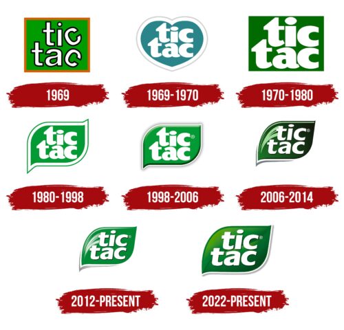
Originally, the products were called Refreshing Mints. The logo of that period is not known. The first logo appeared simultaneously with the original name of Tic Tac. After that, it was changed five times more and more, getting closer and closer to the maximum visual expression of freshness and naturalness.
What is Tic Tac?
Mints were invented in Italy and sold in a clear plastic box that resembles a lighter. Each mini candy has 2 kcal. Ferrero SpA manufactures and sells them.
1969
The first visual sign was a green square in an orange frame. Inside is the name in white letters with a black border.
Tic Tac translates as “tic-tac-toe,” a game where you must get ahead of your opponent to place your pieces correctly. That’s how quickly mini-candy copes with the elimination of bad breath. Another word combination is reminiscent of the ticking of a clock. It corresponds to one second. The secondary indicates the speed of the candy. Subsequently, the founders also spoke of the similarity of the name with the sound of opening the box lid: Tic – opened, Tac – closed. Everything is simple and fast.
The inscription is in lowercase letters, hinting at the candy’s small size. The black border is a prototype of the outer colored shell, corresponding to the candy flavoring. It’s dense, and there’s an explosion of freshness inside.
The C’s on the ends of the words turned in different directions are a real eye-catcher. They are reminiscent of jellybeans rolling around in a package. The emphasis on the two letters is not accidental. For freshness, it is recommended to use two jellybeans at once.
The green background color is a hint of mint use. The orange trim is the image of the box. The whole logo looks like a package with lollipop letters inside.
1969 – 1970
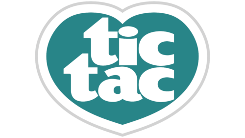
Lollipops were perfect for freshening your breath before a kiss. That’s why the next logo shape changed from square to heart-like. It was another allusion to the Summer of Love.
Combining the blue-gray background, white trim, and white lettering created a sense of icy cold and indicated menthol cooling.
Also, the logo’s shape remotely resembled a tooth. Dragees aren’t bad for teeth, like refreshing gum. Ascorbic acid, tartaric acid, and menthol disinfect the mouth and are antioxidants for teeth.
1970 – 1980
The logo of this period returns to a square shape and mint background. Inside is a very large Tic Tac inscription in white letters. However, in this emblem, the background trim and lettering also disappear. The freshness of the lollipop has no limits anymore.
The size of the letters shows how many lollipops are in one package and how densely they are placed. Each letter resembles a single candy.
1980 – 1998
The lollipops have become widespread and are sold on five continents.
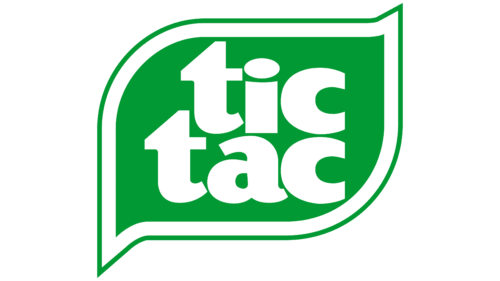
To make it clear to people speaking different languages what Tic Tac is, an original solution for the logo’s background was invented in the 80s. It was made in the form of a mint leaf. This conveyed the freshness of the mint, and the white border demonstrated the coolness that occurs in the mouth when the lollipop is consumed.
1998 – 2006
The emblem becomes darker and gains volume. The leaf and letters appear convex; you want to touch them with your hands. The emblem’s volume and rounded, flowing forms hint at a streamlined oval dragee. A rich color indicates a bright, deep taste. The freshness lasts for 2 hours.
2006 – 2014
These changes in the visual sign were a step towards naturalness. The mint leaf is colored with a gradient. The veins are marked on it. The leaf plate takes on a curve, and the typeface tilts to the right.
The gradient from light green to almost black and the italicized lettering indicate that the brand is steadily growing. It has practically no competitors. However, no global changes are expected yet.
Keeping the leaf in the composition indicates that the mint flavor is still the most popular flavor of dragee.
After 2006, the owner did not do much to promote the brand. Old age (78) and the death of his eldest son (2011), who was to succeed him, pushed things aside. Since 2015, the youngest son, Giovanni Ferrero, has owned the brand.
2012 – today
In 2012, the details of the emblem were changed, but its structure was retained. The green color became lighter to show the freshness and naturalness of the product. The designers added blurry white highlights at the top for the same purpose. The letters in the lettering were slightly enlarged and rounded. This is due to the desire to create a softer and friendlier brand image. Also, thanks to the new font, the name Tic Tac stands out better against the background of the sheet. The gray stripe in the lower corner has acquired a silver gradient. On the one hand, the transition of shades makes the logo look voluminous and deep. On the other hand, its use is consistent with modern design trends.
2022 – today
After the redesign, the green leaf lost its white glare, but a gradient was added, which gave the image freshness and depth. This makes the emblem look more realistic, in line with the brand’s concept of naturalness. A thin vein in the middle of the leaf runs, increasing the detail.
The silver line in the bottom corner was removed. Instead, there is a long, semi-transparent gray stripe along the bottom edge of the emblem. It is separated from the sheet by a thin white line, which gives a feeling of lightness and airiness. Although the typeface has not changed, the letters seem larger. This draws attention to the name Tic Tac.
Font and Colors
The main colors present on almost all logos are green and white.
- Green is the color of greenery, mint. It is a shade of health and pleasant coolness. Drage takes care of a healthy breath.
- White is the color of the brand’s main lollipops and tooth enamel. The shade echoes snow and ice. It evokes the association with cold and freshness.
PMN Caecilia Sans Head Black Oblique font. The dot above the letter i is shaped like a jellybean.
FAQ
What is the meaning of Tic Tac?
“Tic Tac” refers to the sound that clocks and watches make, but it’s also the name of a famous mint candy made by Ferrero, an Italian company. This candy started in the late 1960s and is known for its small, pill-like shape. Shaking the clear plastic box, they make a “tic-tac” sound, as the name suggests. This sound makes Tic Tac unique and fun, linking it to its original meaning. The design and sound of the packaging help make Tic Tac stand out as a brand, connecting it with feelings of freshness and fun.
Tic Tac creates new flavors and styles as candy trends change while keeping its fun spirit. The brand works hard to stay current with what people like ensuring it remains a popular choice worldwide for a long time.
Why is Tic Tac called Tic Tac?
Tic Tac got its name because of the sound its packaging makes. Ferrero first sold these mints as “Refreshing Mints” in 1969. A year later, they changed the name to “Tic Tac.” The name comes from the noise you hear when you open and close the mint’s box: a “tic” as it opens and a “tac” when it shuts. Many people recognize this sound and connect it with the Tic Tac brand.
The name was a smart marketing move. It turned the simple action of getting a mint into something you remember because of the sound. This helps Tic Tac stand out from other mints and candies. It’s not just about how the mints taste but also about the experience of hearing that sound. The “tic tac” sound reflects what the mints are about: they’re small, they work fast, and they’re refreshing. This fits well with what Tic Tac wants to be: a fast, easy way to freshen your breath.
Tic Tac has been successful and well-known around the world. The name “Tic Tac” is easy to remember and means something special. It shows how the right name can make a big difference in how people see and remember a product.
What shapes are Tic Tacs?
Tic-tac mints are small, oval candies that people love for freshening their breath or just enjoying a quick, tasty treat. Their size and shape make them super easy to carry in a pocket or purse, so you can have them handy whenever you need them. They’re designed to come out one at a time from their container, which is pretty handy and reduces mess.
These mints are also great because they can fit almost anywhere, making them perfect for people on the go or anyone who likes to keep a breath freshener nearby. The oval shape isn’t just for looks; it makes the mints easy to enjoy and dissolve nicely, giving you a burst of flavor. Tic Tacs come in many flavors like mint, spearmint, orange, and various fruits, all in the same small, oval shape. This gives you many options to find your favorite one, adding to the fun of Tic Tacs.
Why is the Tic Tac logo green?
The Tic Tac logo first appeared around 1969 to 1970 and is known for its bright green color. This wasn’t a random choice; the green and the logo’s design and rounded shapes are meant to remind you of the mints. This helps make the logo stand out and easy to remember.
The green color was chosen for a few reasons. It’s often linked to freshness and nature, which fits well with what Tic Tac mints are all about. The logo has a leaf shape, which goes along with the green theme, suggesting that the mints will give you a fresh, minty breath. Adding white and green trim to the logo makes it look more polished. White tends to stand for purity and cleanliness, which could make people think of fresh breath. The green trim emphasizes the logo’s connection to nature and being fresh. With its green and white colors and leaf design, the logo itself works well to make people think of Tic Tac mints as a refreshing choice.
What is Tic Tac known for?
Tic Tacs have been around since 1969, known for their small, hard mints that freshen your breath. People love them because they’re easy to eat and come in a handy, clear container that lets you get one mint at a time. This packaging is pretty unique and makes Tic Tacs stand out.
They’re great for keeping your breath fresh all day, perfect for after meals or before meeting someone. Because they’re so small, you can eat them quietly without anyone noticing.
Even though Tic Tacs were made to be low in calories, they are now available in bigger sizes. This change has sparked debate since the small size and low calories were big reasons people liked them. Tic Tacs come in different sizes and flavors, not just mint. There are fruit flavors and even special editions, giving everyone many options. Whether you want a small pack for your pocket or a bigger one for longer use, there’s a size for you. Tic Tacs are famous for being a handy, tasty way to freshen your breath with their cool packaging and many flavors.
