


 Nabisco Logo PNG
The Nabisco logo inspires trust among customers because it is familiar to all fans of sweet pastries and snacks. It is instantly recognizable, so snack packages featuring this emblem are the first to disappear from store shelves. After all, the most delicious products are hidden under this logo.
Nabisco began in 1898, when American Biscuit & Manufacturing Company merged with New York Biscuit Company to form the National Biscuit Company. Adolphus Green became its first chairman and expanded through bakery acquisitions. Uneeda Biscuit arrived in 1901 with sealed packaging that extended shelf life, while Oreo followed in 1912. Premium Saltines appeared in 1927 and Ritz crackers in 1934.
During World War II, the company produced K-rations for US troops. The Nabisco name became official in 1941, and factories opened in Europe and Latin America in the 1950s and 1960s. A 1981 merger with Standard Brands created Nabisco Brands and added Planters Nuts and Baby Ruth. R.J. Reynolds bought the business for $4.9 billion in 1985.
In 1988, Kohlberg Kravis Roberts & Co. acquired RJR Nabisco for $25 billion after a takeover battle. Debt shaped the 1990s, although production, product launches, and international sales continued. Philip Morris bought Nabisco for $14.9 billion in 2000 and later operated it through Altria Group. The food division then became part of Kraft Foods.
A 2012 corporate split placed the snack business inside Mondelez International. Factory modernization followed in 2013. Limited flavors, reduced-sugar biscuits and thinner cookie formats appeared from 2014 to 2017. Partnerships expanded in 2018, digital campaigns followed in 2019, and online sales gained priority in 2020. Packaging changes appeared in 2021, while distribution in emerging markets widened in 2022.
Meaning and History
What is Nabisco?
A major American snack company that has been meeting people’s needs for sweet and savory products for many years. Some of the most well-known snacks are produced by this esteemed company, such as Oreo cookies, Ritz crackers, and Chips Ahoy! From wholesome Triscuit wheat crackers to decadent Nutter Butter peanut butter cookies, some of its products have achieved iconic popularity, leading to countless flavor variations and limited editions and influencing American snack culture. It uses recipes that have been around for decades to produce billions of cookies and crackers each year in its factories.
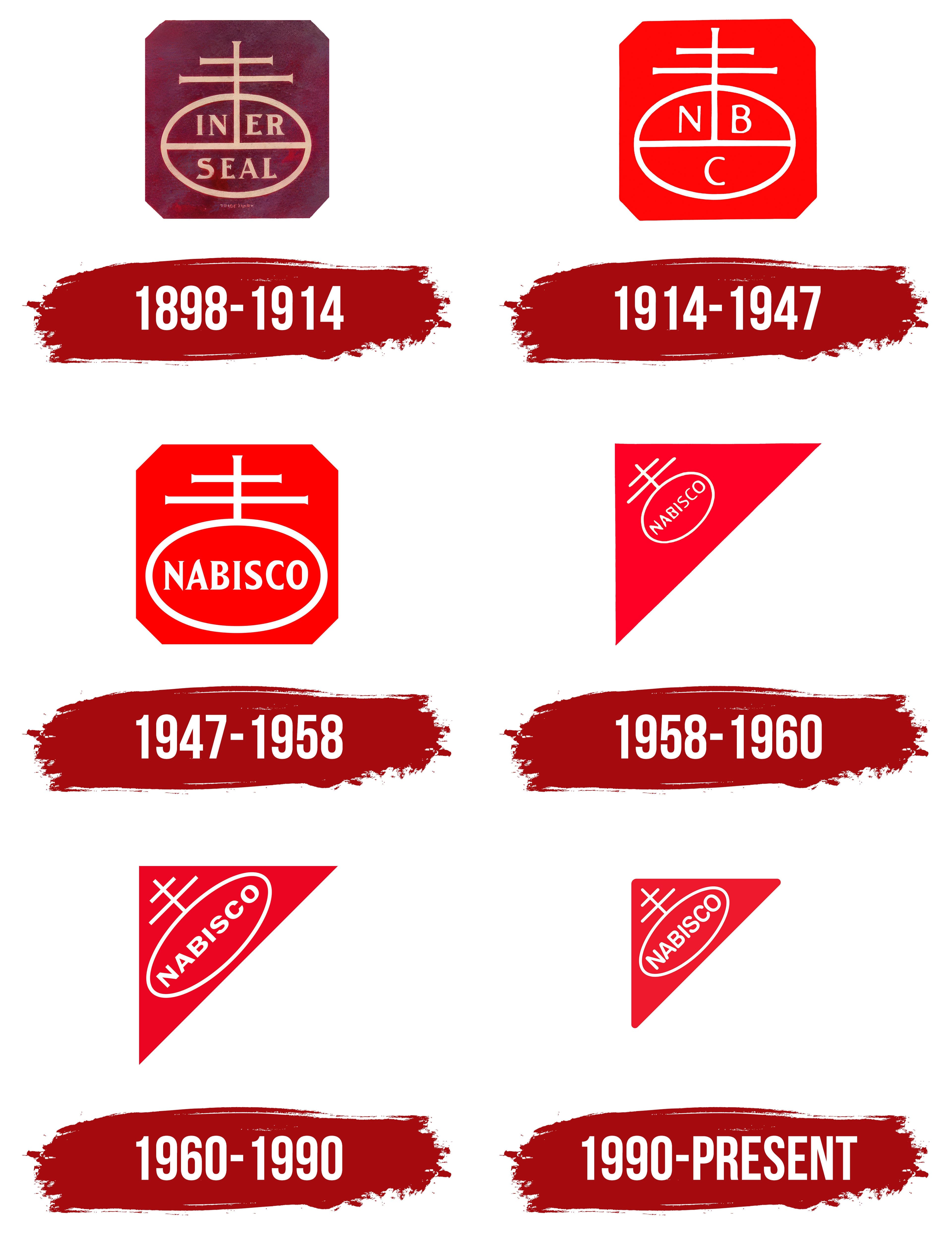
1898 – 1914
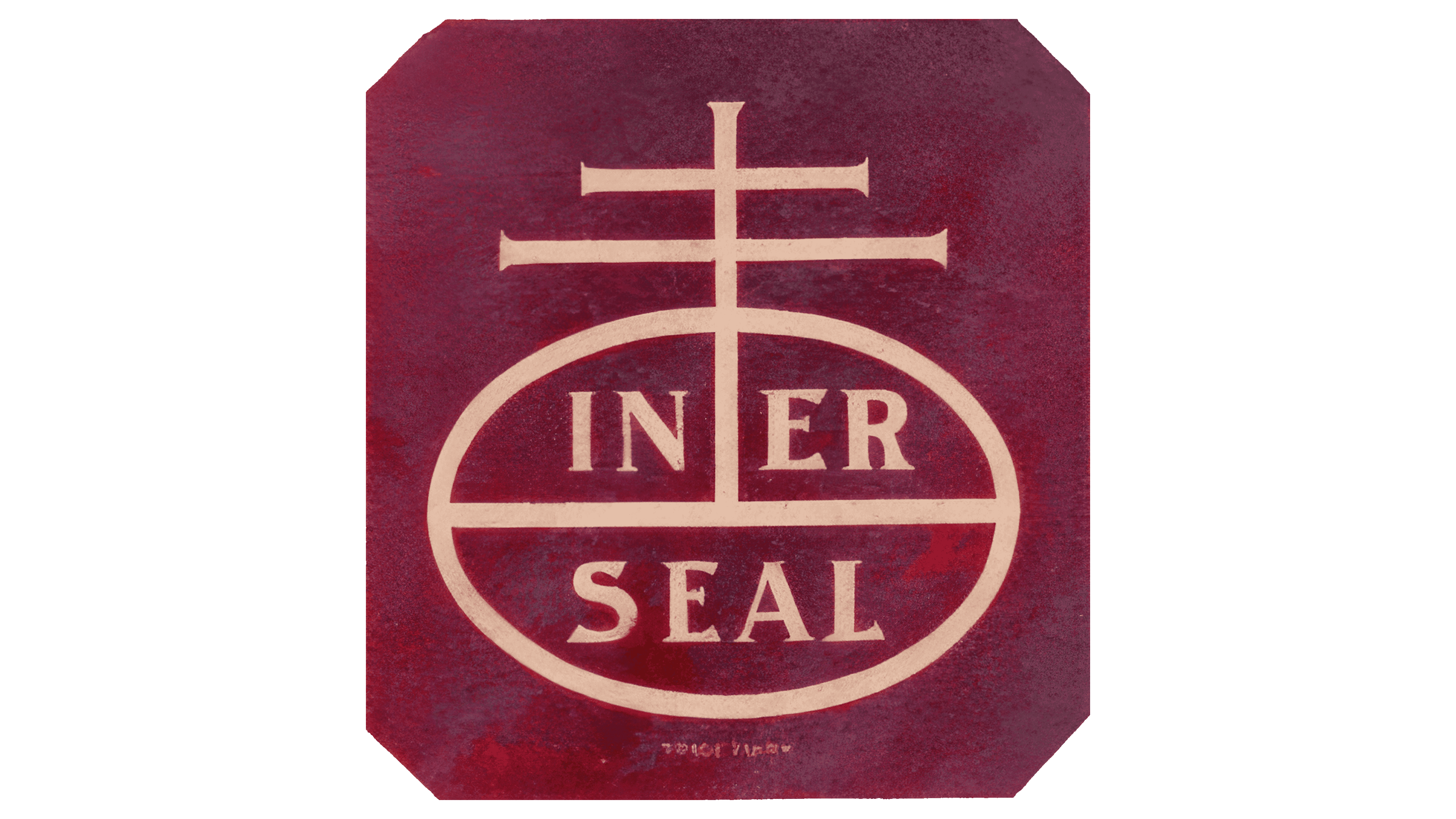
The visual identity of this beloved American brand is based on two foundations: confectionery and religion. Both are visible in the Nabisco logo. How are these two different directions connected? It turns out, morally and ethically.
The main element of the identity originates from a symbol that once represented the world’s redemption by Jesus Christ. These are crossed thin lines, resembling a double cross. They represent a Venetian printing symbol from the Medieval era, signifying the triumph of spiritual and moral values over material and evil. It is a so-called orb, a royal regalia in the form of a spherical object with a cross on top, symbolizing dominion. Later, under the influence of designers, it evolved into an everyday element.
The horizontal ellipse features several lines resembling an antenna. They rise upward and intersect at two points, forming an impressive symbol that, in its original form, appears on all branded products. A longitudinal stroke serves as the starting point for the vertical line, which divides the oval into equal halves with inscriptions placed on two levels:
- The top line reads “IN-ER.”
- The bottom row is labeled “SEAL.”
This was the former name of the Nabisco company. The octagonal shape of the emblem (a square with cut corners) was inherited from the trademark of its flagship product Uneeda biscuits. It serves as a reminder of the airtight packaging used for storing crackers. Both the inscriptions and the upward lines have short serifs. These appear as sharp, miniature extensions at the ends, adding a unique touch to the logo.
The text is in uppercase font. The glyphs feature lines of uneven width, narrowing in some places and widening in others. However, all the letters are bold overall. They are painted peach, standing out clearly against the dark maroon background. Both colors embody positivity, creating a favorable atmosphere and giving customers a sense of anticipation for wholesome snacks, perfect for a quick bite in any setting.
1914 – 1947
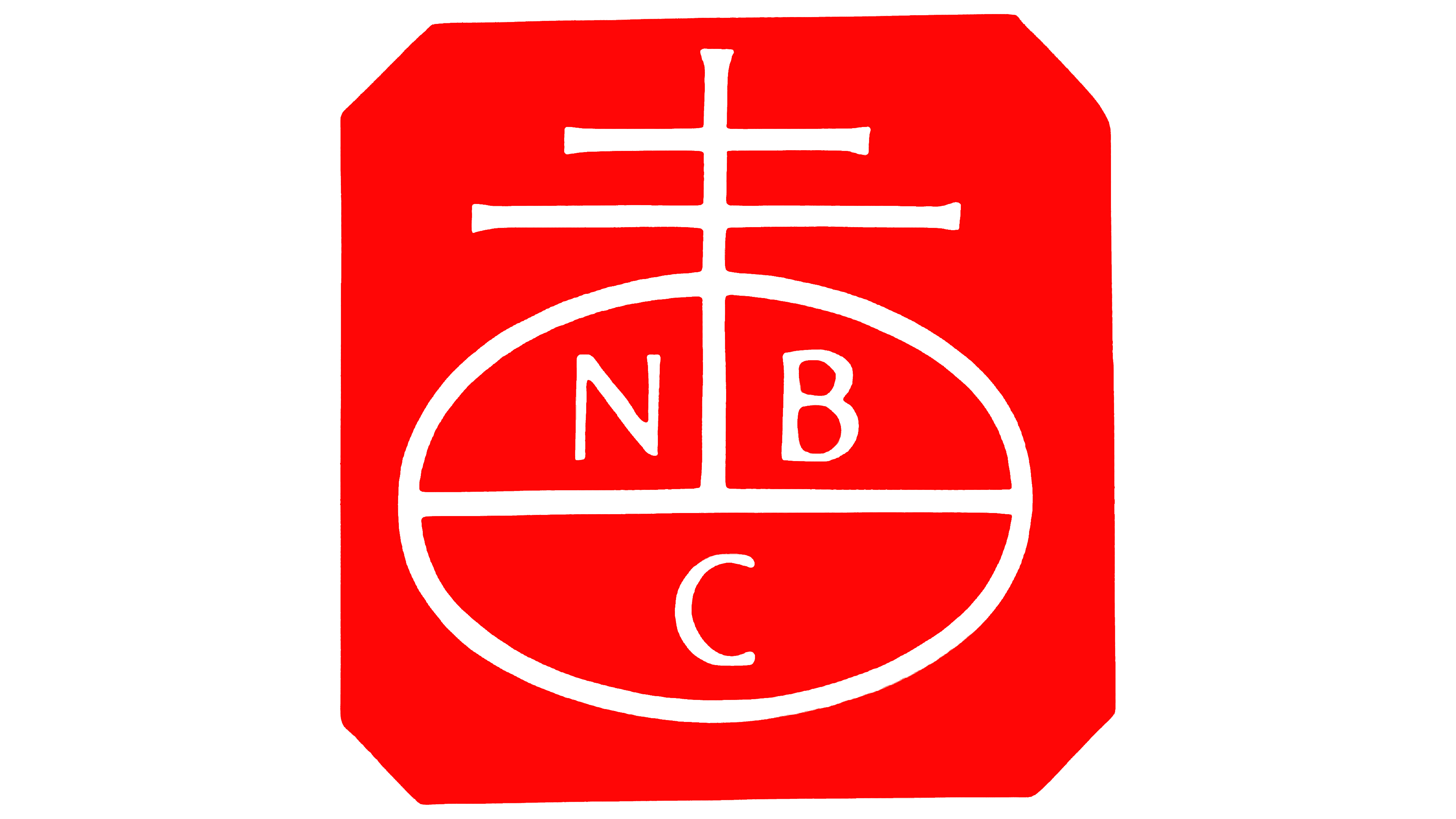
After receiving a new name, the cookie and snack company slightly redesigned its logo. The first step was to incorporate its name into the logo and make it fit perfectly within the limited space; they shortened it. Since then, the brand has been officially called Nabisco, a shortened form of “National Biscuit Company.”
Designers chose the most compact option to minimize the text: an abbreviation. As a result, the logo featured three separate letters: “N,” “B,” and “C.” Each letter occupied an individual space, making them completely independent of each other:
- The left section displays the “N.”
- Directly opposite, on the right, is the “B.”
- In the lower half of the oval is the “C.”
They possess not only a dividing factor but also a unifying one. All glyphs are painted white, positioned in uppercase, and enhanced with barely noticeable serifs that lend them a sense of formality. The letters are large and bold, commanding respect for the brand. They are crafted in a classic style, with a perfect balance of angles and curves, making them visible and leaving a trustworthy impression.
The other elements are also white: the oval, the internal horizontal line, and the cross with two upper bars. All lines share the same thickness to maintain a unified, calm, gentle, and balanced style. However, the logo does not hint at the sweetness or snack hidden behind the trademark. Instead, it is distinctive and deeply rooted in the company’s history.
The octagon is made of red (almost scarlet), which contrasts well with white. It fills the entire square space with clipped right angles, creating a vivid background for the other elements. In cookie and snack production, this shade reflects the brand’s confidence in its product and aspiration to be a leader in its field.
1947 – 1958
The confectionery company used the full name by abandoning the abbreviation in the logo, leading to another redesign. However, the intervention was minimal: it did not alter the emblem’s concept, structure, color, or even its elements. A strong connection to its origins restricted significant changes, resulting in a single innovation: the word “Nabisco.” This word is derived from the old name:
- Na – National;
- Bis – Biscuit;
- Co – Company.
The double cross still rises above all other elements, symbolizing a Venetian printer’s mark or a royal symbol. It conveys trust in the product, emphasizes its high quality, and hints at the manufacturer’s leadership. These three factors are combined in a concise emblem that leaves a positive impression. The visual identity contains no playful elements to show that the brand’s products are for children and adults.
To fit the new name entirely within the ellipse, designers removed the dividing line and placed the text directly in the center, equidistant from the edges. Additionally, they stretched the oval horizontally, slightly elongating it. The typographers left the font style untouched: the letters remain bold, uppercase, and even. They still have the miniature, sharpened serifs, which appear as extensions at the ends.
The neat and vivid Nabisco logo reflects the confectionery company’s professionalism, strict adherence to food standards, and desire to stay ahead of competitors. It showcases an identity that combines moral and ethical principles with high-tech production standards.
1958 – 1960
The era of a simple geometric shape began with a side isosceles triangle. It held a dominant position in the confectionery company’s visual identity for a long time and started to dictate its concept. More precisely, it adjusted the concept, guiding it in the right direction.
- First, the emblem gained compactness, which it previously lacked, making it suitable for placement on packaging of various shapes and sizes.
- Second, the snack producer standardized its products by placing its mark on all product categories.
- Third, this logo positioning had not been seen before, making it more original and easier to recognize.
This brought the brand widespread popularity, as the triangle, standing on its pointed corner, was easily associated with crackers, sandwiches, and cookies, especially since the company had long been producing shaped products, including triangular ones. The side positioning also removed the emblem’s emphasized religiosity; this undertone became secondary. As a result, the logo gained thematic relevance, aligning more closely with the confectionery industry.
Thus, a simple geometric shape changed everything. It acquired significant status, becoming a symbol of high-quality products. The ellipse and double cross also shifted their positions. They now occupy a diagonal position, pointing upward to the right, resembling a round satellite dish. In this way, the brand emphasized its readiness to capture consumer signals, indicating its intent to be even more attentive to their feedback. The intersecting lines lost their sharp terminations and became standard bold lines.
The text’s position also changed, now appearing diagonally. The upward line suggests company growth and an optimistic outlook. It hints at active development, leadership, success, and a positive future. The serifs on the letters remained, adding seriousness to the emblem and establishing it as Nabisco’s official trademark for a long time. The color combination also stayed the same: white on a bright red background.
1960 – 1990
In this case, the cookie and snack manufacturer decided to arrange elements more compactly on the triangular emblem because they didn’t scale well and became barely noticeable when reduced. This led to several significant changes.
- One of the changes involved the color palette. The bright scarlet was replaced with dark red, which added restraint and professionalism to the Nabisco logo. It emphasized the company’s seriousness, highlighted its priorities, and made the name stand out.
- The second modification concerned the font. Designers removed the extensions at the ends of the letters but kept the original stroke width. The strict glyphs became more rounded and flattened, making them easier to recognize.
- The third adjustment concerned the ellipse. The creators elongated it to ensure the name fit entirely while maintaining optimal readability. Now, the oval stretches from one narrow corner to the other.
The changes benefited the bakery business: it gained a modern trademark featuring balanced, harmonious elements. Even the religious and moral theme no longer stands out, as the intersecting lines without extensions at the ends no longer resemble a cross atop a dome; they look more like locators or antennas.
The font in the inscription became bold, with a barely noticeable taper at the bends. This gave the Nabisco emblem a specific touch without drastic intervention. Yet the changes were still noticeable because the size of the uppercase letters increased, drawing attention. Additionally, the intersecting lines are now elevated. They almost touch the only right angle in the triangle, on the left side.
1990 – today
After another update, the Nabisco logo appeared in a modern style. It was refined without drastic changes to the concept and structure. In other words, the symbol remained largely the same, with only minor changes that significantly downplayed the moral and ethical themes, bringing delicious snack food to the forefront.
The most crucial change involved the font, which became simpler, lighter, and softer. These three elements manifested in the rounded ends of the improvised antenna. The intersecting lines now resemble a double cross to the smallest degree, lacking any sharp protrusions or extensions.
The next significant change affected the lettering. Now, the font used has the same thickness as the upward-extending lines. Additionally, the letters have been softened, thanks largely to rounded ends on each glyph. There are no sharply cut strokes here. This was done to minimize negativity and to present the snack and cookie manufacturer as a customer-oriented company that cares about its consumers by offering safe, beneficial products.
Rounded edges even appeared on the red-colored background triangle. Speaking of which, the color palette was another aspect that was updated. In this version of the Nabisco logo, a softer, pastel shade of red is used, gentle, muted, and not too bright. It reflects attention to customers, product benefits, operational stability, and the joy of achievements. The brand has no doubts about its leadership; it presents it as a fact achieved through its efforts.
The pleasant red embodies everything the company prides itself on: high technology, warmth, enjoyment, and confidence. It forms a perfect tandem with white, the color of purity, sincerity, and openness. This refined combination symbolizes professionalism, passion, and impeccable product quality. Furthermore, the white lettering on the red background remains highly legible, even with minimal spacing between the letters.