The Frito-Lay logo immediately says, “This is insanely delicious!” That’s because the company it represents produces iconic, beloved chips worldwide. The emblem on the vibrant packaging entices fans of spicy snacks and stimulates the appetite, as it is designed in vivid colors.
Frito-Lay: Brand overview
Frito-Lay is an American subsidiary of PepsiCo Corporation. It specializes in various flavors of quick snacks, including potato and corn chips. Fritos, Cheetos, Doritos, Tostitos, Lay’s, Ruffles, Rold Gold, Walkers, and others are Frito-Lay trademarks. The company was founded in 1961 and has its headquarters in Plano, Texas.
The story of Frito-Lay begins with two entrepreneurs, Charles Elmer Doolin and Herman W. Lay, who started their own snack companies in Texas and Tennessee, respectively, in 1932. Doolin’s Frito Company brought corn chips into the market, while Lay’s Company introduced potato chips. Over the years, these businesses grew, giving America beloved snacks like Fritos, Cheetos, and Lay’s chips.
In 1961, these two snack giants merged to create Frito-Lay, Inc., marking a significant chapter in snack food history. This move combined their strengths and set the path for future growth, which included joining forces with Pepsi-Cola Company, now PepsiCo, making Frito-Lay a key player in the snack industry.
The 60s and 70s were big for Frito-Lay, with the launch of now-famous snacks like Doritos, Tostitos, and Ruffles. The brand kept growing, always paying attention to what people wanted. This led to healthier options like Baked Lay’s and WOW! Chips in response to changing tastes.
Today, Frito-Lay is a giant in the North American snack market, controlling nearly 60%. The brand has evolved, offering artisanal and natural options, gluten-free and organic choices, and striving to make snacks healthier. This evolution shows Frito-Lay’s commitment to innovation and meeting consumer needs.
Meaning and History
This company results from years of work by two specialized firms, which merged in 1961 and became Frito-Lay. Its founders are The Frito Company and HW Lay & Company. They chose the name for the joint structure following the principle of merging: both words are part of the old companies’ names.
The logo is no exception, representing a harmonious combination of the previous names in an abbreviated form. Designers combined the first letters to create an original and informative emblem that embodies the image of chips. That is, it’s not just text but an allegorical graphic.
What is Frito-Lay?
Frito-Lay is an American company that produces and sells snacks under several brands. It owns the trademarks of chips, tortillas, salty pretzels, Fritos, Cheetos, Doritos, Tostitos, Lay’s, Ruffles, Rold Gold, and Walkers others. It is part of the PepsiCo corporation and is located in Plano, Texas. The company was established in 1961.
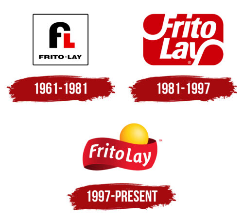
1961 – 1981
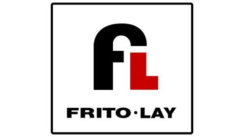
The Frito-Lay logo features “F” and “L.” They are uppercase, large, and bold. Their main function is to represent the company, as they are an abbreviation formed from its full name. The developers successfully combined the glyphs, imbuing them with the main concept of the food brand, which revolves around the production of chips.
If you look closely at the “F,” you can notice that the upper part conveys the shape of the company’s main product. Straight angles balance the smooth curve, soft line, and gentle rounding. One glyph is colored black, the other red. The phrase “Frito Lay” is placed underneath them with a small dot between them. The letters are lowercase and slightly flattened (wide). The background for all elements is a white square with a black frame.
1981 – 1997
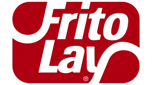
After a redesign carried out by Landor Associates, the logo acquired entirely different features:
- The inscription was given a two-level layout with center alignment;
- The letters were converted to lowercase, except for the first;
- A red rectangle with rounded corners replaced the white square;
- The abbreviation was completely removed.
The developers retained only the idea of conveying the shape of chips through the glyphs. This is visible in the curves of “F” and “Y,” one of which is directed upwards and the other downwards. To achieve this, a slight italic was added to the letters.
1997 – today
The emblem features three elements:
- A red ribbon;
- A white inscription;
- A yellow circle.
According to the designers’ idea, these represent chips, the name, and fire. The circle also symbolizes the sun, while the ribbon conveys dynamism. Together, they embody the passion, energy, and taste that Frito-Lay embodies in its products. The wide strip is positioned diagonally. It has visible and invisible parts, resembling an infinity symbol. The circle is located to the right, in its folds, and the name is placed horizontally in the middle.
Font and Colors
The Frito-Lay logo uses Futura Pro Extra Bold Condensed typeface and a custom font created for the company. With their help, designers could accurately convey the rounded shape of chips without compromising the readability of the text.
The color scheme of the emblem corresponds to bright impressions and unforgettable tastes. It includes red, yellow, white, and black (in earlier versions). These colors symbolize reliability, an emotional burst, dynamism, and passion.
FAQ
What is the meaning of Frito-Lay?
Frito-Lay is a big name in the American snack world, mainly making snacks from potatoes and corn. It started in 1961 when two companies, The Frito Company and H.W. Lay & Company, joined forces. This merger brought together their best products and skills, making a wider variety of snacks and growing their business.
In 1932, Charles Elmer Doolin founded The Frito Company in San Antonio, Texas, and started making Fritos corn chips. At the same time, Herman W. Lay started a business in Nashville, Tennessee, focusing on potato chips, which led to Lay’s becoming a top-selling potato chip brand in the U.S.
Frito-Lay is behind many well-known snacks like Fritos, Doritos, Ruffles, and Lay’s. It also owns Walkers, selling similar snacks in the UK and Ireland. Frito-Lay stands out in the snack industry for its long history of creating new and tasty snacks while keeping up the quality of its classic ones. It’s also adapted to people’s wants by making snacks that fit different diets, like lower-fat and gluten-free options.
Does Pepsi own Frito-Lay?
Yes, PepsiCo owns Frito-Lay. The partnership started in 1965 when PepsiCo, known for its drinks, decided to buy Frito-Lay to add food to its offerings. This was a big step for PepsiCo, helping it become a major snack and beverage player.
PepsiCo manages several well-known brands, including Frito-Lay snack favorites like Doritos, Quaker Oats, Lipton teas, and Gatorade. This mix of products lets PepsiCo meet different customer needs, from snacks to drinks.
Buying Frito-Lay was a key moment for PepsiCo, a global leader in the food and drink industry. Since then, PepsiCo has grown worldwide, thanks to its strong brands and ability to create new products people want. Frito-Lay plays a big role in PepsiCo’s success, with its popular snacks and strong brand contributing to its growth.
Is Doritos Frito-Lay?
Yes, Doritos are made by Frito-Lay, Inc., a major player in the snack industry. Frito-Lay makes many well-known snacks, including Fritos, Cheetos, Tostitos, Lay’s, Ruffles, Rold Gold pretzels, and Walker potato crisps, the last of which is sold in the UK and Ireland.
Doritos are famous for their strong flavors and unique triangular shape, making them a favorite tortilla chip worldwide. They’re often found at various social events because they come in many flavors that appeal to many people. Being part of Frito-Lay means Doritos are widely available, thanks to the company’s big distribution network. They also benefit from creative marketing and the ongoing development of new flavors. This connection to Frito-Lay helps ensure Doritos remain top quality and continue to be loved by snackers everywhere.
Is Frito-Lay an Israeli company?
Frito-Lay is not an Israeli company; it’s a part of PepsiCo, a big food and drink business from the United States. But in Israel, Frito-Lay works closely with the Strauss Group, a major Israeli food manufacturer, through a joint venture called Strauss Frito-Lay. This partnership lets Frito-Lay share its snack foods with the Israeli market, making products that suit local tastes with the help of Strauss Group’s knowledge of the area and distribution network. This team-up between Frito-Lay and the Strauss Group means that people in Israel can enjoy Frito-Lay’s well-liked snacks, made right there in their country.
What chips are made by Frito-Lay?
Frito-Lay North America makes a bunch of popular snack chips in the U.S. and Canada, including:
- Lay’s Potato Chips: These are classic chips loved for their crispy texture and many flavors.
- Ruffles Potato Chips: Known for their ridges, They have a great crunch and many flavor choices.
- Doritos Tortilla Chips: Famous for their bold taste and triangle shape, Doritos are perfect for dipping.
- Cheetos Cheese-Flavored Snacks: Cheetos are cheesy, crunchy snacks with different shapes and spice levels.
- Tostitos Tortilla Chips and Branded Dips: Great for parties, Tostitos come with various salsas and dips.
- Santitas Tortilla Chips: These chips have a classic taste that works well with any dip.
- SunChips Multigrain Chips: SunChips stand out for their multigrain texture and tasty flavors.
With such a wide selection, Frito-Lay has snacks to satisfy all kinds of cravings, making it a major name in the snack industry.
What are some fun facts about Frito-Lay?
Frito-Lay, a big snack name, started with two entrepreneurs, Herman W. Lay, and Elmer Doolin. They didn’t know each other but had similar dreams. Lay opened a potato chip business in Tennessee in 1932, and Doolin started a corn chip company in Texas in 1931. Their separate businesses were the beginning of what would become Frito-Lay. Both wanted to make snacks that people would enjoy.
Lay was ahead of his time in getting his chips to stores, using a method that ensured his chips were always fresh and built good relationships with stores. On the other hand, Doolin bought a corn chip recipe for $100 and even got the equipment to make them, leading to the creation of Fritos, which people still love.
In 1961, their companies joined Frito-Lay, Inc., a move that pooled their strengths in making, marketing, and selling snacks. This wasn’t just about mixing their products; it was a smart strategy to take over the snack market.
A few years later, in 1965, Frito-Lay joined Pepsi-Cola, creating PepsiCo. This wasn’t just about combining snacks and drinks; it offered a wide range of products to meet customers’ needs.
The story of Frito-Lay is about starting from scratch, innovating, and growing strategically. From its early days with Doolin and Lay to becoming a major part of PepsiCo’s worldwide business, Frito-Lay’s history shows how big ideas and hard work can lead to success in the snack world.
