


![]() Doritos Logo PNG
Doritos Logo PNG
The Doritos logo is like scalding chips, the bright taste of which is impossible to refuse. Sharpness, abundant seasonings, and the crunchy corn base, as indicated by the emblem, make the snack a favorite in the United States.
Doritos are corn tortilla chips with cheese, peppers, and other flavorings. Before they became a well-known brand, they originated at the Tex-Mex restaurant in Disneyland, where chefs cut up old tortillas and fried them into a mouthwatering new form. This snack proved very popular because it resembled a Mexican dish. Thus began the mass production of Doritos, first regionally (in 1964) and two years later nationally.
In 1964, inside Disneyland in Anaheim, California, the world got its first taste of what would become a legendary snack: Doritos. Arch West, a clever chef at Casa de Fritos, turned leftover tortillas into something special by cutting them into triangles, frying them, and seasoning them. This snack, similar to traditional Mexican totopos but with a twist, quickly caught the eyes of park visitors.
Seeing its potential, the folks at Frito-Lay brought Doritos to the wider public in 1966 with an irresistible cheese flavor, offering a fresh take on the snack world. “Doritos,” meaning “golden brown” in Spanish, perfectly described these crispy, flavorful chips.
In the 1970s, Doritos expanded its flavor lineup with hits like Taco and Nacho Cheese, along with bright packaging and catchy ads. In the following decades, Doritos kept the excitement alive with new flavors like Cool Ranch and Salsa Rio, appealing to young people with vibrant marketing.
In the 2000s, Doritos continued to innovate with products like Doritos Locos Tacos in collaboration with Taco Bell and limited-time flavors that kept fans intrigued. They also broke new ground in advertising with their “Crash the Super Bowl” contest, letting fans create their own Doritos commercials.
Now a global brand in over 55 countries, Doritos has maintained its popularity for over fifty years by always finding new ways to engage with fans and update its products. Yet as health awareness grows, there’s pressure on snacks like Doritos to become healthier options.
Meaning and History
![]()
The first brand of tortilla chips in US history was named after a word derived from the Spanish “doradito. This choice is made because the term’s translation is entirely consistent with Doritos’ appearance. “The little golden thing” is the most accurate description of a snack made of tortillas cut into triangles and refried.
Over the years, the company has had several rebrandings to stay afloat during declining sales. Thus, chips with new flavors and packets with upgraded logos that changed more than a dozen times came out.
What is the meaning of the Doritos Logo?
The main meaning of the Doritos logo is spicy corn tortillas. This is evidenced by the shape of the main element (triangular frame), its spikes, and its color. Yellow represents corn and orange pepper, which were the first ingredients of branded snacks. Together they form a fiery gradient. The triangle is associated with chips cut into miniature slices. Serrated edges hint at a spicy taste.
1964 – 1968
![]()
When the Doritos brand debuted regionally, the designers used its name for the logo. They made the lettering burgundy and placed each letter in a separate vertical rectangle. The colors alternated: every odd card was orange, and every even card was yellow. And both letters and rectangles “jumped.” The “r” and “t” were the highest, with the “i” occupying the lowest position. The raised and lowered elements also alternated, creating the illusion of movement.
1968 – 1973
![]()
The orange quadrangles became yellow and vice versa. The typeface did not change.
1973 – 1979
![]()
In 1973, chocolate began to be used for the lettering, and the hues of the rectangles were almost equalized, approaching the gold palette. The letters were lined up in a single row, although a slight asymmetry remained. Their bases were narrowed vertically, which was reflected accordingly in the typeface. Under the “s” appeared the small and barely noticeable word “BRAND.”
1979 – 1985
![]()
The designers increased the angle of the background rectangles so they no longer aligned with the letters. The letter spacing had to be reduced to fit the lettering on the base. The orange had a red tint, and all colors were dull.
1985 – 1994
![]()
The trademark name was enlarged and repainted in black with a thin white outline. The word “BRAND” disappeared. The dot above the “i” was replaced with a triangle that replicated the shape of the snacks. The base’s colors became very expressive: bright yellow instead of gold and deep red instead of faded orange-red. The number of quadrangles was reduced to five, each with a black accent line at the bottom.
1994 – 1999
![]()
In 1994, the designers added the word “BRAND” under the “s,” written in small print. The outlines around the letters became yellow. Behind the “D” and “o” appeared a triangle of the same color. It curved slightly, copying the shape of Doritos chips. Above it was a red triangular frame with jagged edges. From it, chaotic stripes stretched, underlining the product’s name.
1999 – 2000
![]()
After some rework, the logo was inside a big black rectangle with “bitten-off” edges. The lettering became white and slanted, with the serifs shortened. Instead of the word “BRAND,” the phrase “CORN CHIPS” attracted attention with its bright yellow color.
2000 – 2005
![]()
A black triangle replaced the uneven base. Dark blue, white, and black stripes framed it. Because of their different thicknesses, they reinforced the asymmetry created by the triangle’s slant.
2005 – 2013
![]()
In the mid-2000s, Doritos’s unusual logo was on the shelves in US stores. It contained the brand name, a streamlined sans-serif font, and a fiery line shaped like a cardiogram. The word was white and gray, with a red outline adorning the right side of each letter. All elements cast fuzzy, gradient-black shadows.
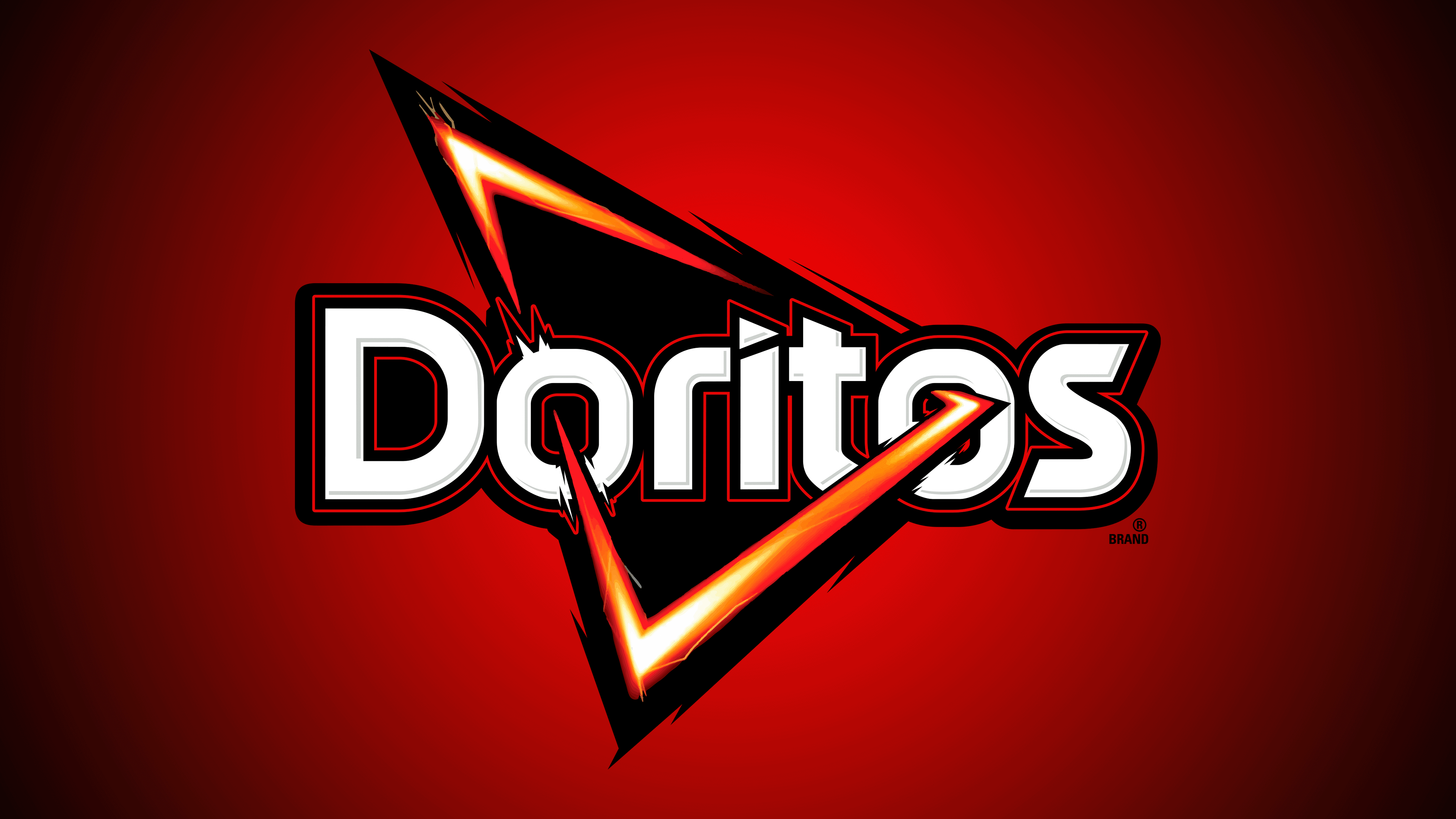
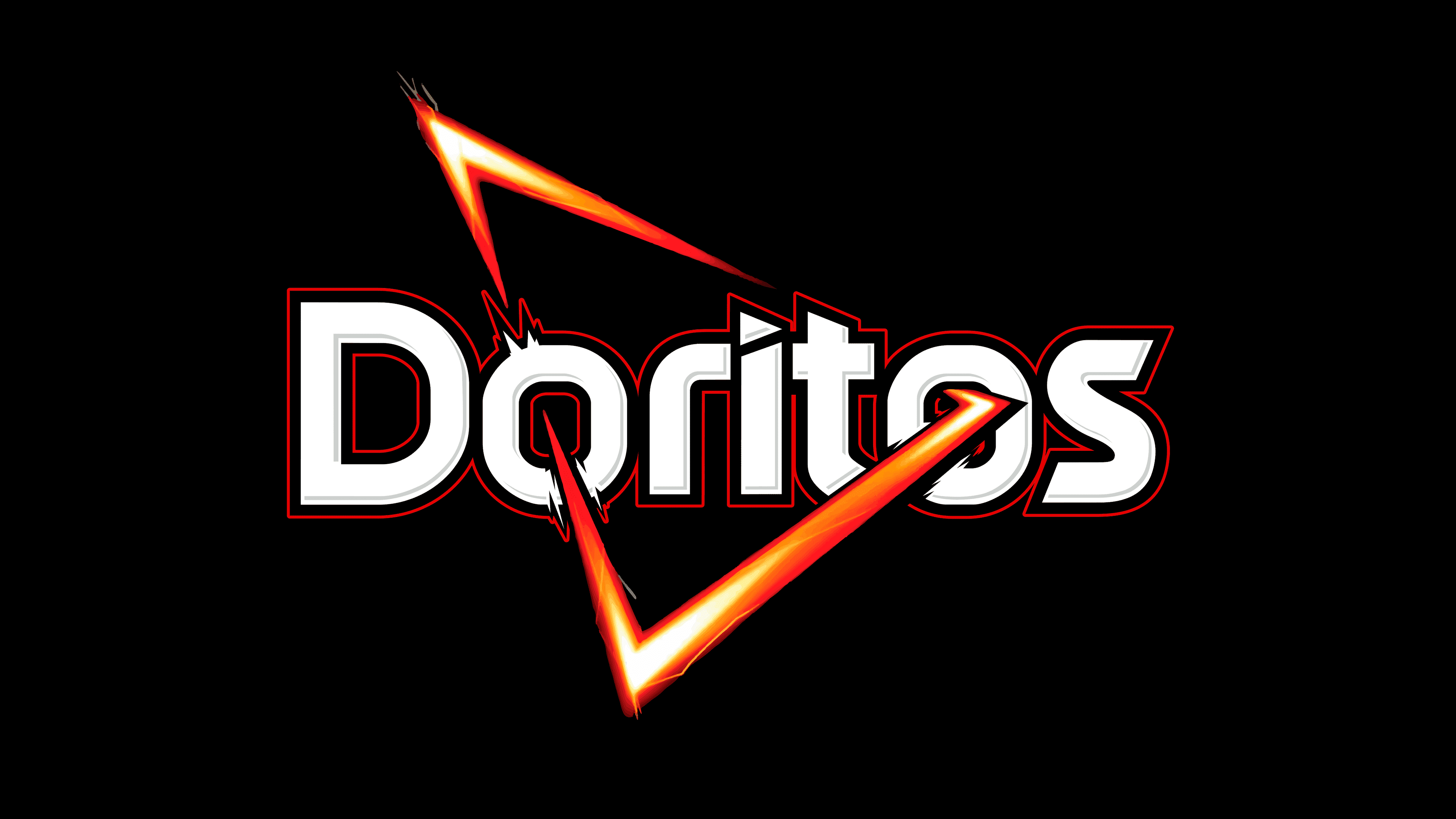
2013 – today
![]()
After another rebranding, the iconic triangle was back. Its red-orange frame now pierces the two letters “o,” making the image appear three-dimensional. The triangle’s interior is black, as is its jagged outline with needle-like protrusions. The letters are entirely white but have a dark red-and-black border. This is the basic version.
In 2019, marketers decided to appeal to Doritos’s special category of customers, Generation Z teens, who mostly despise brands. A logo without the chips’ names was designed especially for them. It contained the black inscription “LOGO GOES HERE,” divided into three lines and slanted to the left. It was across a red triangle with an empty middle. The brand owners expected customers to recognize the chips by the package color and the diagonal triangle on the packages.
Font and Colors
Experience has shown that consumers can identify the Doritos logo without a brand name. The traditional triangular shape is associated with snacks cut into small slices. And the edges of the base are jagged, hinting at the bright and unforgettable taste of tortilla chips.
At the beginning of Doritos’ history, different serif fonts were used. But more recently, the letters have a streamlined, sans-serif shape. The typography is based on individual glyphs. The strokes are bold and about the same thickness. A triangle replaces the dot over the “i,” and the top of the “t” is cut off to follow its shape.
The current logo features a combination of contrasting colors. A black outline and thin red lines complement the white lettering. The background triangle’s frame is painted in several shades of yellow and orange, forming a fiery gradient. The bright colors symbolize pepper and corn, the main ingredients of the first Doritos.
FAQ
Why is the Doritos logo a triangle?
The triangle shape of the Doritos logo wasn’t chosen by chance. It comes from how the original snack was made: cutting tortillas into triangular pieces, a simple way to turn a tortilla into a tasty snack. But the shape does more than make production easy. The triangle’s three corners and edges mean each chip has more area for seasoning, so every bite packs a flavorful punch. This wasn’t just about looking good; it was about making Doritos as delicious as possible. Choosing this shape shows the company’s focus on making the chips easy to make and enjoyable to eat.
What is the Doritos logo?
The Doritos logo stands out for its modern, artistic style. It has clean, white text in a unique font, all set inside a triangle. This triangle blends shades of orange, red, and yellow, suggesting the heat and bold taste Doritos is known for. A black outline and a centered design give the logo strong contrast, making it pop. Beyond looking good, the logo reflects Doritos’ promise to deliver intense, delicious snacking experiences. The design, resembling a flame, hints at the spicy and exciting flavors that define Doritos, inviting people to enjoy a snack that’s anything but ordinary.
What font is the Doritos logo?
The Doritos logo is set in a clean, straightforward sans-serif font. This type of font lacks the extra strokes at the ends of letters, giving it a modern and neat appearance. This font choice matches Doritos’s bold and lively style, making the logo easy to read and visually striking. The simple look of the sans serif font complements the Doritos logo’s modern, creative design, helping it catch the eye on packages and ads. Using a sans-serif font, Doritos is a modern, innovative brand that appeals to a broad audience through its clear, direct branding.
Which Doritos flavor was first?
Doritos started in 1966 as the first nationwide tortilla chip in the US, with a simple toasted corn flavor. This flavor was the brand’s first step into the snack world. The next year, in 1967, Doritos introduced a taco flavor, bringing a bit of Mexican taste. This showed the brand’s knack for creating new and interesting flavors.
The real game-changer came in 1972 with the launch of Nacho Cheese Doritos. This flavor perfectly combined cheese and spice, quickly becoming a fan favorite. It wasn’t just popular; it helped make Doritos a major snack name.
These first flavors, toasted corn, taco, and nacho cheese, helped Doritos grow from a new product to a household name. Each flavor was a step in Doritos’ story, showcasing their ability to blend simple ideas with bold flavors. Doritos has many flavors today, but it all began with that basic toasted corn chip in 1966.
What does the Doritos logo symbolize?
The Doritos logo isn’t just cool to look at; it’s full of meaning that shows what the brand and its chips are all about. The logo looks like a sharp-edged triangle, meant to remind you of Doritos chips. The yellow and orange colors in the logo represent the corn tortillas used to make the chips and the spicy seasoning that gives Doritos their unique taste. These colors aren’t just chosen for their aesthetic appeal; they’re meant to evoke the flavors of the chips.
The spikes on the sides of the logo symbolize the bold, spicy flavor Doritos are famous for. This design makes you think about what it’s like to eat the chips even before you open a bag. The name “Doritos” also adds to the logo’s meaning. It comes from the Spanish word “doradito,” which means “little golden things.” This refers to the chips’ golden color, suggesting they’re a tasty, crunchy treat. The use of golden yellow in the logo emphasizes this idea and the chips’ quality.
So, the Doritos logo is thought out. It uses shapes and colors to show off the chips’ main ingredients and flavors; even the name “Doritos” tells you what to expect. Everything about the logo is designed to represent the bold flavors and fun of eating Doritos.
What is Doritos changing its logo to?
Doritos isn’t planning to change its logo anytime soon. They’re sticking with the one they introduced back in 2013. Some rumors about a new logo have been online, but those aren’t true. These rumors started from a fake Instagram post by someone in the UK.
Logo changes are a big deal for brands. They usually mean the company is trying to update its look or shift its focus to a different customer base. But Doritos is happy with its current logo. The 2013 update was about keeping the brand fresh while staying true to what fans already like.
This situation shows how quickly false information can spread, especially on social media, where it’s hard to check if something’s true. Doritos says it’ll officially let everyone know if it decides to change its logo. So, until you hear it straight from Doritos, you can assume any rumors about logo changes aren’t true.
What is the Dorito slogan?
Doritos constantly updates its look and messages to keep things interesting. Its slogan is “Another Level,” which means its chips are super spicy and not for everyone. But if you love a snack with a big kick, these chips are right up your alley.
In 2013, Doritos introduced a new slogan, “For The Bold.” This slogan showed that the chips are for people who love adventure and aren’t scared to stand out. “For The Bold” fits Doritos perfectly because the brand is all about strong flavors and living boldly. This slogan tells customers that Doritos are more than just chips; they’re for experiencing bold tastes and living life with the same intensity.
“Another Level” and “For The Bold” are Doritos’ way of inviting you to try something different. They want their chips to be an experience, not just a snack, and these slogans speak to anyone who’s into bold, exciting flavors. Doritos uses these catchy phrases to keep its brand strong and interesting, especially for those always looking for something new in their snacks.
When was the Doritos logo created?
The first Doritos logo appeared in 1964, featuring the brand name with letters of varying heights, giving it a fun, lively look. This design aimed to make Doritos stand out to snack lovers. But the logo we know today, with its distinctive triangle, didn’t come about until 1994. This triangular shape, which looks a lot like a Doritos chip, was a big change that made the brand easily recognizable.
In 2013, Doritos updated its logo again. This version, which we still see today, modernized the look while keeping the iconic triangle. This update shows how Doritos has kept up with the times without losing what makes it unique.
From its simple start to the bold logo, the Doritos logo’s journey shows how the brand has evolved. Each update reflects new marketing ideas, design trends, and what people like, proving Doritos knows how to stay popular with chip fans everywhere.
Why did Doritos change its logo?
Over the years, Doritos has changed its logo to keep up with what people like, especially younger folks. In 2019, they made a big move by removing the Doritos name from their ads, leaving only the triangle shape everyone knows stands for their chips. This cool move was about getting young people interested and showing off how well-known Doritos is without even saying the name.
The biggest change came in 1994, when Doritos swapped its old logo, featuring vertical rectangles, for a new triangle. This wasn’t just about looking good; it was about making the logo look more like their chips and making Doritos stand out. The triangle matches the shape of the chips and showcases Doritos’ boldness and creativity.
These logo changes show how Doritos keeps trying to stay new and exciting. They’ve become a top choice for snacks by consistently finding new ways to connect with people. Doritos knows how important it is to keep changing its look to stay in tune with what people want, showing they’re all about creativity and reaching out to customers in fun ways.
When did Doritos change its logo?
The latest update to the Doritos logo was in 2013. They kept the famous spiked triangle, which everyone associates with Doritos, and placed it inside a red-orange frame around the ‘O’s in the name. The lettering stayed white but got a new black outline to pop more. This refresh was all about ensuring Doritos stayed modern and attractive while keeping the logo both familiar and bold. It shows how Doritos is dedicated to maintaining a strong, interesting image for all its fans.