All over the Earth, there are drinks produced by the company on every continent. The Pepsico logo confirms the presence of a large list of lemonades, juices, and mineral waters of all colors and flavors. The visual sign is a symbol of globality and recognition.
Pepsico: Brand overview
| Founded: | August 28, 1898 |
| Founder: | Caleb Bradham |
| Headquarters: | Harrison, New York, United States |
| Website: | pepsico.com |
Meaning and History
Since its inception in 1902, The Pepsi Cola Company has been busy promoting and advertising its beverage. It wasn’t until 1963, when D. Kendall took the helm, that the firm found a globalization strategy, expanded its product line, and began buying other companies. The Frito-Lay deal was the first major purchase and entailed a name change to PepsiCo (1965), a reference to Pepsi and Company. “The Company” was constantly expanding. Until 2015, more than ten manufacturers joined the conglomerate permanently, including 7-Up International, Quaker, Wimm-Bill-Dann, Sandora, etc.
Because of the constant expansion, PepsiCo’s logo has also gradually changed. And with each transformation, it moved further and further away from the theme of the popular beverage.
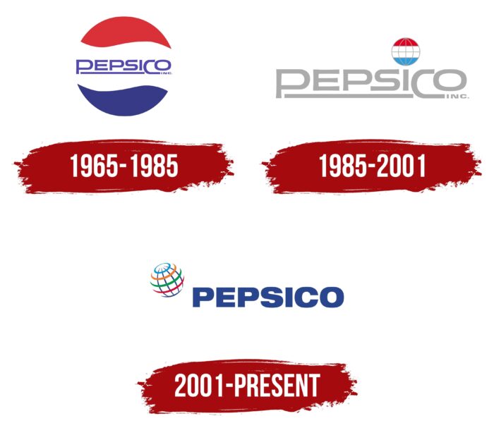
1965 – 1985
After the formation of PepsiCo, there was no need to change the symbolism. So the first logo of the corporation was a slightly modified trademark of Pepsi, which saw the light in the 50s, after World War II. Its idea was inspired by patriotism. The logo features the colors of the American flag flying in the wind (red, blue, and white).
The wavy lines of the circle were perfect for Pepsi drinks and Frito-Lay chips. The merged companies belonged to the U.S. market and maintained patriotic motifs.
The Pepsi sign was well recognized and promoted the new corporation. It was just slightly tweaked: the bottle cap was replaced with a laconic circle, and PepsiCo was inscribed on the white stripe instead of Pepsi.
The capital letters P and C were used for the company name, but they were raised down instead of up, unlike the spelling rules. The rest of the text between the capital letters was underlined. The strip connected Pepsi and Co into one, hinting at the firm’s birth by merger. The word Pepsi was underlined, indicating its fundamental role in the concern.
1985 – 2001
By 1985 the corporation found fame far beyond the USA borders (exported to the USSR, China, Japan, Europe, Middle East, and Latin America). Changes in the company’s management (W. Calloway took the helm) and a significant expansion of the market and the list of brands have caused the necessity to change the visual mark.
On the new logo, the name of the concern extended beyond the Pepsi cap and became a separate logo. The style of capitalization and underlining was maintained. But the color of the letters was changed to light gray.
A colored accent was made on the point above the letter i. It was enlarged and turned into a globe model with parallels and meridians. It was a distant reminder of Pepsi, as it retained its horizontal striping in red, white, and blue. The blue hue was made much lighter, bringing the balloon closer to the soft gamut of the inscription. The image of Earth indicated an intercontinental company.
2001 – today
In 2001, for the opportunity to represent the sports drink Gatorade, PepsiCo made another major acquisition. Chicago-based Quaker was bought for $14 billion. The old concern, named after Quaker, originated in the mid-19th century as an oatmeal producer. The merger made Pepsi the world’s 4th largest consumer products company.
After this significant expansion, the logo was redesigned. It was commissioned to Landor Associates, a major American consulting, design, and research firm. The main goal was to create a modern, environmentally friendly, and popular brand image. During the renovation process, PepsiCo’s main message and association with the globe was preserved.
The globe was made more volumetric and real, creating a sense of movement. It is placed on the left side in front of the corporation’s name and is slightly elevated. This indicates the constant growth of the company, its rise to the top, and its work in all corners of the world.
The coloring of the globe has also changed. Its parallels and meridians became multicolored. They are a symbol of the diversity of the brands the company owns. Blue represents clear water; green is health drinks, orange juices, and white is children’s dairy products. The parallels symbolize the five continents where the corporation’s products are sold and the firm’s global divisions.
The name of the brand is written in big steady blue letters. They show PepsiCo’s reliability, confidence in the future, scale, and great possibilities.
Font and Colors
Basic color combinations in the company logo:
- White, blue, and red are the colors of the flag. It is a symbol of patriotism, love for their country, and the fact that the main market is in the U.S. (more than 50%).
- Light gray reflects freedom, lightness, readiness for new contacts. It hints at success, achievement, ascent, and development beyond boundaries. It is the symbol of a developing company constantly expanding its sales market.
- Blue stands for experience, reliability, wise management, rising to the top, trading across oceans, the corporation’s core business (beverages). In addition, blue has become an important identification color of Pepsi and helps to separate the product from the “red” competitor, Coke.
font of the latest version of the logo is Neue Helvetica Pro 93 Extended Black.
Pepsico color codes
| Marian Blue | Hex color: | #28458e |
|---|---|---|
| RGB: | 40 69 142 | |
| CMYK: | 72 51 0 44 | |
| Pantone: | PMS 7687 C |
| Rich Electric Blue | Hex color: | #0096d6 |
|---|---|---|
| RGB: | 0 150 214 | |
| CMYK: | 100 30 0 16 | |
| Pantone: | PMS 801 C |
| Pumpkin | Hex color: | #eb7b30 |
|---|---|---|
| RGB: | 235 123 48 | |
| CMYK: | 0 48 80 8 | |
| Pantone: | PMS 1575 C |
| Spanish Green | Hex color: | #00984a |
|---|---|---|
| RGB: | 0 152 74 | |
| CMYK: | 100 0 51 40 | |
| Pantone: | PMS 354 C |
| Medium Candy Apple Red | Hex color: | #df002c |
|---|---|---|
| RGB: | 223 0 44 | |
| CMYK: | 0 100 80 13 | |
| Pantone: | PMS 185 C |
