The logo of Ferrero Rocher is closely associated with the brand’s reputation for creating luxurious and finely crafted chocolates. Introduced by the Italian chocolatier Ferrero, the brand is known for its gold-wrapped chocolates that symbolize elegance and indulgence. The logo reflects Ferrero Rocher’s commitment to quality and excellence, symbolizing the sophisticated pleasure derived from each piece of chocolate. It highlights the company’s meticulous attention to detail and role in celebrating special moments, making Ferrero Rocher a popular choice for gifts and celebrations. The emblem represents the blend of creativity and culinary expertise that Ferrero Rocher applies to its confections, establishing it as a symbol of gourmet chocolate treats worldwide.
Ferrero Rocher: Brand overview
In the late 1970s, the Ferrero company, known for favorites like Nutella and Tic Tac, introduced Ferrero Rocher. This premium chocolate quickly became a symbol of luxury with its unique combination of a whole hazelnut inside a wafer shell, surrounded by hazelnut cream and milk chocolate. Its gold foil wrapping and clear box packaging added to its elegance, making it stand out.
Named after a French truffle for its luxurious vibe, Ferrero Rocher was marketed as a sophisticated snack right from the start. It gained fame in Italy and then all over Europe, thanks partly to ads that showcased it as the choice for upscale events. The famous British ad phrase, “Ambassador, with these Rocher, you are spoiling us,” helped cement its posh image.
By the 1980s and 1990s, Ferrero Rocher had become the go-to for special moments, gifts, and holidays. This success led to new varieties, including Ferrero Rondnoir with dark chocolate and Ferrero Garden, a mix of Rocher and other chocolates.
Ferrero has also been working on being more sustainable and ethical, aiming for all their cocoa to be sustainably sourced by 2025. These efforts show their commitment to quality and responsibility, from supporting cocoa farmers to reducing environmental impacts.
More than forty years after its launch, Ferrero Rocher is loved worldwide and available in over 140 countries. Its dedication to quality, innovation, and luxurious branding has kept it in the hearts of chocolate lovers everywhere.
Meaning and History
What is Ferrero Rocher?
Ferrero Rocher, owned by the Ferrero company, is a well-known Italian chocolate brand that was launched in 1982. Known for its unique taste and texture, each piece consists of a whole roasted hazelnut encased in smooth chocolate cream, surrounded by a crispy wafer, and coated in milk chocolate with crushed hazelnuts. Marketed as a luxury item, Ferrero Rocher is often associated with celebrations and special occasions. Available in over 140 countries, it is one of the most recognized and beloved chocolate brands worldwide.
1979 – 1982
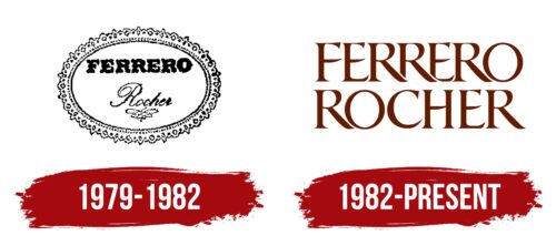
From 1979 to 1982, Ferrero Rocher introduced its first logo, which immediately conveyed the candy’s special taste and elegance. The logo reflected the brand’s commitment to sophistication and quality. It featured an oval shape surrounded by lace-like patterns, providing elegance and a sense of delicacy without being overly complex.
The design mirrored the look of a Ferrero Rocher candy sliced in half, showing remarkable attention to detail. The border resembled the candy’s nutty shell and an image of the creamy center, making it unique and memorable. This emphasized the natural ingredients and the care taken in making the candy.
The logo included a design resembling a crocheted doily, evoking the nostalgia of home tea parties with white lace tablecloths, sweet-filled vases, and the joy of family gatherings. The brand name ‘Ferrero’ was styled in a special font that hinted at the nut pieces, adding texture and depth to the text. Below this, the word ‘Rocher’ was written in soft lowercase letters, underscored by a stroke that resembled a signature, enhancing the luxury and exclusivity of the candies.
1982 – today
In 1982, Ferrero Rocher completely revamped its visual identity to focus on its main ingredient, chocolate. The new logo was designed to reflect its products’ essence, quality, and taste and became a central element of the brand’s new visual strategy.
The logo incorporates elongated, thin symbols with small serifs that overlap, illustrating Ferrero Rocher candy’s complexity and layered nature. This design represents how the different ingredients combine to create its distinctive taste. The letter’ O’ in the logo is especially emphasized to look like the round hazelnut at the center of each candy, highlighting the brand’s commitment to quality and its tradition of incorporating essential ingredients directly into its identity.
The emblem, designed to resemble milk chocolate, reinforces Ferrero Rocher’s reputation for fine chocolate products. Its appearance evokes the rich taste of milk chocolate, which is vital to the candy’s flavor. A thin white outline around the logo adds a touch of elegance and lightness, resembling the candy’s packaging. This detail underscores the brand’s focus on packaging design, which protects the candies and enhances their presentation, making them attractive and complete.
Font and Colors
The Ferrero Rocher logo uses a serif font reminiscent of typefaces like Shango Bold or Anavio Small Capitals Bold, with customized lines for a distinctive touch. Serifs with subtle flares at the stroke end lend the logo an air of elegance and tradition, aligning with the brand’s image of offering luxurious, premium chocolate products.
The overlapping “R” at the top of the logo creates a mirror effect, enhancing brand recognition and a sense of luxury. Spacing between the letters in “ROCHER” at the bottom allows each character to stand out, adding to the logo’s refined appearance.
The rich brown color of the text evokes the chocolate confections, reinforcing sensory associations with the brand. Brown is linked to reliability, warmth, and comfort, resonating with the indulgent nature of the product.
The clear, well-spaced serif letters make the logo easily legible from a distance or when scaled down, which is crucial for packaging and advertising. The font style and color palette work together to ensure the brand is immediately recognizable and memorable for its high-class, indulgent offerings.
FAQ
Why is there an N on Ferrero Rocher?
The small letter on the bottom of a Ferrero Rocher chocolate wrapper is a code that shows which factory made that chocolate. Ferrero Rocher assigns a different letter to each of its factories. This helps the company keep track of where each chocolate comes from. It’s important to ensure all chocolates meet Ferrero’s high quality and safety standards, no matter where they’re made. This coding helps Ferrero quickly find and fix any problems. It shows that Ferrero is serious about making quality chocolates and being open about how they’re made, giving customers confidence in their products.
What does Ferrero Rocher stand for?
Ferrero Rocher is a famous chocolate brand that mixes the Ferrero family name with the French word for rock, “rocher,” to show off its quality and luxurious image. The Ferrero company is known for making popular treats like Nutella and Tic Tac, and it brings that same commitment to excellence to Ferrero Rocher. The chocolate itself is designed to look and feel like a rock, with layers of milk chocolate, hazelnuts, a wafer shell, hazelnut cream, and a whole hazelnut inside. This makes eating Ferrero Rocher a unique experience, especially blending taste and texture.
The name “Rocher” matched the chocolate’s rich and natural feel, and the gold wrapping and special packaging added to its fancy look. Ferrero Rocher isn’t just any chocolate; it’s made for important moments, gifts, and celebrations. It aims to be sophisticated and indulgent.
By mixing the Ferrero family’s legacy with a word that suggests luxury, Ferrero Rocher shows its dedication to making high-quality, luxurious chocolates. It blends tradition and new ideas, offering a chocolate experience beyond the ordinary. Ferrero Rocher has kept its reputation as a top-tier chocolate brand by focusing on elegance, taste, and quality in every piece it makes.
Is Ferrero Rocher Italian or German?
Ferrero Rocher is an Italian chocolate brand, part of the Ferrero Group, that started in 1982 in Alba, a small town in Italy’s Piedmont region. The goal was to make fancy, top-notch chocolate more available to everyone. Its Italian roots show in the care that goes into making it, the high quality, and the top ingredients used, all reflecting Italy’s famous food culture.
The Piedmont area is especially known for its excellent hazelnuts, a main component of Ferrero Rocher chocolates. These hazelnuts and the area’s rich farming background give Ferrero Rocher its special taste and feel, setting it apart as truly Italian. The Ferrero Group’s focus on being the best and always coming up with new ideas while staying true to its Italian background has made Ferrero Rocher a worldwide symbol of fancy chocolate. The brand’s identity is closely linked to its Italian beginnings, from the concept to the recipe’s ingredients.
Why is Ferrero Rocher named that?
Ferrero Rocher is named after its creator, Michele Ferrero, and a special religious place, the Rocher de Massabielle. This is a rocky cave in the Lourdes shrine, known for its religious significance. The word “rocher” means rock in French, matching the cave’s rocky look. This name connects the chocolate to spiritual meaning and natural beauty, giving it a special feel.
Michele Ferrero didn’t just use his last name for the chocolate; he also honored a sacred site many people respected for its miracles and religious value. By choosing this name, he gave Ferrero Rocher a deeper story, making it more than a sweet treat. This choice shows the brand’s aim to provide an extraordinary experience with every bite, blending nature’s toughness with spiritual depth.
What makes Ferrero Rocher unique?
Ferrero Rocher is known for its quality and luxury, and several things make it stand out. First, its special recipe perfectly mixes flavors and textures: inside each chocolate is a whole hazelnut surrounded by creamy hazelnut filling, wrapped in a crispy wafer, coated in milk chocolate, and finally rolled in chopped hazelnuts. This mix gives you both crunchy and creamy in every bite, making it unforgettable.
What also makes Ferrero Rocher unique is how it’s packaged. Each chocolate is wrapped in gold foil, making it look sophisticated and easily recognizable. This gold look makes it pretty and adds a sense of luxury.
The transparent box then shows off the gold-wrapped chocolates, making it a great choice for gifts and celebrations. Seeing the chocolates through the box makes you excited to try them.
Since its introduction, Ferrero Rocher has been celebrated for its great taste and experience. Its recipe, gold wrapping, and clear packaging show Ferrero’s dedication to making top-quality chocolates. These elements make Ferrero Rocher more than just chocolate; they make it a special indulgence and a sign of elegance.
What is a fun fact about Ferrero Rocher?
Ferrero Rocher had a rough beginning when it first came out. It hit the Italian market in 1979 and spread to other parts of Europe by 1982. But not long after it launched, a problem with the labels stopped production for a while. This shows that even the best products can run into unexpected problems early on.
There’s also a cool story behind the Ferrero Rocher name. It comes from the Rocher de Massabielle, a cave in the Lourdes shrine that is important to many for its spiritual meaning. Michele Ferrero, who created this chocolate, picked the name because it meant something special to him and to add depth and heritage to the brand. Naming the chocolate after a place known for miracles and faith adds an interesting twist to its story, making it more than just a treat. This mix of overcoming early hurdles and having a meaningful name gives Ferrero Rocher a unique and interesting background.
What is the motto of Ferrero Rocher?
The motto “Work, Create, Donate” has been Ferrero Rocher’s guiding principle since the beginning, introduced by its founder, Michele Ferrero. It reflects his vision for both business and life, shaping the company’s identity and success. “Work” shows Ferrero’s commitment to hard work and quality, aiming to make the best products and maintain the brand’s reputation. “Create” is all about innovation and coming up with new ideas and flavors, which has led to famous products like Ferrero Rocher. “Donate” focuses on the company’s social responsibility, including charity work, environmental efforts, and caring for employees and local communities.
These three ideas—working hard, being creative, and giving back—guide everything Ferrero does. The motto represents the company’s core values and mission to achieve greatness, inspire creativity, and positively impact the world. This motto also honors Michele Ferrero’s legacy, reminding us of the values at the heart of Ferrero’s business and its relationship with people everywhere.
