The Nutella logo captures the brand’s rich history as a beloved hazelnut spread that began in post-World War II Italy. Nutella was originally developed as an affordable luxury when chocolate was scarce. The logo reflects the company’s role as a source of joy and comfort in homes around the globe. It symbolizes tradition and the joy of sharing, fitting the brand’s image as a staple for family breakfasts and snacks.
Nutella: Brand overview
There was a significant cocoa shortage during the challenging 1940s, specifically in World War II Italy. Pietro Ferrero, a creative pastry maker from Alba, Piedmont, faced this problem head-on. In the 1940s, he introduced Pasta Gianduja, an inventive creation that combined a small amount of cocoa with plenty of locally sourced hazelnuts, offering a delicious solution to cocoa scarcity.
By 1951, this innovative product evolved into Supercrema, thanks to Pietro’s dedication to refining his recipe. Supercrema, a sweeter and creamier version than its predecessor, was designed to be cut and spread on bread, making it a hit among Italian families.
The story took a remarkable turn in 1964 when Michele Ferrero, Pietro’s son, further perfected the recipe. This led to the birth of the brand we know and love today. With its packaging in glass jars, Nutella quickly became a favorite in Italy and far beyond its borders.
The following decades, specifically the 1970s and 1980s, marked a period of rapid international expansion for the company. Ferrero opened production facilities in Europe and other parts of the world, introducing the brand to a global audience. The marketing campaigns of this era highlighted Nutella’s delicious taste and versatility as a breakfast spread and a key ingredient for desserts.
As the 21st century rolled in, Nutella’s popularity continued to soar. In 2007, fans of the spread even initiated World Nutella Day, celebrating the love for the brand annually. Despite facing competition and navigating through concerns over health impacts due to its sugar and fat content, Nutella’s place in the hearts of many remained secure.
Responding to the changing times, especially from the 2010s onwards, Ferrero took significant steps toward sustainability. The company focused on responsible sourcing for key ingredients like palm oil and hazelnuts. In 2017, the “Nutella Unica” campaign showcased Ferrero’s commitment to biodiversity with millions of uniquely designed Nutella jars. New flavors and packaging sizes have been introduced recently, catering to diverse tastes and preferences.
It is one of the world’s most beloved spreads, produced annually in millions of jars across over 50 countries. Nutella’s unique taste and Ferrero’s sustainability efforts ensure its continued success and beloved status worldwide.
Meaning and History
What is Nutella?
It is a globally recognized brand of chocolate hazelnut spread made by the Italian company Ferrero. It is widely popular for its unique flavor that blends chocolate with hazelnuts. Nutella is commonly used as a spread on bread, baking, and desserts. Its smooth, creamy texture and rich taste make it a favorite choice among consumers.
1951 – 1964
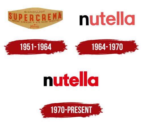
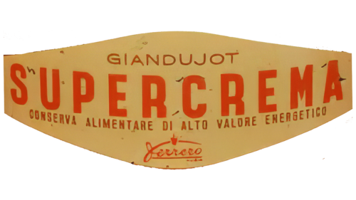
From 1951 to 1964, during a post-war period marked by scarce and expensive cocoa, Ferrero launched Supercrema, an innovative product made with less cocoa to keep it affordable. The Supercrema logo was designed to be attractive and informative, showcasing the product’s features.
The logo’s stylized diamond shape with soft edges was appealing and easy to remember. Its yellowish hue, suggestive of peanut butter and hazelnuts, emphasized the natural ingredients and conveyed a sense of warmth and comfort, resonating with consumers then.
The logo’s red letters symbolize strength and energy, reflecting the high energy value of the product. Claims of naturalness and high nutritional value on the packaging also influenced consumer choice.
Ferrero’s company emblem, placed in small letters at the bottom of the logo, represented quality and trust, assuring customers of the high standards of a well-respected manufacturer. This strategic placement targeted customers prioritizing knowledge about ingredients and the producer before purchasing.
1964 – 1970
In 1964, the company entered the international market with its new name, chosen for its friendly, soft sound, which suggests a diminutive term for “nut.” The name is easy to remember and brings to mind warmth, emphasizing the key ingredient. The Nutella logo stands out due to its design. The first letter in rich black contrasts with the other letters in bright red. This design draws the eye and represents deep flavor and quality. The black suggests a rich taste, while the red conveys passion, energy, and warmth. Nutella has become known as a delicious treat that brings energy to people of all ages.
1970 – today
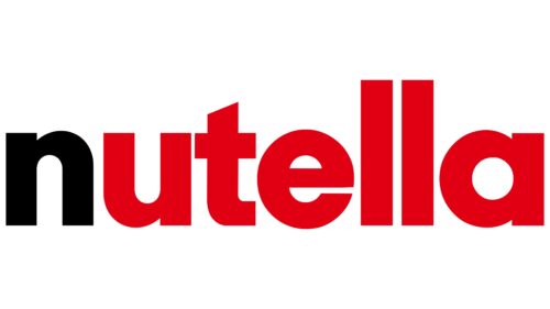
In the 1970s, as Nutella grew in popularity, its logo was redesigned to reflect its evolving status and widening global influence. The logo’s colors became brighter and the letters thicker, visually representing the spread’s increasing popularity and the brand’s growing recognition worldwide.
Font and Colors
The Nutella logo stands out with its bold sans-serif typeface, which is bold, playful, and smooth. This font, similar to Neue Singular H Black, is uniquely altered to add a dynamic feel to the design. A distinctive feature is the vertical stroke of the letter “T,” diagonally sliced, giving the logo a sense of motion and energy. Design emblem, including the scaled-down ‘t’ and the larger ‘ll,’ injects originality and movement, differentiating it from conventional logos.
The logo’s color scheme contrasts starkly between black and red, which commands attention. The black is used for the initial letter’ n,’ which may be designed to draw focus to the start of the brand name, symbolizing the beginning of the Nutella experience. Red is a color associated with energy, passion, and appetite and is commonly used in the food industry to attract consumers. The red corresponds with the brand’s identity, which is lively, joyful, and associated with the pleasure of enjoying Nutella.
The distinctive typography and bold colors—convey Nutella’s identity as dynamic, modern, and approachable. They communicate quality and deliciousness, reinforcing Nutella’s position as a favorite in many households worldwide.
FAQ
Why is the N black in the Nutella logo?
The black “N” in the logo is a smart branding choice. When Nutella first hit the market, Ferrero, the company behind this favorite spread, had to deal with trademark issues. Trademarks are super important for brands. They help differentiate products from competitors and protect the brand name.
For a brand, creating a trademark meant making a logo easy to remember and unique enough for legal protection. It’s tough to trademark common words or names that just describe what the product is, especially for food items that often have descriptive names.
To solve this, Ferrero made the logo with the first letter “N” in black and the rest of the letters in red. This was done for appearance and to make the logo unique and protected by trademark laws. The black “N” quickly became a key part of the brand, making it easy for shoppers to spot Nutella, among many other products. This move teaches a big lesson to anyone starting a business about the power of branding and the need for a smart trademark strategy. Choosing a special color scheme for the logo was Ferrero’s way of ensuring Nutella stood out and was protected, helping it become the well-known and loved brand it is today.
What does the Nutella logo mean?
The logo is a smart mix of words and design, showing why people love this brand. The name “Nutella” combines “nut” from its main ingredient, hazelnuts, with “Ella,” a suffix that means something good or sweet in many languages. This name does a great job of highlighting what’s in Nutella and making it appealing.
The logo itself is pretty unique, with the first “N” in black and the rest of the letters in red. Ferrero, the company that makes Nutella, had to do this because of a trademark issue. There was already another brand called “Nutella.” Ferrero made the “N” black to deal with this and ensure Nutella stood out. This was done to resolve a legal issue and to make the logo eye-catching, helping Nutella stand out among the many other products in stores. This mix of black “N” and red letters is designed to grab your attention and make Nutella’s brand easy to spot. This helps make Nutella unique in a world of different spreads and sweets.
What font is the Nutella logo?
The logo uses the ITC Avant Garde font, a purposeful choice to match the brand’s modern and innovative image. The font fits Nutella’s vision with its modern, clean look and geometric shapes. It started in the 1970s, inspired by the Avant Garde magazine, known for its futuristic and stylish designs.
Using ITC Avant Garde makes the logo stand out. Its clean lines and modern look make the logo easy to spot and attractive, helping it catch your eye among many other products on store shelves. This match between the font and what Nutella stands for helps make the brand more appealing to people everywhere. Picking this font shows Nutella’s focus on high quality and style.
What are the colors of the Nutella logo?
The logo stands out with its unique colors: dark red, brown, black, and a white background. Each color plays a big part in making the logo memorable and meaningful. Dark red colors are used for most of the letters, giving off a vibe of warmth and joy, which matches Nutella’s goal of spreading happiness. This color represents energy and love, fitting what Nutella wants to bring to its customers.
Brown symbolizes the hazelnut chocolate spread, directly linking the logo’s color to Nutella’s main ingredient. It suggests natural quality and a comforting taste, making you think of the delicious spread made from cocoa and hazelnuts. The logo’s first letter, “N,” is in black, a choice made to make it stand out. Black adds sophistication and makes the logo easy to read, helping it grab attention on store shelves.
The white background makes these colors stand out even more, making the logo bright and welcoming. This mix of colors works well together, creating a look that’s easy to spot and hard to forget.

