![]() Foster Farms Logo PNG
Foster Farms Logo PNG
The Foster Farms logo symbolizes the company’s reliability and quality, and the company specializes in poultry food products. Its simple, recognizable design emphasizes everyday accessibility and the brand’s established reputation.
Foster Farms began in 1939 when Max and Verda Foster started a small turkey farm in California. The couple personally cared for the birds and gradually expanded the business. By the late 1940s, they added chickens and dairy cattle. Acquiring a feed mill in 1950 allowed them to control feed quality.
In 1959, the company opened a processing and packaging plant in Livingston. After Max Foster’s death, his son Paul took over, strengthening the company’s position in California and expanding into neighboring states. By 1987, Foster Farms became California’s largest poultry producer.
In the 1990s, Foster Farms significantly expanded production, acquiring new facilities and offering processed meats and ready-to-cook products. In 2013, Foster Farms earned certification from the American Humane Association, confirming humane poultry practices.
The 83-year family ownership ended in 2022 when Atlas Holdings acquired Foster Farms. Despite new ownership, Foster Farms remains a leading fresh poultry producer on the U.S. West Coast.
Meaning and History
![]()
What is Foster Farms?
It is a major American poultry producer with products distributed on the U.S. West Coast from California to Alaska. The company raises poultry independently, controlling the production steps and avoiding deep freezing. The range includes fresh meat, semi-finished products, and ready-to-eat meals. The brand gained popularity through humorous ads featuring puppet chickens hoping to join the production.
1974 – 1985
![]()
In 1974, Foster Farms introduced a new logo as part of its visual identity; this is now considered the earliest preserved version. The company, founded in 1939, had by then established a recognizable name in the agribusiness sector, and updating its logo was a step toward creating a more distinctive market identity. The logo combined a simplified rooster illustration with the name, creating a cohesive visual impression.
The rooster was depicted in a flat style, featuring large areas of color and minimal detailing. A red accent highlighted the tail and comb, while white defined the body and neck silhouette. A dark burgundy (almost brown) background, in the shape of a rounded rectangle, enclosed the composition. Smooth lines and generalized forms gave the symbol decorative expressiveness.
To the right of the symbol was the company name “Foster Farms,” rendered in bold uppercase sans-serif letters. The large font size and tight spacing ensured easy readability against a bright yellow background.
The contrast among vivid red, white, and dark burgundy was balanced by the yellow background, creating an energetic visual rhythm. This palette enhanced readability and strongly associated the brand with poultry products.
The visual style reflected the aesthetics of the 1970s, when agribusiness brands sought simple, memorable marks. The logo was used in a unified horizontal layout, with symbol and text balanced proportionally.
1985 – 1996
![]()
In the second half of the 1980s, Foster Farms updated its visual identity with a new layout that was distinct from the previous one. The visual block was structured with modularity, typical of that period’s design, emphasizing large areas of color and organized composition.
On the left side, two vertical stripes featured a smooth gradient from yellow to scarlet, followed by a rounded rectangle containing the silhouette of a rooster. The bird appeared in red and white against a deep, dark-brown background, intensifying the contrast. To the right of the symbol, the textual element featured the name “FOSTER FARMS,” set in uppercase, sans-serif letters.
The letters were vertically elongated, with reduced spacing between them, and their heights differed between the upper and lower lines. This structure formed a dense, stable textual section. The optical balance between the elongated typography and the compact modules on the left created an overall sense of unity.
The color palette combined warm tones, predominantly red and yellow, complemented by dark burgundy in the rooster’s block. The color contrast provided strong readability while creating a warm association closely tied to agriculture and poultry products.
1996 – 2014
![]()
In 1996, Foster Farms’ corporate branding received an updated design, featuring a composition within a horizontally elongated rectangle filled with vibrant yellow. The left section was dedicated to a square block depicting a rooster against a dark burgundy background. The bird’s silhouette was accented with white and red highlights, and the lower edge of the square featured a yellow stripe styled as grass.
Compared to previous versions, the rooster image became more naturalistic, with smoother contours, softer color transitions, and an overall form that appeared more dimensional. To the right of the image was the two-line text “Foster Farms,” set in a serif typeface with proportionally large letters. Inside the glyphs, lighter highlights added subtle texture and a sense of volume.
The palette combined yellow, dark burgundy, white, and vivid red. These tones amplified the warmth of the visual identity and reinforced brand recognition. The contrast between the background color, the dark framing tone, and the lighter bird details establishes a clear visual hierarchy.
2014 – 2021
![]()
In 2014, the Foster Farms logo was redesigned into a more complex, three-dimensional composition, maintaining bright yellow as the dominant color. The frame acquired softly rounded top and bottom edges, resembling a plaque, with an additional inner outline in darker and lighter shades, creating an embossed effect.
At the top of the logo is an illustration of a rooster standing on a strip of green grass. Detailed feathers, volumetric body and head shapes, and accurate anatomical rendering give the image a naturalistic appearance. The bird is depicted in a dynamic pose, with its head raised and beak open, which enhances a sense of activity.
Below the illustration, the brand’s name appears in two lines. The serif typeface is characterized by its high-contrast, large, and dark burgundy appearance. White highlights along the glyph contours, combined with subtle shadows, create depth and a sense of volume. Beneath this, on a separate line, the phrase “Family Owned Since 1939” is set in a thinner, medium-weight font, emphasizing the company’s heritage and family history.
In 2016, as part of a packaging update, Foster Farms collaborated with Murray Brand Communications. The goal was to maintain the distinctive yellow as the brand color while modernizing banner shapes, fonts, and decorative elements. Templates were created for numerous SKUs, unifying and strengthening visual identity on retail shelves.
The color palette features a warm yellow background, complemented by burgundy, white, bright red, and a new green hue. These contrasting combinations enhance readability and draw visual emphasis to the brand name and rooster image, while staying within the brand’s traditional color scheme.
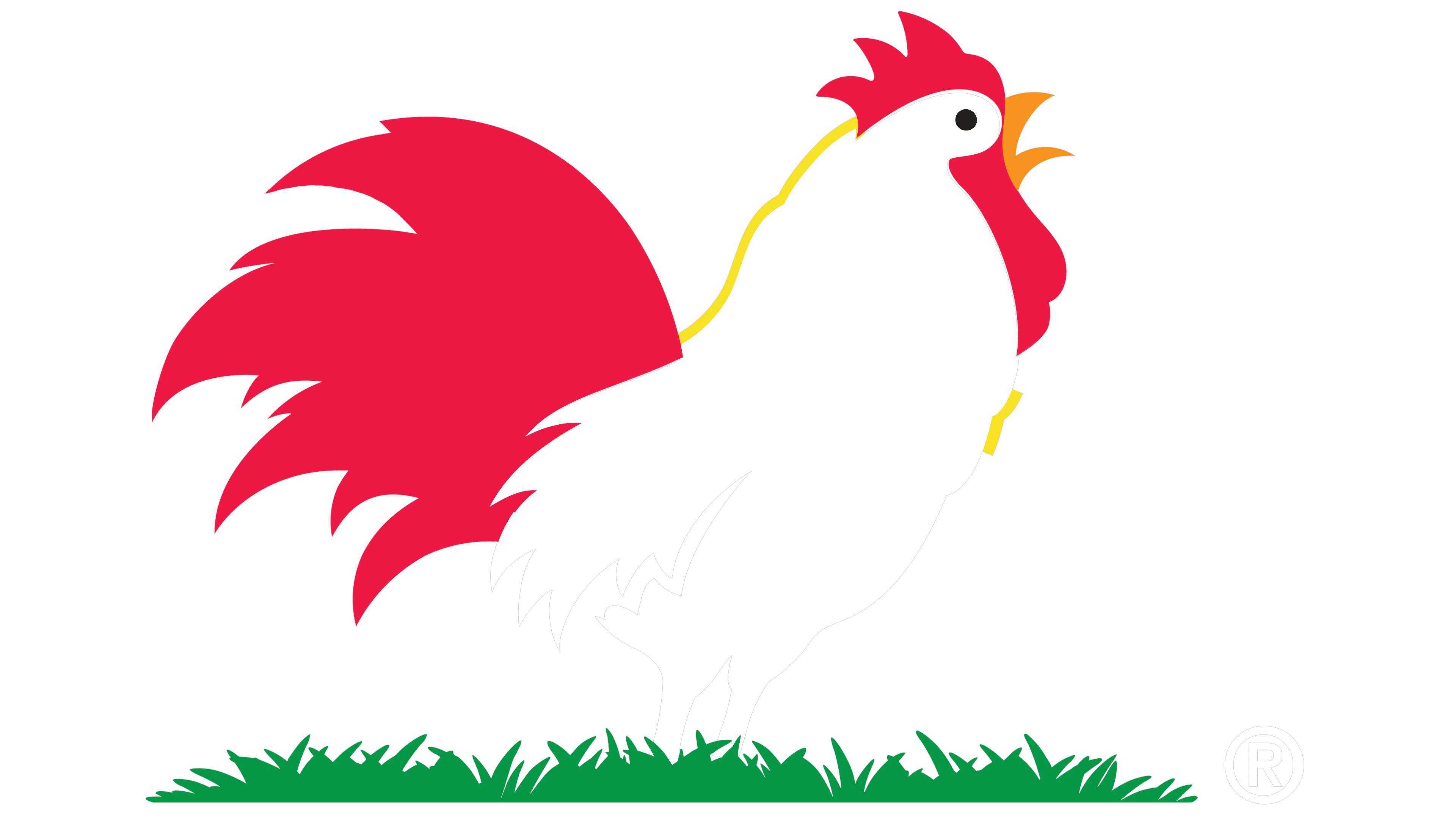
2021 – today
![]()
The current version of the Foster Farms logo is more minimalist compared to the previous design. The visual composition retained the rounded rectangular shape. Still, the inner frame lost its gradient shades (now white) and decorative transitions, giving the logo a flat, simplified character.
At the top is an image of a rooster standing on a narrow strip of stylized grass. The bird remains detailed, but the overall style became cleaner and less textured. Its dynamic pose remains: the head is raised, the beak is open, suggesting sound.
Below is the two-line inscription “Foster Farms,” rendered in black to enhance contrast against the background. The serif font remained, but highlights, shadows, and other volumetric effects were removed, visually aligning the typography with the overall flat design concept. Omitting the slogan “Family Owned Since 1939” made the layout more compact, shifting attention to the main symbol and brand name.
The background retained its yellow tone, but without complex color gradients. The rooster continues to symbolize the industry affiliation, while the simplified palette and geometry reflect current branding trends.