


 Smartfood Logo PNG
The Smartfood logo symbolizes a unique product that Americans love. This informative and presentable emblem combines identity innovations with the clarity of the brand’s offering.
Not every company can depict its essence and demonstrate reliability, strength, and high competitiveness with just three colors. The Smartfood brand has undoubtedly achieved this. It provided gastronomic pleasure to millions of Americans and preserved the traditions of its recipe. The tastiest popcorn accompanies people during leisure and in theaters; at home, during moments of relaxation, it becomes the perfect snack.
The brand openly states that the corn grown on vast fields is environmentally friendly. This is why an ear of ripe and juicy corn occupies the logo’s central place. The realistic, precise depiction provokes an immediate desire for popcorn.
The brand name, written in black on a yellow textured background, looks bright and attractive. The logo emphasizes graphics, shapes, and textures to convey the product’s naturalness.
Smartfood began in 1985 in Marlborough, Massachusetts, when Ann Withey and Andrew Martin created a popcorn snack made with real cheddar cheese. The couple developed the first recipes in a home kitchen, aiming to offer a lighter alternative to standard chips and packaged snacks. Early production was small, with sales through local stores and farmers’ markets across New England.
The brand gained regional attention because of its cheese flavor and positioning as a smarter snack option. In 1989, four years after launch, PepsiCo’s Frito-Lay division bought Smartfood for $14.5 million. The acquisition gave the brand access to national distribution, larger production capacity, and broader marketing support.
During the 1990s, Smartfood became a stronger name in the snack aisle, with campaigns focused on natural ingredients and the absence of artificial additives. In the 2000s, the brand moved beyond its original white cheddar popcorn and tested new varieties, including caramel and ketchup flavors. In the 2010s, it responded to changing consumer habits with products containing less fat and salt, along with gluten-free popcorn.
In 2020, Smartfood marked its 35th anniversary with limited retro-style packaging. In 2021, it introduced Smartfood Air Pops, made through air popping and positioned as a lighter option. In 2022, the company announced fully recyclable packaging and work to reduce production waste. In 2023, the Global Flavors line added varieties inspired by Mexican cheese nachos, Indian tikka masala, and Thai chili lime. In 2024, Smartfood Creator allowed users to suggest and vote on new popcorn flavors.
Meaning and History
What is Smartfood?
It is a brand of PepsiCo’s Frito-Lay division, specializing in ready-to-eat popcorn. The brand is known for its popcorn, especially its flagship product, white cheddar popcorn. It focuses on providing tasty and convenient snacking options, offering a variety of flavors such as Sea Salt, Movie Theater Butter, and Sweet & Salty Kettle Corn. The brand emphasizes the use of premium ingredients to create healthy snacks, appealing to health-conscious consumers. Popcorn is widely available in supermarkets, convenience stores, and online retailers, making it a popular, tasty, and hearty snack.
1985 – 2019
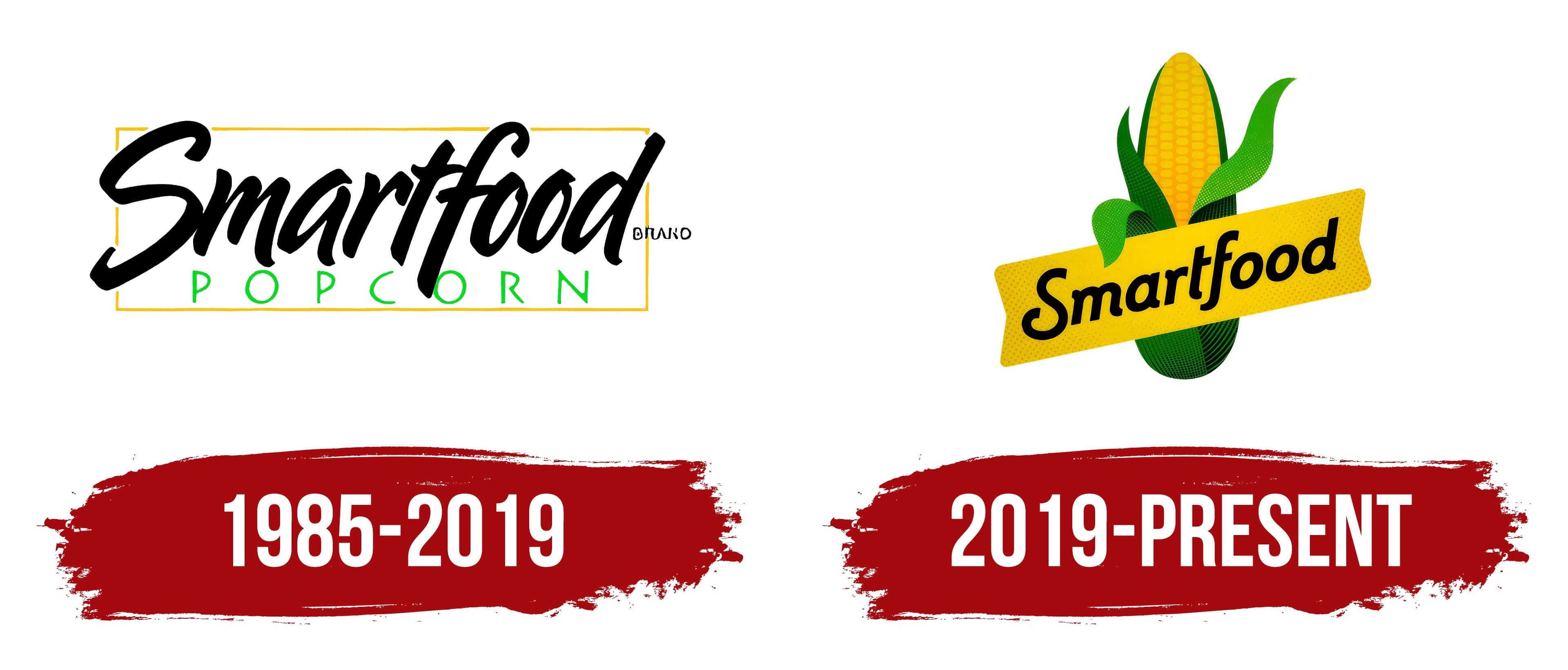
In 1985, many believed that tasty and healthy products were incompatible concepts. However, Andrew Martin, Ken Meyers, and Annie Withey proved otherwise by offering something special in taste and quality. Their unique snack, white cheddar popcorn, quickly won customers’ hearts. Popularity grew, and by the end of 1989, this led to significant changes in the company. Frito-Lay acquired the brand, and PepsiCo continued to manage Smartfood.
This event marked a turning point in the brand’s history and spurred its rapid development. Introducing new flavors and diverse advertising campaigns increased interest among potential customers. The logo, symbolizing originality and a responsible approach to snack production, played a crucial role. It conveyed the brand’s reliability and customer focus.
The logo’s simplicity was delightful, while its detailing was impressive. The color scheme was not flashy: black, light green, and yellow were used for the text elements, with a white background.
The brand name was written in black italics and placed in the central part of the logo. A different, more readable font was used to specify the product type. The frame focused attention on the words, excluding any drawings or patterns.
2019 – today
In 2019, the logo underwent a major transformation. The main goal was to emphasize that the brand remains true to its traditions. Despite adding new flavors and snack types, the quality of the products remains high.
The rebranding included changes to graphics, design, and information presentation. The identity had to embody the brand’s high competitiveness. The result was successful, meeting expectations and delighting customers. The new logo showed that Smartfood’s popcorn and snacks are incredibly tasty. The yellow-green image of corn conveyed this message directly.
Black letters on a yellow background emphasized the brand’s stability. The logo was dynamic, with each symbol detailed and appearing lively. The white background highlighted the bright, colorful elements, making them more noticeable and clear.