


![]() Tostitos Logo PNG
Tostitos Logo PNG
The taste of crunchy corn triangles and spicy seasoning comes from looking at the Tostitos logo. The emblem emphasizes the snack’s unusualness, making it perfect for snacking with friends during your favorite activities.
Tostitos was launched in 1979 by Frito-Lay, part of PepsiCo, 15 years after Doritos. The brand entered the US snack market as a corn chip made for dipping, parties, and casual gatherings. Its name, “tostado,” meaning “toasted” or “crisp,” positioned the product closer to Mexican-style snack culture than to classic potato chips. The same snack group also produced Cheetos and Lay’s.
In the 1980s, Tostitos moved beyond plain tortilla chips. In 1985, the company introduced Tostitos Salsa, turning the brand into a chip-and-dip line rather than a single snack. During the 1990s, the range expanded with lime-flavored chips and Salsa Con Queso. The brand also built a closer link with football through NFL partnerships, making it a regular part of game-day marketing.
The 2000s brought format changes and lighter options. In 2003, Tostitos Scoops appeared with a bowl-like shape made to hold salsa and dips. The brand later added baked chips and lower-sodium salsa, responding to changing eating habits while keeping the core focus on tortilla chips and shared eating.
In 2017, Tostitos drew attention with its “Party Safe” bag. This promotional package could detect alcohol and help partygoers call Uber. By then, the brand was tied to chips, salsa, dips, football, and social occasions. Its growth came from new flavors, practical snack formats, and marketing focused on group settings.
Meaning and History
![]()
Tostitos has proven to be one of Frito-Lay’s most commercially successful products because its developers unlocked the secret to the true Mexican taste of cornmeal chips. The cooking techniques required a high concentration of calcium hydroxide, achieved by boiling corn in slaked lime. This substance enhanced the taste of snacks by reacting chemically with the frying oil.
Jack Liczkowski led the research team. He created round chips called Tostitos with other specialists for Frito-Lay. The first batches hit the shelves in 1978. Over time, new product versions were released with wheat, spices, cheese, pepper, and lime flavors. There were also snacks in the form of triangles, tubes, bowls, and flattened circles.
Despite the great variety of Tostitos, all varieties share a common logo. It has evolved noticeably, undergoing four redesigns from 1979 to 2012. The concept has not changed: the focus has always been a black inscription with a red dot above the “i.” But the developers decided to experiment, turning the middle of the word into a small “feast.” To do this, they depicted two “t” as men who dip chips in salsa. Such an interesting move drew attention to the brand’s main product, making it the central element of the graphic sign.
What is Tostitos?
Tostitos is one of the most successful products of the American company Frito-Lay, which is part of PepsiCo Corporation. Like Doritos, this brand produces tortilla chips; only its target market is the USA. The range also includes a variety of appetizer sauces. The trademark was introduced in 1979 and used a logo with an inscription in which the two letters ‘t’ are stylized as people holding one chip each.
1977 – 1985
![]()
In 1979, the first batch of Tostitos was released. Snack packages were decorated with a black logo and inscription. The designers chose a bold, low-contrast typeface with long, sharp serifs. The top edges of the “t’s” were triangular, while both “o’s” were oval. Letter spacing was practically non-existent. A large red dot above the “i,” resembling a rising sun, completed the composition. And in the lower right corner was the most inconspicuous element, the word “BRAND,” written in a thin grotesque right under the last “s.”
1985 – 2004
![]()
From the mid-1980s until 2003, a Greek-style logo was used. Its creators worked on the typography, removing serifs and the trailing element of the lowercase “t.” They completely changed the shape of the letters: the “o” became round, and the “s” took on a zigzag appearance with smooth curves. The triangles at the tops of the “t” have been replaced with trapeziums. The capital “T” has side cuts. Due to the lack of proportion, the word “BRAND” was moved slightly to the left and placed between the last “o” and “s.” The red dot above the “i,” probably representing the rising sun, rose slightly higher and separated from the vertical black line. At the same time, the designers made it brighter and larger.
2004 – 2012
![]()
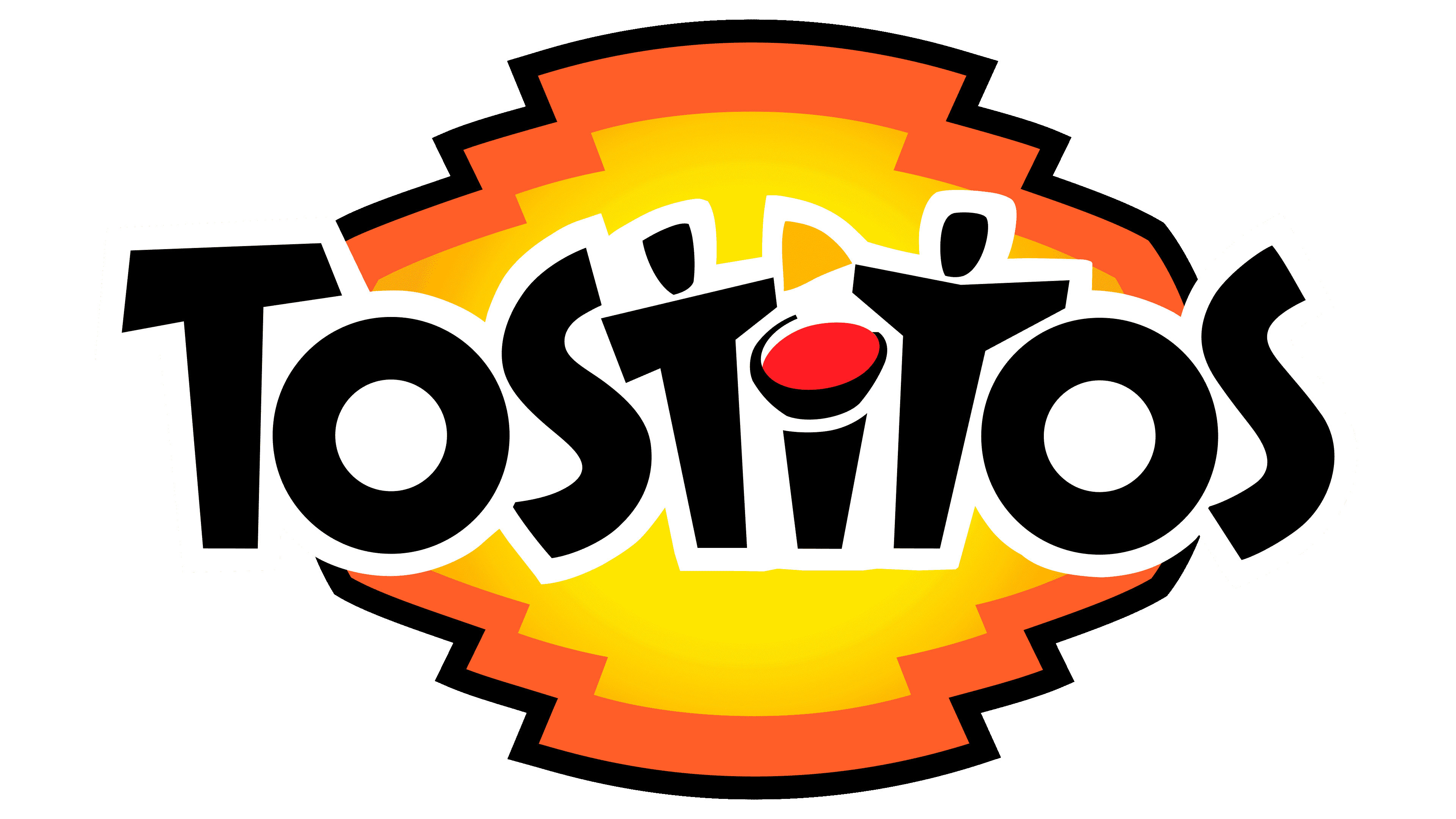
In 2003, the most famous Tostitos logo debuted, drawing public attention thanks to an optical illusion. The artists turned two lowercase “t” into little people. Horizontal stripes depicted arms spread to the sides, and the top short stroke of each “t” became the head. To achieve this visual effect, the designers made the sidelines asymmetrical and separated the letter tops from their bodies.
The makeshift men held one large, triangular-shaped orange chip as if they were about to split it in half. Directly between them was a bowl of salsa with the same red dot above the “i” that appeared in 1979. The rest of the letters in the inscription also looked new: the capital “T” strokes narrowed and expanded unevenly, and both “s” turned into twisted ribbons.
The background was no less interesting. The logo creators rotated the word “Tostitos” to the right and placed it on a multi-faceted base. The center was painted yellow with an orange gradient and outlined with thin black stripes. Against a bright background, the dark inscription “BRAND TORTILLA CHIPS” stood out, located under the trademark name. Around the edges of the yellow-orange area was a curly red border with black outlines.
2012 – 2026
![]()
In 2012, PepsiCo introduced a new Tostitos logo that combined all previous logos. The old inscription has been preserved, albeit with minor modifications. The developers made the “o” oval, as in the 1979 version, but left the sans-serif font, as in the 1985 wordmark. At the same time, the brand name is aligned horizontally, and the background image is removed.
The central letters, stylized as men with a chip, have become symmetrical: the right half of the “tit” exactly repeats the left, like a mirror image. To enhance the logo’s symmetry, the designers have converted the last letter “S” to uppercase. Now, it balances the first capital “T.”
2026 – today
![]()
When a brand changes its logo, people split into different opinions. Some like the fresh look, while others see it as the loss of a familiar image. “Tostitos” updated its emblem carefully, without breaking from the past. The brand focused on warmth, conversation, and food shared at one table.
The new version became softer. Instead of photos on the packaging, illustrations appeared, connected to a Mexican-style gathering. The type became calmer, without the earlier deliberate playfulness. But the brand’s main idea stayed the same. It tells a story about people, get-togethers, and food made to be shared with friends.
The most important part of the logo is tied to the two “T” letters. They are shown as people sitting next to each other over food. Between them is a bowl of salsa, hidden in the letter “i.” A similar device was already present in the old logo, but now the human figures are easier to understand. People take chips, dip them into sauce, and spend time together.
Red and yellow became softer on some packages and brighter on others. This lets the brand adapt to different flavors and product lines. Blue remained an important part of the image. Still, the overall presentation became warmer and more in line with the idea of a gathering at home.
The “Tostitos” logo update is tied to changes in the audience. Shoppers are paying more attention to where products come from, their ingredients, and food with a cultural story. For this brand, the theme of Mexican flavors and a shared plate fits naturally. Chips are rarely bought for a solo snack. More often, they are placed on the table during parties, family gatherings, or while watching a game.
The parent company, “PepsiCo,” launched the updated “Tostitos” look in the U.S. market. For the brand, America remains the key territory where chips are tied to house parties and friendly get-togethers. That is why the new presentation began there.
Font and Colors
A change in the appearance of the packages accompanied the last update of the visual identity. As colorful rays appeared on the packages, there was no need for a multi-colored figure behind the inscription. It had to be removed, and the phrase “BRAND TORTILLA CIPS” had to be placed at the bottom. But the most important thing remains a veiled image of two people enjoying chips and sauce. The logo features both snack types, making it applicable to all Tostitos products.
Two sketchy figures reflect the concept adopted back in 2004. In a press release at the time, cornmeal chips were positioned as a snack that brings people together. The T-shaped people hold only one chip as if sharing it.
The emblem represents Tostitos as a socializing and party brand. Moreover, snacks like these are served in Mexican restaurants as appetizers to treat friends sitting next to you. The symbolic elements in the inscription convey a sense of togetherness and authenticity of North American cuisine.
The fonts in the brand logo changed frequently. At first, it was an antique with thin and elongated serifs. Then letters in the Greek design were used, and in 2003, they became “Mexican.” However, some might say that it resembles the Mayan or Aztec style. The word looks non-standard because the lines are skewed in different directions. Due to the lack of serifs, it acquired an informal look. There is no similar typeface: the inscription consists of individual glyphs designed specifically for Tostitos.
Bright colors accentuate the festive Mexican mood, but there are not many: a small yellow triangle and a red oval depicting a bowl of sauce. All other parts of the logo are traditionally black.