


![]() MMs Logo PNG
MMs Logo PNG
The modern M&M logo, the most famous candy brand, reflects the founders’ names and the nature of the material used in production. The simplicity and straightforwardness of today’s emblem have guaranteed the product’s ideal beauty and recognizability.
M&M is a well-known chocolate candy brand produced by Mars. The brand is renowned for its entertaining advertising campaigns and vibrant candies, available in two varieties: with peanuts and without.
M&M’s originated during the Spanish Civil War, when Forrest Mars Sr. observed soldiers eating chocolate that didn’t melt easily. In 1941, he teamed up with Bruce Murrie from Hershey’s to create a unique chocolate candy that stayed solid in your hand. They named it M&M’s, after their last names.
By 1954, M&M was getting even better. It introduced peanuts into its chocolates and came up with the catchy slogan “Melts in your mouth, not in your hands.” This made it even more loved by chocolate fans everywhere.
In the 1960s, M&M’s reached new heights by becoming the first candy to travel to space with NASA, providing astronauts with a little taste of home. However, there was a hiccup in 1976 when red M&M’s were pulled from shelves due to concerns about a certain dye, but they returned in 1987, reintroducing the full range of colors.
Over the years, M&M kept things exciting by adding new flavors like peanut butter and crispy, as well as mini versions of the candies. In 1995, they went digital by launching their website, becoming one of the first candy brands to do so.
The brand came to life with its colorful characters, such as Red, Yellow, Green, Blue, and Orange, making it even more memorable.
The 2010s were all about innovation, with new flavors like Pretzel M&M’s and collaborations with other big brands. Moving into the 2020s, M&M’s celebrated its 80th anniversary by introducing lower-sugar options and even vegan options, keeping up with what people want.
For nearly 80 years, M&M’s has been evolving, bringing new flavors and joy to people across generations.
Meaning and History
![]()
The packaging was introduced in 1941. The M&M logo has always consisted of a wordmark without any additional symbols. The only difference has always been the font used and the color palette.
What is M&M’s?
M&M’s is a brand of multicolored round candies in a hard shell with a white letter “m” on them. It belongs to the American company Mars, and its name stands for Mars & Murrie’s. The first pills of this brand appeared in 1941. They were purchased by the US Army so that soldiers could carry chocolate that does not melt in hot climates.
1941
1941 – 1954
![]()
The first M&M logo was characterized by lowercase letters, a traditional serif font slightly narrower, and an elongated height. The letter “S” was smaller than the letter “M”. The original M&M logo’s color palette was monochromatic.
1954 – 1971
![]()
The inscription was changed. The logo now features a hand-drawn, uneven-style font in yellow on a black background. This was the brightest M&M logo in the brand’s history.
1971 – 1988
![]()
In 1971, the logo’s color scheme changed from yellow to brown, and the letters were updated to a slightly different font. This version of the corporate-style visual design remained in use at the company for 17 years.
1988 – 2001
![]()
The M&M logo’s main colors are now dark brown and chocolate. The inscription has cleaner and bolder lines. This simple but powerful logo will stay with the brand for 13 years.
2001 – 2004
![]()
The 2001 redesign brought the M&M logo a new, brighter shade of brown. It now also features a white-brown outline, adding depth to the logo.
2004 – 2018
![]()
In 2004, the M&M logo was placed diagonally on the packaging, in brown with a black shadow, which added dynamism and gave it a modern look. The letters are set against a white background that mirrors the emblem’s contour.
2019 – 2022
![]()
The 2019 redesign returns the M&M logo to a flat two-dimensional form, again making dark brown the main color in the brand’s palette. The letters are still placed diagonally, but now look more minimalist and straightforward. However, in this case, simplicity is the key to beauty. The ampersand visually appears to be positioned above the letters and has a white outline.
2022 – today
![]()
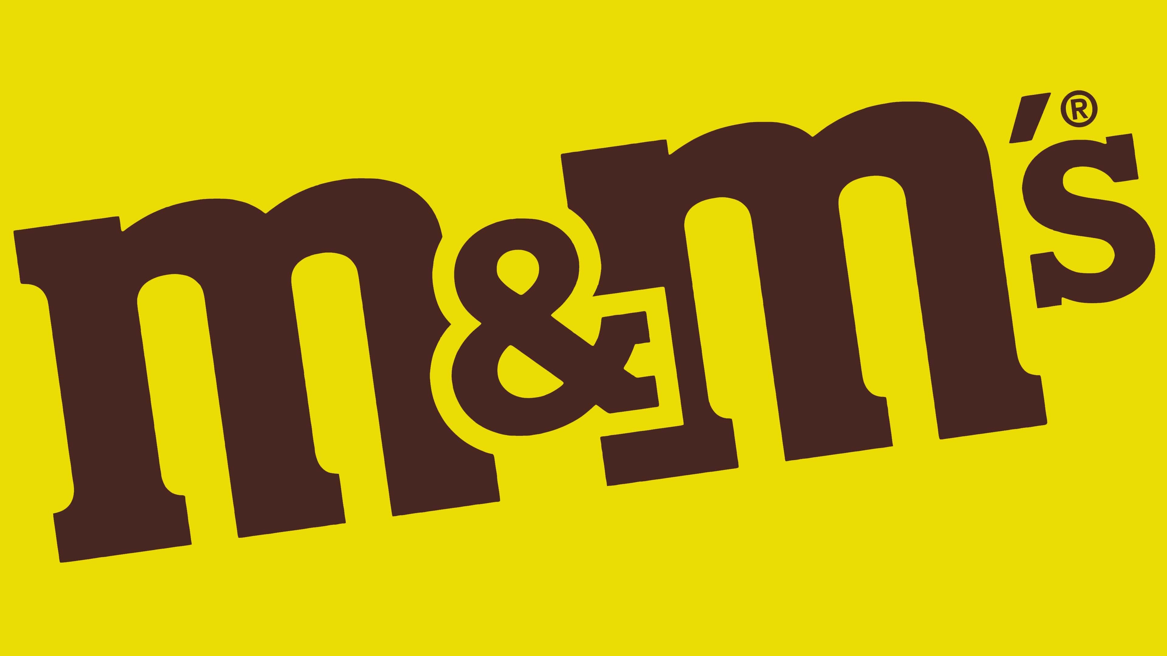
In 2022, M&M’s underwent a rebranding effort with a new signature logo. This involved the American corporation Mars, which owns the chocolate dragees brand. The leaders hired the creative agency Jones Knowles Ritchie to make the design more recognizable, staying within the global concept.
As a result, the “M&M’s” inscription was aligned horizontally. This is the only change in the emblem, apart from the disappearance of the letter “R” in a circle (the registered trademark used to be above the letter “s”). The change in orientation in space emphasized the ampersand, symbolizing unity and linking the names of the company’s two founders: Mars and Murrie. Now, it represents the brand’s focus on uniting people.
The brand name is not displayed diagonally, but this does not prevent the logo from being dynamic. Structurally, it resembles the versions of 1986 and 1991, but now the ampersand is brought to the forefront and outlined in white, partially overlapping the two Ms. The brown letters have become lighter because the designers made the inscription more optimistic without using extraneous colors.
Font and Colors
The letter “M” on the candies and the M&M’s wordmark have the same wide rectangular serifs. Moreover, all “M”s appear lowercase, although they are uppercase. In this case, it is not a full-fledged font but a unique set of glyphs. Although the candy manufacturer recently introduced its corporate font, it is not used in the logo. This eclectic emblem was created in 2022 by Jones Knowles Ritchie. The emblem’s design has remained relatively unchanged over the past few years. Both “M” are similar to glyphs from the Aachen SB-Medium font. As for “s,” the ampersand resembles the corresponding ITC Lubalin Graph Demi symbols.
All elements are brown, although M&M’s is considered the most colorful chocolate brand. The color of the inscription is associated with cocoa beans, from which the candies are made, because, under the bright glaze coating, all dragees are the same brown. Wide white lines are used as contours.