Vietnam’s beloved children’s dairy brand, KUN, a key offering from International Dairy Products (IDP), has introduced a vibrant new brand identity. This refreshing change, reflecting KUN’s dedication to providing nutritious and tasty dairy choices to youngsters, comes as a significant step in its branding evolution.
Renowned for its range of ready-to-drink dairy products, KUN shares the stage with other notable IDP brands like LOF, LOF Malto, and LOF Ba Vi. Collectively, these brands have been nourishing children with delicious and healthful dairy products, making them household names in Vietnam.
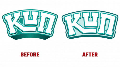
The transformation of the KUN logo, masterminded by M — N Associates based in Ho Chi Minh City, marks a notable shift in the brand’s visual representation. While the new logo preserves the essence of its original design, it introduces meaningful refinements that significantly enhance its visual impact. The complex shapes previously seen within the letters have been removed, and the gradient effect of the old logo has been eliminated, resulting in a logo that is both clearer and more readable. The streamlined shape and the refined drop shadows further accentuate the logo’s refreshed, dynamic look.
A pivotal aspect of the new KUN identity is the introduction of a custom-type family, expertly crafted to resonate with the brand’s young audience. This typography uniquely blends playful, cartoon-like elements with a refined elegance, ensuring it appeals directly to children. The type family is diverse, featuring three styles: “Junior,” “Kiddy,” and “Pixel.” Each style echoes a different facet of a child’s imagination, with “Pixel” in particular striking a nostalgic chord reminiscent of vintage video games, capturing the hearts of both children and parents.
KUN’s revamped branding is not limited to visual elements. The brand has employed a comprehensive strategy to engage young audiences across various platforms, including mobile and television, and through a physical presence in schools and on the streets. Central to KUN’s brand story and identity are its key characters, who play an essential role in forging strong emotional connections with its young customers.
In an era where minimalism and sophistication often dominate branding trends, KUN’s new identity stands out for its commitment to authenticity and child-friendliness. The brand strikes a perfect balance between innocence and amusement, which is crucial for resonating with its young audience. This thoughtful and engaging design approach ensures the KUN logo remains a symbol of quality and delight in the world of children’s dairy products.
KUN’s latest branding initiative demonstrates a deep understanding of its core consumer base. By embracing a design that stays true to its youthful audience, KUN effectively reinforces its position as a brand that values and understands the joy and nutrition children find in its products.


