The history of La Banque Postale, the French postal bank, began in 2000 with the creation by France Post of its investment subsidiary Efiposte. In 6 years, it would become La Banque Postale which would start to give consumer loans in 2007, adding insurance services in 2009 through a merger with CNP Assurances, expanding its offer to corporate banking in 2011. One of the promising directions of the brand became the development of a youth loan program, which is designed for those who are only 16 years old today, as well as the brand itself. The program is designed to consider young people’s interests and needs, close solidarity with them, and respect their beliefs seeking to eliminate inequalities in any form, including financial. The people’s savings book plays an important role in improving their well-being and increasing their finances, with tax-free deposits and an interest rate of only 2.2%. All of this increases the potential of the brand’s customers, increasing interest in it and providing the need for a change in the company’s visual identity.
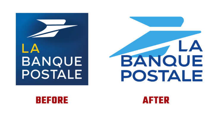
Building on its past experiences and having a real positive impact on its chosen strategy, the brand has rebranded itself, demonstrating its commitment to its history. The new logo was built on the previous one, preserving the overall meaning, the basis of the architecture, and the main mark, improving and enhancing the quality of the elements displayed. The entire identity has been redesigned to meet the requirements of modern digital and typographic ways of communicating information. The new logo has a bright, saturated color palette and an accurate, easy-to-read text module. It provided convenience and easy perception of information in any size version. At the same time, the visualization gained ease of recognition and better memorability.
The logo is made in compliance with the requirements of modern minimalistic style. The new interpretation is made in two colors, in two shades of blue. The symbol is made in light blue, and the text – the name of the brand – is in deep navy blue. Both colors successfully contrast with each other, providing the best perception of the image, focusing the viewer’s attention on the main brand symbol.
The applied font differs from the previous one in the letters, which are more stretched across the width, giving the text visual solidity and inspiring confidence in the future. At the same time, the whole identity is aimed at creating absolute trust in the brand, its offers, and its programs.


