


![]()
“La Ligue contre le cancer” has introduced a new visual identity designed by W Conran Design. The update combines familiar elements with a modern touch, reinforcing continuity and a fresh perspective as the organization moves forward.
The previous logo had a straightforward structure: a rectangular design split into two parts. The top section, in blue, displayed the organization’s name, while the lower orange segment carried the phrase “CONTRE LE CANCER.” The typography was clean and formal, designed for clarity and direct communication.
![]()
The new logo is more dynamic. The name is now spread across three lines, improving readability and creating a well-structured, balanced look. Layout creates a sense of openness while strengthening the brand’s presence.
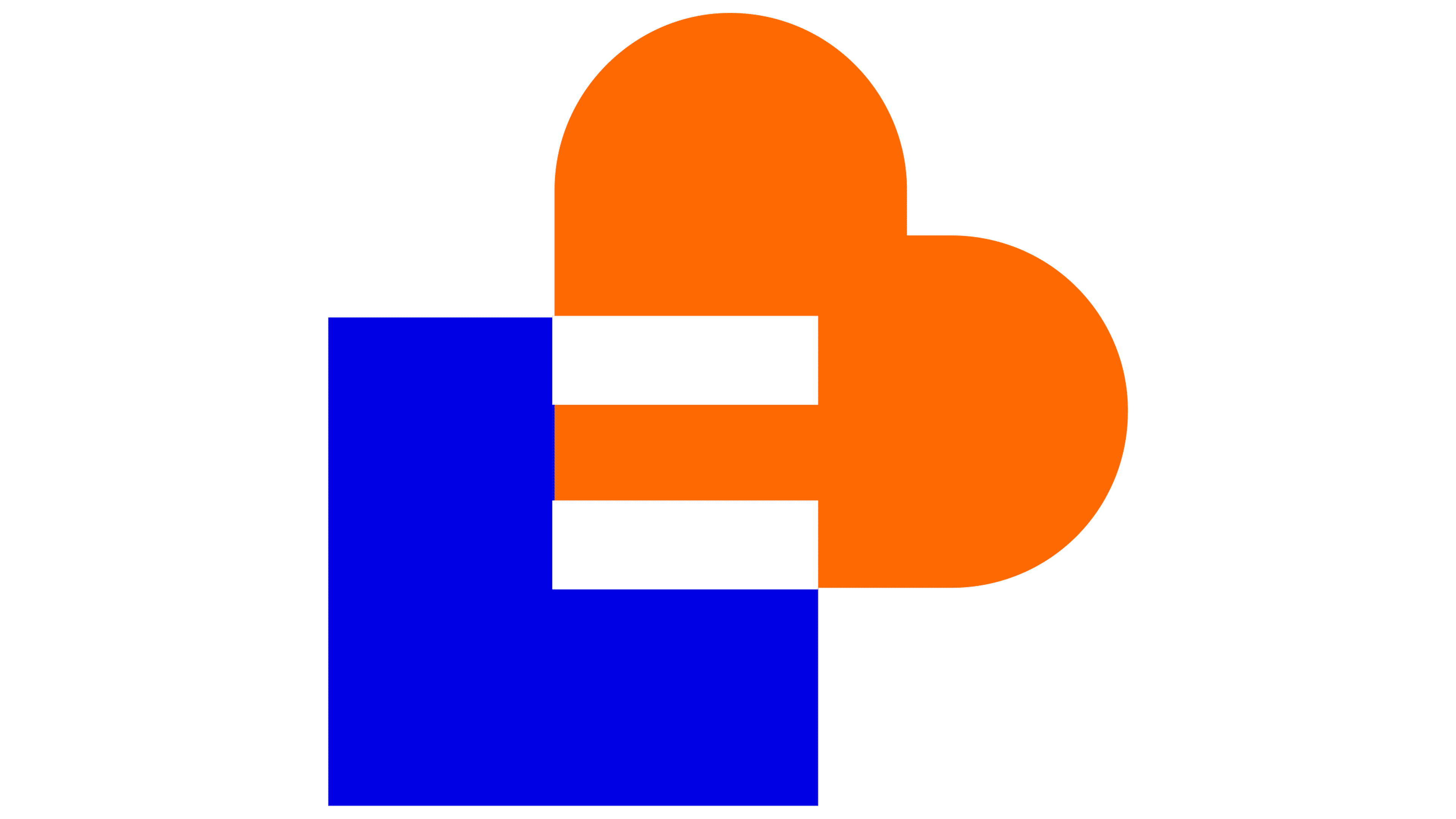
One of the standout features is the emblem, which blends geometric precision with deeper symbolism. It consists of a square, symbolizing stability and structure, paired with an orange shape resembling a stylized heart. The heart-like element represents care, support, and vitality—reinforcing the Ligue’s dedication to patient advocacy and healthcare.
The old logo used a thin, traditional font, while the new one embraced a bold, modern, grotesque typeface with even line thickness.
The color scheme has been refreshed to bring more energy to the design. A deep, rich blue contrasts with a bright orange, creating a strong visual balance. The blue conveys reliability and continuity, while the orange adds warmth and reflects the organization’s active role in health promotion.
![]()
The sharp edges of the square are softened by the rounded curves of the heart-like shape, striking a balance between structure and emotional connection. The emblem’s proportions are carefully crafted to keep the design harmonious, clear, and recognizable, whether displayed on large banners or small digital icons.
The new logo will accompany the organization as it moves forward, representing its dedication and ongoing efforts in the fight against cancer.