The Lactaid logo symbolizes harmony and well-being. The emblem reflects everyday convenience that consumers of all genders and ages can appreciate. The design is based on principles of simplicity and minimalism, emphasizing that when a product effectively eliminates pain and discomfort, the attention required for its use becomes minimal.
Lactaid: Brand overview
The origins of Lactaid started in the 1970s when biochemist and entrepreneur Alan Kliger began studying lactose intolerance. Being a victim of lactose intolerance himself, Kliger set out to discover a way to make dairy products comfortable for those who were intolerant to it.
Kliger established LacTaid Inc. in Pleasantville, New Jersey, in 1974. The company started making lactase enzyme pills meant to be consumed before consuming dairy products. These tablets helped with the body’s lactose breakdown, reducing or eliminating intolerance symptoms.
The business faced difficulties in its early years. Kliger had to put in a lot of effort to promote lactose intolerance and the advantages of his product. He went to pharmacies, doctors’ offices, and health food stores to promote the enzyme tablets.
The producer started expanding its product line in the 1980s. The firm-created enzyme drops to immediately break down lactose in milk. This invention made ingesting dairy products even more convenient for lactose-intolerant people.
When the company released its line of lactose-free milk in 1988, it marked a critical turning point for the business. This ground-breaking innovation allowed lactose-intolerant people to drink milk without needing tablets or drops. Lactose-free milk gained popularity quickly and is still a major offering from the brand.
During the 1990s, the manufacturer kept growing its range of lactose-free products. The firm launched ice cream and other dairy products, in addition to different varieties of milk (whole, low-fat, and skim).
The acquisition of the company by Johnson & Johnson in 1991 was a turning point. This acquisition provided access to more resources and growth and development opportunities.
Throughout the 2000s, the brand kept innovating and broadening its selection. The producer expanded its dairy product line to include butter and coffee creamers and introduced additional milk varieties like chocolate and strawberry.
The 2010s saw increased development and innovation. The company started manufacturing protein milk and released lactose-free milk in organic varieties to accommodate the growing demand for high-protein goods.
In 2020, a new product line called “Lactaid Organic” was introduced. This series included organic lactose-free milk from cows raised without growth hormones or antibiotics. By making this change, the producer continued to fulfill its primary goal of offering lactose-free alternatives while breaking into the organic product industry.
In 2021, the firm added cottage cheese and sour cream to its lineup of dairy products. These items were developed in response to consumer requests for more lactose-free dairy products for everyday use and cooking. The new products maintained the flavor and texture of regular dairy products while being safe for lactose-intolerant people.
A new generation of lactose-free milk, called Lactaid Ultra, was introduced in 2022. This product’s protein and calcium content was raised using cutting-edge filtering technology while its lactose-free qualities were preserved. Lactaid Ultra targeted customers searching for more nutrient-dense, lactose-free milk substitutes.
The same year, the company improved its educational program by introducing the “Lactaid Learning Center,” an online resource. This website offers recipes with its products, dietary advice, and information about lactose intolerance. The firm conducted webinars and produced instructional content with nutritionists and gastroenterologists.
Additionally, the firm increased its visibility by creating an online store and interacting with customers on social media.
The company has come a long way from being a modest business started by one man on a personal mission to becoming a well-known brand in the lactose-free dairy products industry. It continues to innovate and expand its product line to satisfy the demands of lactose-intolerant people, allowing them to enjoy dairy products without discomfort.
Meaning and History
What is Lactaid?
It is a brand that produces lactose-free dairy products and lactase enzyme supplements for people with lactose intolerance. It offers a wide range of dairy products, including milk, ice cream, cottage cheese, and other dairy-based products designed to be easily digestible for those with difficulty processing lactose. The brand’s flagship product is a lactase enzyme supplement that can be taken with regular dairy products to break down lactose and reduce digestive discomfort. The company’s products are widely available in grocery stores and pharmacies across the United States, making them popular among people with lactose intolerance. Offering both dairy alternatives and digestive aids, the company has established itself as a leader in meeting the needs of people with lactose sensitivity while allowing them to adhere to a diet that includes dairy products.
1974 – 1980s
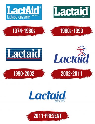
The first logo of the Lactaid brand is designed in blue and white tones, symbolizing the freshness and health benefits of dairy products. These colors also highlight the brand’s primary goal—to make milk consumption accessible and comfortable for everyone. The brand name combines the words “help” and “lactase,” clearly indicating the product’s purpose for people with lactose intolerance. This issue is caused by insufficient production of the enzyme lactase, and to alleviate this condition, the enzyme is added to Lactaid products. This information is reflected in the lower part of the logo, emphasizing the company’s care for its consumers.
1980s – 1990
In the new Lactaid logo, the blue background was replaced with green, symbolizing life and naturalness. The mention of adding the “lactase enzyme” was removed, shifting the focus to other important aspects of the product. The green color emphasizes the company’s commitment to the health and well-being of gut flora, as well as the safety of its products. The milk used in Lactaid products comes exclusively from cows not treated with hormones. Thus, the brand aims to show that its dairy products fully meet natural standards, with the only difference being the processing of lactose into simple sugars, making the milk accessible to people with lactose intolerance.
1990 – 2002
The product name “Lactaid” has been given more slender and elegant letters, reflecting its beneficial and dietary properties. The logo’s background is now blue, gradually darkening toward the bottom, creating an impression of depth and reliability. Textured stripes in the background resemble chains of molecules, symbolizing lactose and lactase while also hinting at the assistance provided to those with reduced production of this enzyme. The color scheme emphasizes health and professionalism, reflecting the company’s medical approach. The red line under the name highlights the urgency and effectiveness of the relief provided while maintaining the product’s high-quality taste.
2002 – 2011
The 2002 logo conveys the harmonious coexistence between humans and dairy products. The image of a cow dancing in an embrace with a person symbolizes the ease and joy that Lactaid brings to those with lactose intolerance. This visual represents the founder’s dream of making milk accessible to everyone. The new font used for the brand name appears elegant and confident. The smooth, carefully crafted letters embody the harmony and well-being that Lactaid provides to its consumers.
2011 – today
Lactaid products help people enjoy dairy without discomfort, and the logo, with its simplicity and clarity, conveys this message directly and without unnecessary details. It embodies the brand’s core values through a simple yet expressive design. Minimalism is at the heart of the logo, emphasizing the brand’s commitment to comfort and health for its consumers. The smooth lines and soft shapes of the font create a sense of ease and care, which is important for a brand specializing in products for those with lactose intolerance.
The blue color used in the logo is not accidental. This shade symbolizes purity, calmness, and reliability. In the context of Lactaid, blue underscores that the brand’s products help maintain comfort and ease digestion, providing a simple and effective solution to the problem. Blue is associated with trust and professionalism, which is important for a company that aims to offer its customers high-quality products.
The font is soft and rounded, creating an impression of friendliness and accessibility. The shape of the letters is visually pleasing and conveys a sense of safety and comfort, which are key aspects of the brand’s philosophy. The logo appears simple, but that’s where its strength lies—it’s easy to read and remember, creating positive consumer associations.
The modern version of the Lactaid logo is the most streamlined of all previous versions, aligning with current design trends where minimalism is highly valued. This approach highlights the products’ effectiveness and ability to quickly and easily address issues related to lactose intolerance.
