Founded in 2004 in Toronto, Canada, the Italian pizza chain Lamanna’s Bakery represents the brand from the heart of Sicily – Monteleone di Puglia. The founders are proud of the long history of their brand. From generation to generation, from grandparents and their grandparents, the secrets of delicious and unsurpassed recipes of real Italian pizza are passed on. These family recipes are changing due to new technologies and modern ideas, making the food on offer tasty, a little adventurous, and uplifting. The variety of assortment – delicious lasagna, veal, lobster tails is just a small part of what can not only saturate but also satisfy the most refined taste, pamper any discerning palate with amazing sensations. It’s not even worth talking about desserts since every cheesecake, cannoli, and many other “goodies” won’t let you leave the table until the last crumbs have been eaten. All this became possible thanks to the harmonious combination of an old family recipe and modern possibilities, which required reflection in the brand’s own visual identity.
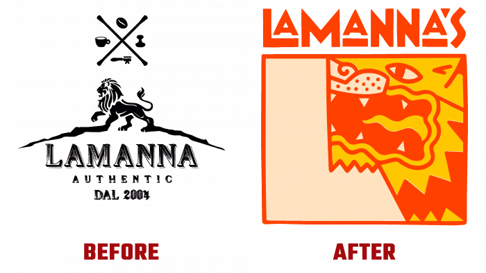
The new “tasty” identity developed by the American design studio – Contino Studio (New York, NY) was able to advantageously reflect the classic Italian Art Deco in a modern emotional color. The changes affected all areas, including the logo itself. In it, a proud and menacing roaring lion – the main element of the brand’s emblem – was placed in a space that is a pizza box. He speaks with all his appearance about the readiness to eat the pizza itself or the one who dares not to appreciate it. To the left of his image is the free space of the box, which is a visually formed monogram in the form of the letter “L” – the first letter of the brand name.
The color palette has also been chosen to whet the appetite and the urge to order from Lamanna’s Bakery. The selection of color combinations effectively conveys the idea of the unity of salty and sweet, thanks to the created visual system, which is in perfect harmony with the graphic design of the logo and the products of the pizzeria. A mixture of rich brown, “burning” orange, and appetizing melting yellow shades with soft creamy and juicy pink create the necessary atmosphere for the perception of how amazingly and effectively a dessert can complete an unforgettable dinner.


