The team has done a great job to convey the brand’s 150-year heritage accurately.
The history of Iron City Beer is filled with many ups and quite unpleasant moments. The brand has gone through 2 bankruptcies and many ownership changes. Despite not all the brightest periods, the company managed to be remembered by the consumer. Over the past two years, Iron City Beer has detailed advertising, packaging, and branding with Top Hat in Millvale, PA.
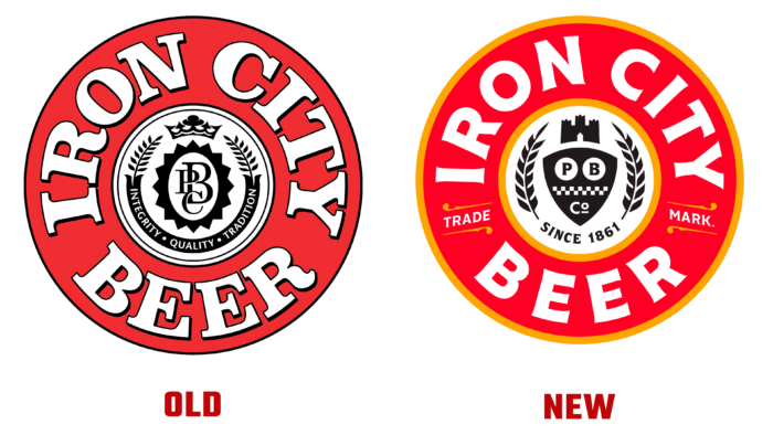
The Top Hat team analyzed that frequent redesigns of beer cans have left a negative mark on brand awareness. In order not to make a similar mistake, they studied previous variations and created their vision. The Iron City Beer logo looks contemporary and laconic. The designers completely removed the black outlines and added a combination of red and yellow to soften the picture. The new font in the Cenzo Flare logo is pretty nice and gives it a touch of originality. The shield, wreath, and castle still adorn the central part of the logo, only in a different interpretation. Top Hat detailed the image by adding the word “Trade Mark” and the year the brand was created (1861).
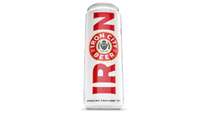
Iron City Beer packaging looks impressive thanks to the harmonious combination of red and white colors. The bright red lettering combined with the new logo stands out beautifully against the solid color background. For large packages for several bottles or cans, a checkered pattern was added.

Billboards with a new style are hung on the city’s streets, and we can say that they look great. Some of them seem to have been made back in the 1970s and are perfectly preserved. In addition, local coal miners have become heroes of some advertising signs, and the packaging design looks beautiful against the background of black ore. The brand presented a series of pictures dedicated to various professions and holiday cards. In general, the corporate identity leaves a pleasant aftertaste, like many other Iron City Beer ideas. For example, a promotional competition run in partnership with Pittsburgh Dad, in which a photo with an iron throne of beer won, and the winner received 1,861 cans of beer. Symbolical, isn’t it?


