Experienced BMX riders prefer comfortable, practical, and aesthetic gear from Lead Racewear, introducing a new collection of racing pants with a new logo. A new generation of such equipment – ultra trousers- is presented in the widest range of colors and sizes. They are distinguished by high strength, the use of polyester fabric, good moisture resistance, the presence of built-in multi-directional stretch panels, two hip adjusters, lightweight, a zipper and a button, a pocket, no interaction with oil and flammable substances, ease of cleaning.
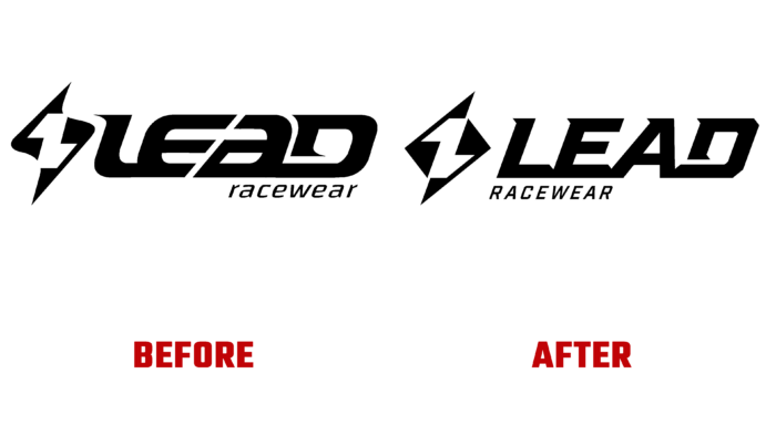
The new logo adds a bold, distinctive look to the top-of-the-line sweatpants. Constantly creating original design developments, the brand demonstrates its aspirations for the future development in this area of sports BMX equipment for motocross riders, mountain bikes. The new collection has acquired its modern vision thanks to the design expertise of Adrian Ridley. The assignment was both simple and difficult. It was necessary to develop a new appearance in such a way as to preserve the historical spirit of the brand but introduce modern dynamism into it, reflecting all the features of the preferences of the modern consumer. All this was very effectively expressed in the visual image of the new collection thanks to a deep “immersion” in the world of BMX and the study of the peculiarities of the socio-psychological nuances of individuals, social groups of this world. As a result, it was possible to very accurately convey the priorities of the modern mentality of BMX participants, which reads – “Lead, don’t follow.”
The logo itself has retained the basic concept of its predecessor. But it is made in an updated modern version. The sign, consisting of two opposite triangles, acquired clarity and sharp angles, making its visual perception more definite and straightforward. The text composition has a new visual experience thanks to the same crisp corners and the use of italic serif typeface. Both words are depicted in lowercase, right-skewed to represent forward movement and speed. The second word is left aligned. The whole composition has acquired clarity and aspiration, demonstrating the desire for victory and beauty. At the same time, the basic requirements were met – practicality, sportiness, and aesthetics.


