


![]() Levis Logo PNG
Levis Logo PNG
The Levi’s logo has become a symbol of true denim culture. It recalls the brand’s roots and the time when durable workwear became a symbol of freedom and self-expression. Today, the emblem is associated with youth style and the American spirit that made the brand a legend.
Levi’s began with Levi Strauss, who moved from Bavaria to New York in 1847 and then to San Francisco in 1853 during the Gold Rush, founding Levi Strauss & Co. as a wholesale supplier of fabrics and goods.
In 1872, tailor Jacob Davis proposed reinforcing pockets with metal rivets. Together with Strauss, he received a patent on May 20, 1873, which marked the start of jeans. The first models, known as waist overalls, were made from denim and duck cloth, with indigo dye chosen for cost and practicality.
In 1886, the two-horse leather patch appeared as a trademark. In 1943, the Arcuate stitching on back pockets was patented. After Strauss died in 1902, the company remained family-owned and focused on workwear for the American West.
During World War II, Levi’s were classified as essential goods, creating scarcity. In the 1950s, the brand entered youth culture through films starring Marlon Brando and James Dean, and expanded into Europe.
In 1971, the company went public. By 1976, women’s lines were introduced. In 1986, the 501 model was relaunched with the “Button Your Fly” campaign, competing with Calvin Klein and Jordache.
In 1985, the Haas family took the company private. In the 1990s, Levi’s faced declining sales against Gap and Tommy Hilfiger. Revenue dropped from $7 billion to $5 billion by 1999. In 2019, the company returned to the stock market with a valuation of $6.6 billion.
Meaning and History
![]()
Throughout the brand’s existence, it has undergone nine logo changes, the first appearing in its founding year.
What is Levis?
It is the brand name under which Levi Strauss & Co. releases denim clothing. The company that owns it appeared in 1853. Initially, it sold denim pants to gold miners. Then, they were bought by railroad workers, lumberjacks, and cowboys. In the 1950s, jeans were worn by subcultural figures, and only then did they enter the everyday wardrobe.
1853 – 1892
![]()
One of the early marking variants of Levi Strauss and Co appeared as a small plaque. Inside an elongated rectangular frame was the inscription “LEVI STRAUSS and CO,” with the numbers 16 and 14 at the sides.
At first, the brand was limited to the owner’s name. Later, “Co” and an ampersand were added to denote the company. The typeface remained strict, without decorative elements.
The numbers together form 1614, but they were deliberately separated and positioned on opposite sides of the inscription. The frame united the text and numbers into a single block. The mark emphasized reliability and practicality.
1892 – 1925
![]()
When Levi Strauss & Co. released its first jeans with metal rivets, it was important to highlight the product’s main advantage: the fabric’s high durability. In the Wild West, some customers could not read or did not speak English, so the company relied on a visual image that became part of the brand’s history.
The mark is executed in black and white. At the top is the brand name in large type. Below, it appears “SAN FRANCISCO, CAL” in rounded sans-serif letters. Beneath them is an arched ribbon with the inscription “ORIGINAL RIVETED,” white, slanted letters on a dark background. Below the ribbon is the text QUALITY CLOTHING XX.
The lower part of the logo contains the main scene. It shows two horses pulling a pair of jeans in opposite directions, with each horse harnessed to a wagon carrying a simplified human figure. The scene illustrates the fabric’s strength limits. Additional inscriptions appear on the sides, on the left PATENTED IN US, on the right MAY 20 1873, set in white serif letters on dark ribbons.
There is a lot of text on the emblem, but the image carries the meaning. The mark functioned as a visual argument, demonstrating the strength of Levi’s jeans and establishing the image of a reliable manufacturer even before global recognition.
1925 – 1929
![]()
Logo logo Levi Strauss Co
By 1925, Levi Strauss jeans were already selling well, so there was no longer a need to explain quality through a complex emblem. The company simplified the mark, turning it into a universal label used across all products.
The label became brighter and more concise in meaning. The main emphasis was placed on the red LEVI STRAUSS inscription. The letters are large, red, rounded, and sans serif. A black outline traces the contours, reinforcing the text’s visual impact.
The previous version with horses and explanatory phrases was abandoned. The brand name moved to the foreground and was already perceived as a sign of quality and durability. The label became easy to place anywhere on garments.
1929 – 1943
![]()
The appearance of the shortened name Levi’s marked a new stage for the brand. The long official name, Levi Strauss & Co., was replaced with a shorter version linked to the founder’s name. Only the word LEVI’S remained on the labels.
The new logo is built around the dark blue LEVI’S wordmark. Along the left edges of the letters runs a light beige shade that creates the effect of raised lettering and volume. The entire wordmark is placed on a bright red rectangular background.
Below the name is the slogan AMERICA’S FINEST OVERALL. The text is set in small black sans-serif type and spans the full width of the field. The combination of a red-orange background, a dark blue name, and a light shadow creates the image of a reliable manufacturer.
The logo update occurred when Levi’s jeans had already become part of everyday life and no longer required explanation. Focus shifted to the short name, strong color, and clear presentation. This strengthened the brand’s association with American workwear and the mass market.
1943 – 1949
![]()
The next version of the Levi’s logo was placed on a light yellow background, marking a new stage for the company. At the center were large, dark-blue letters spelling “LEVI’S”. The typeface is sans serif. Unlike the previous version, which had a wide, slightly compressed wordmark, the new one is narrower and more vertically elongated. Below it, the line AMERICA’S FINEST OVERALL was set in a thin, elongated green typeface.
1949 – 1954
![]()
After World War II, Levi’s updated the emblem and changed the color scheme. The background became a rich red-orange rectangle. Across it, LEVI’S appears in large, cream-beige, solid letters. They occupy almost the entire area and are perceived as a single block.
The wordmark is set in a large geometric typeface. There are no serifs, and the color is cream beige. The text is positioned closer to the lower edge. At the top, a promotional line was added in a narrow, light yellow typeface: “when there’s work to be done. Wear”. The phrase serves as a slogan, reminding us of the workwear’s purpose without overwhelming the mark.
The result is a simple promotional mark that emphasizes Levi’s focus on workwear and reliability in everyday use.
1954 – 1966
![]()
Red remained part of Levi’s visual language, marking the beginning of a new stage for the brand. The new emblem retained the short name LEVI’S and added the line “VINTAGE CLOTHING”. The former bright red background shifted closer to burgundy.
Inside the saturated rectangle are two lines of text. At the top is the word LEVI’S in white uppercase letters. The typeface is large and heavy in proportion, well aligned with the workwear theme.
Below is the phrase VINTAGE CLOTHING. The typeface is small and simple, and it feels lighter than the brand name.
The word VINTAGE emphasizes the brand’s history and roots. The red label became Levi’s main visual reference and remained part of the product’s appearance for many years.
1966 – 1999
![]()
In 1966, Levi’s introduced a new logo developed by the studio Landor Associates. This version can still be found on selected clothing items today. The logo is often called the batwing.
The logo features a red trapezoid with a white Levi’s wordmark. The top line is straight, the sides taper downward, and the bottom edge is formed by two identical curves resembling spread wings.
The wordmark is set in a heavy sans-serif typeface. Almost all letters are uppercase, while the lowercase e is rounded. This detail adds a distinctive touch, even though most customers do not consciously notice it when seeing the brand logo.
In 1968, Levi’s introduced another version. The lower curves were strengthened in shape, and the letters became more elongated, while the lowercase e was retained. Both versions were used in parallel.
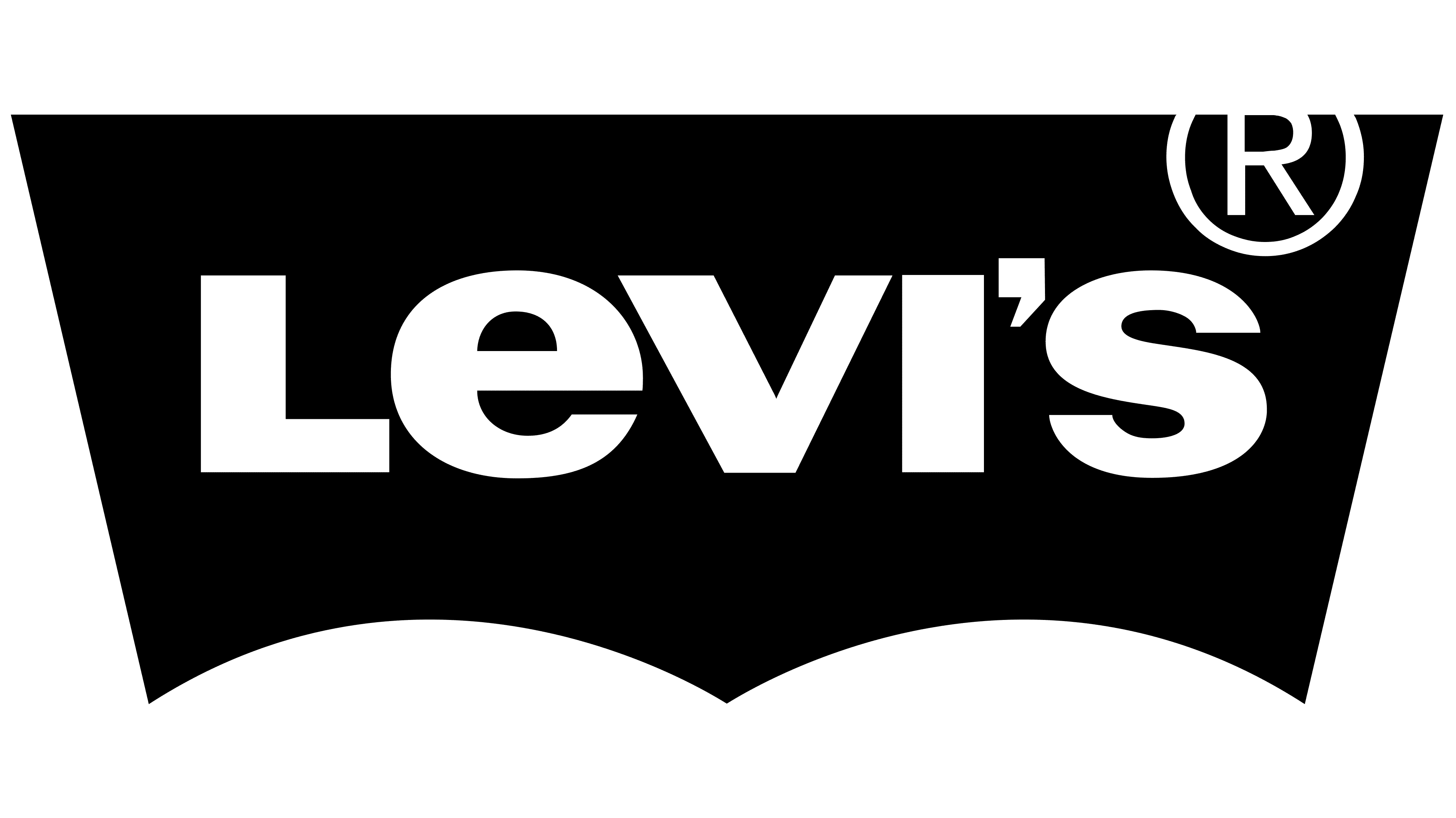
1999 – today
![]()
By the early 2000s, the Levi’s logo was already well recognized. In 1999, the studio Turner Duckworth made minor adjustments. Visually, the changes were subtle, but they made the mark neater. The red background of the trapezoid darkened and shifted toward burgundy, while the letters became more compact and dense.
Later, in 2011, the task again involved strengthening logo recognition without overloading the label space. The silhouette, often compared to bat wings, was left unchanged, but the letter strokes were thickened. The wordmark appeared more unified, with less negative space within the shape.
The revised version retained the original proportions. The typeface remains sans serif, without decorative elements, and the lowercase e still stands out among the other letters.
Font and Colors
All the company’s trademarks bear its name, formed from Levi Strauss’s surname. Thus, they immortalize the name of the entrepreneur who created the fashion brand in 1853. The inscription is set against a trapezoidal background with an uneven base; the lower part features two arc-shaped recesses. Until 1969, the word “LEVI’S” was placed within various rectangular shapes and sizes. The exception is the period from 1892 to 1925, during which a complex, multi-component emblem was in use.
The logo is set in URW Linear Wide Ultra Bold, a stylized geometric sans-serif font created by Albert-Jan Pool. The color palette includes a dark shade of red. Lighter tones, closer to orange, were previously used. The primary color is complemented by white, which serves as a general background and contrasts with the word “LEVI’S” within the bright geometric figure.