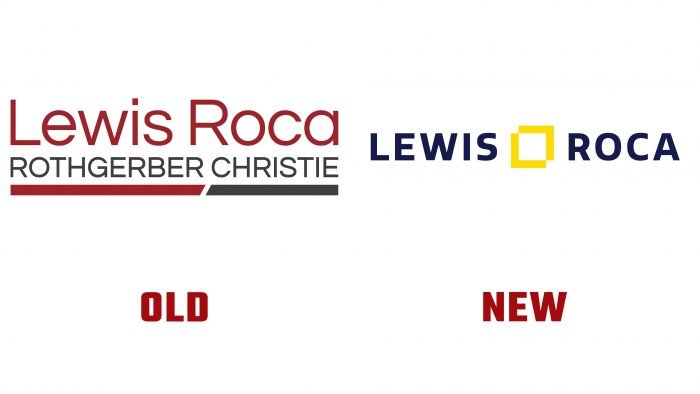
The company changed the logo, shortened the name, and moved to a new website.
The company now uses the abbreviated name Lewis Roca. The purpose of the rebranding is to emphasize the importance of customers to the brand. It is using the experience of its clients that the company develops. Lewis Roca has been using Experience Amplified for over three years. With its help, the firm can monitor the quality of its services provided to clients.
The value of Lewis Roca is reflected in the logo. The brand now uses blue and yellow in their logos, which are associated with reliability and confidence. Also, the image is supplemented with a graphic element between the inscription in the form of the company’s name.
The abbreviated name will help clients remember it more easily. In 2013, Lewis and Roca merged with Rothgerber, Johnson & Lyons. This was not the final decision, and in 2016 Christie Parker & Hale joined the main brand. All other companies’ elements are reflected in the long name, but apparently, Lewis Roca decided to go back to basics.
According to Lisa Simon, the firm’s chief marketing officer, rebranding is tough in the face of the pandemic, especially after most companies have tracked significant declines in revenues. But the rebranding will help Lewis Roca position itself and operate in the legal services market more efficiently.


