


![]()
Ligue 1 introduced its new logo for the upcoming season on Wednesday via social media. This change comes as Uber Eats’ sponsorship ends, with McDonald’s now contributing 30 million euros annually to the league. The sponsorship agreement starts next season and runs until the 2026/27 season.
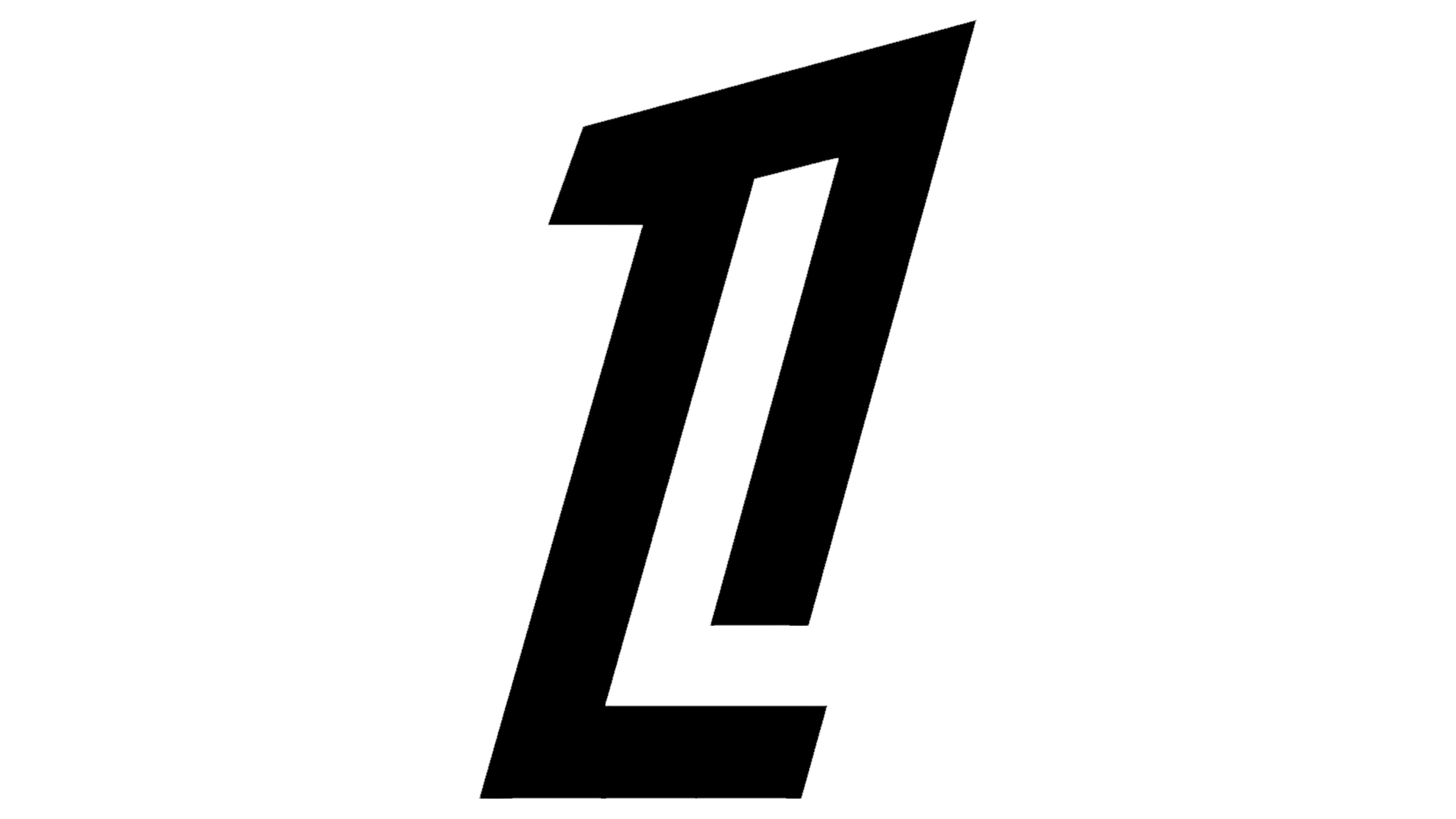
The new logo marks a significant change in Ligue 1’s visual identity. Instead of the previous trophy design, the new logo features a minimalist combination of the number “1” and the letter “L” joined together. This design aims to create a strong, recognizable identity for the league.
![]()
The logo is simple, using just a few strokes. The “L” is visible in the left stroke or inside the opening of the “1.” The basic logo version includes “Ligue 1” in a custom typeface similar to Laqonic 4F, with sloping ends. This typeface adds a contemporary touch to the design. An alternate version might include McDonald’s “M” before the wordmark, subtly indicating the new sponsorship while keeping focus on the league’s identity.
Reactions to the new logo on social media were mixed. Some fans appreciated the clean, modern design, while others felt it lacked tradition and did not honor Ligue 1’s essence. The shift from the hexagonal motif, which has been part of the league’s identity since 2008, to the new minimalist design signifies a departure from tradition.
![]()
The hexagon was iconic in Ligue 1’s symbolism. The competition’s trophy, introduced in 2006, features a disc with a hexagon-shaped center known as L’Hexagoal. Rumors suggest that L’Hexagoal might be replaced, indicating a comprehensive rebranding effort.
Fan reception has not met the marketing department’s expectations, with many comments criticizing the design for lacking personality. Some speculate that the designers aimed to merge the emblem with McDonald’s “M,” possibly using wavy fries imagery, though this connection is unclear. Another possibility is that the company allowed the tournament to focus on its identity, emphasizing “Ligue 1.”
The simplicity of the L1 symbol is a deliberate choice aimed at making the logo versatile and recognizable. The clean lines and minimalistic approach create a timeless and adaptable logo for various platforms and applications.