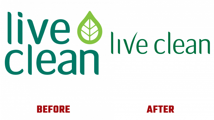
The main goal of the Canadian cosmetics manufacturer Live Clean is to make the lives of men and women cleaner, easier, and more joyful with the help of their natural personal care products. Having been on the market for 14 years, the brand is constantly improving the formulas of cosmetics and has thoroughly studied the needs of its consumer. All this and the peculiarities of today have become the reason for the need to update the appearance of the brand and its corporate identity. The idea came from ROOK / NYC, a creative agency based in New York specializing in branding, design, and creative packaging.
The new identity helped accurately and reflected the high performance of the Live Clean product, glorifying beauty and respecting nature. Visualization from ROOK / NYC is a new vision of the brand’s mission, spirit, and characteristics. The developed and implemented creative ideas for packaging design, reformatting the logo, creating a modern style are already demonstrating efficiency and effectiveness, drawing more attention to the company’s products. The identity renewal and design systems have raised awareness and accelerated the testing of new products, resulting in increased sales and consumer outreach. The new logo has retained its clean and simple beginning of the traditionally “brand block” in all directions of visualization. He reinforced the focus on natural, plant-based origin in each of the brand’s products.
This was facilitated by a bold icon in its creative execution, a simple, beautiful visual hierarchy. A thicker uppercase font in a rich, dark green color makes the logo easier to read. Two words located under each other and aligned on the right side are different in length. To fill the free space above the second word, a plant leaf symbol is placed, symbolizing the product’s naturalness. It creates symmetry in the composition, providing a visual form of the “brand block.” Having a different light green shade, the leaf acquires an accent effect, drawing attention to itself and the entire emblem as a whole.
The color palette has become the most effective way to reflect the natural origin of all Live Clean products, their safety and health benefits for humans. Being a color characteristic of all vegetation, symbolizing nature and naturalness, it transmitted important information about the characteristics of the products and the main goals of the brands.
Helped to improve the visual experience and reduce communication on the packaging, which opened up ample opportunities for creating new bold and bright designs that have a greater impact on the consumer.


