The PRS IN VIVO brand is a large company – a leader in marketing research. This kind of business and services industry presupposes the absence of bright graphic elements in the design to quickly convey to the client that the company is engaged in serious things.
But at the stage of the naming of the company, something already went differently. Vivo means “bright, lively.” This part of the name seems to have become the unspoken credo of the brand.
The consulting company in the fields of packaging, shopping experience, and new products has attracted attention from the very beginning with its creative visual design.
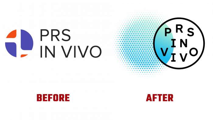
There was the usual black simple narrow font and an interesting icon that connected the rounded parts of the squares within a circle. In this case, parts of the square figures were red and blue, and between them, a white gap, keeping the figures in a safe location from each other. An interesting combination of warm and cold tones gave a contrasting perception and attracted the attention of potential customers with its immediacy of the design concept.
A new logo is presented, which is radically different from the previous one with its uncompromising creativity. A striking and unforgettable unusual design was developed in collaboration with the consulting agency Elmwood.
So now the logo is based on two circles. On the left is a green mesh (honeycomb) circle that has a green gradient. When crossing another circle with a black outline, the first has a completely colored area without dividing into small cells. Inside the black outline, the brand name is in typography. There is no pretentiousness or interesting serifs. Just these extra details are not needed; otherwise, the logo saturated with colors and elements would be visually overloaded as much as possible. The logo is full of diverse elements that do not match each other in texture but look organic.
It is difficult to say why exactly this tradition of creativity was chosen for the design of the logo.
Perhaps I wanted to show the small mechanisms that make up the marketing research, the coherence of parts, the consistency and ordinariness of actions.
Be that as it may, it was possible to preserve the individuality and uniqueness of the brand, which is why the name of the company is heard, and a huge number of customers use its services.
You can only be 100% sure that PRS IN VIVO has taken the path of innovation and rethinking of the digital age.
The current concept of the company is based on the characteristics of human behavior. This idea has been called “human advantage.” The latest discoveries in behavioral science have made it easier for market research pioneers like PRS IN VIVO to understand true consumer behavior and seek new business solutions.
The great hope is pinned on the new design: rethinking the brand’s activities in the plane of the study of human behavior will make customers’ lives easier unleash the potential not only of the company but also of the consumer environment as well as a whole.


