


![]()
Living Optics, a company founded at the University of Oxford’s Physics Department, has presented a new identity developed by the Metric Studio. The company produces hyperspectral cameras that reveal what the human eye cannot see. This opens new possibilities in science and materials research. The new identity emphasizes the company’s technical expertise and role in advancing optical technology.
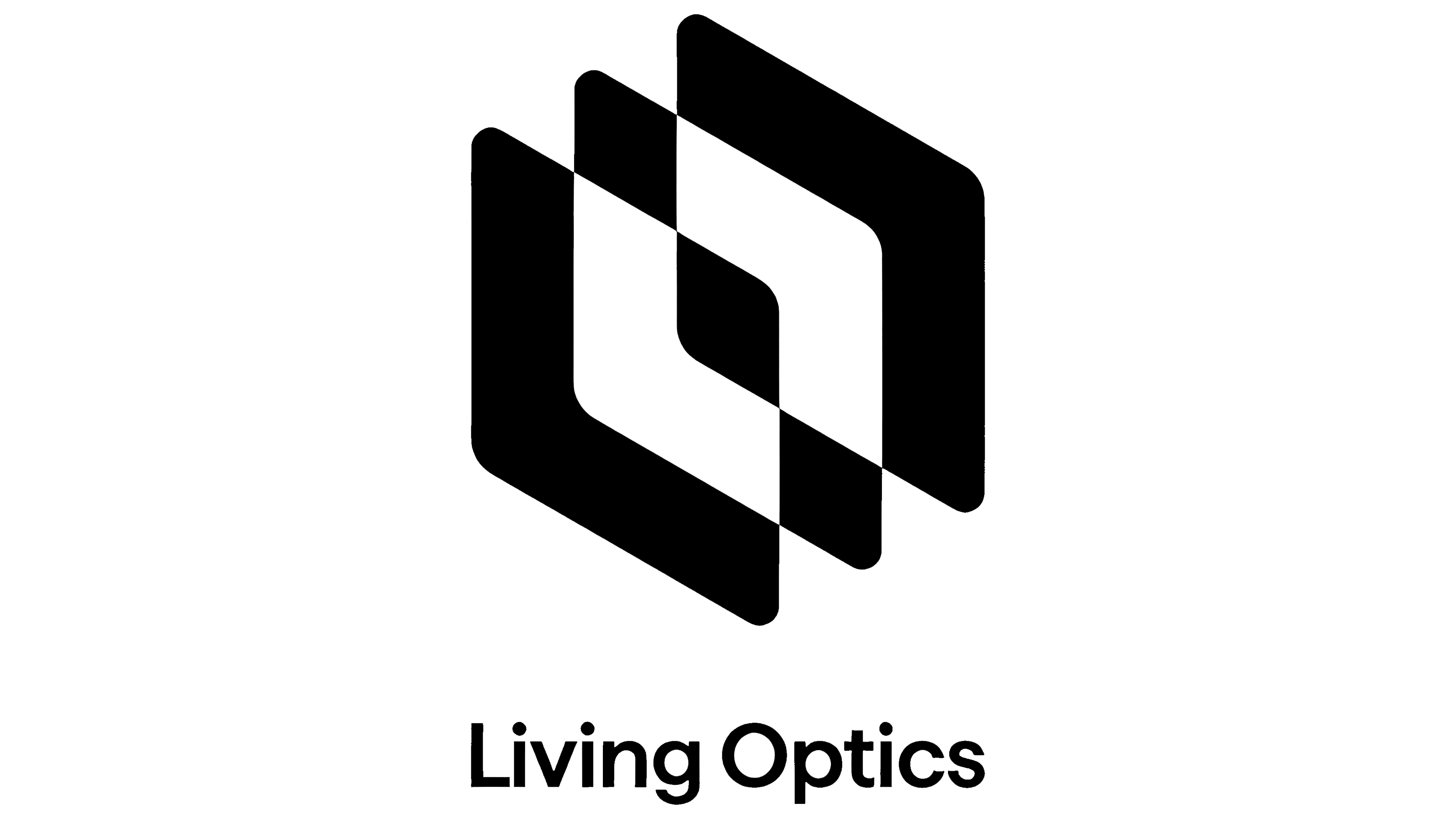
The logo is based on two hexagonal shapes resembling lenses or facets of glass. Their intersection creates depth, reflecting the principles of hyperspectral imaging, where cameras capture multiple layers of information. This concept relates to image processing, light filtering, and computer vision, key areas of the company’s work.
The use of empty and filled spaces emphasizes precision associated with data clarity. This aligns with Living Optics’ technological focus.
The company name is written in a neat, sans-serif typeface with precise proportions. The chosen typeface prioritizes clarity without unnecessary decoration, matching the company’s character.

The color palette is black and white, highlighting the brand’s scientific nature. The monochrome design conveys clarity and functionality, underscoring the company’s scientific orientation.
The updated identity effectively communicates Living Optics’ achievements in hyperspectral technology through geometric forms and minimalism. The new branding presents the company as a developer of advanced optical solutions suitable for science and business.