 The designers decided to bring back the old elements, adding uniqueness and modernity.
The World Series is an important event in the world of baseball. The best teams get the right to participate. It is not strange that a large-scale event attracts the attention of the press and baseball fans. In early March, the 2021 World Series logo was posted on MLB.com. Fans can happily imagine what to expect during this year’s game.
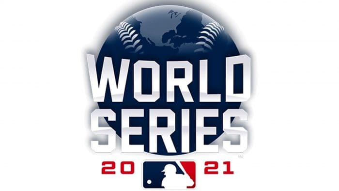
The logo consists of a blue baseball in the shape of the Earth. Above are images of North America and parts of South America and Africa. Baseball embroidery has been added to the top corners and the World Series lettering in white with silver tints in sans serif font and additional center elements. As with the images from previous years, the Major League Baseball logo is placed underneath in red, white, and blue with a neutral athlete. The numbers for 2021 have taken on a red hue.
If you analyze the chronology of the logos, you will notice that in the period 1998-2007, each image consisted of an element with the image of the Earth. In 2021, designers brought back the tradition and added continents by combining two symbols in one logo: a baseball and a planet. For the first time, the World Series logo features land areas.
The World Series has been held since 1903. The logo for a historical game should reflect the greatness of the event. Designers use vibrant colors, large fonts for the title, and graphic details that change every year. The 2021 image is not overflowing with additional elements and does not copy the design of last year. This is perhaps one of the best sports game logos we’ve seen so far this year.


