The modern, simple, and minimalist Loreal logo possesses deep symbolism. The elegant font reflects the presence of balance, a subtle sense of style, true beauty, naturalness, and purity, as well as the characteristics of the cosmetic brand and its products.
Loreal: Brand overview
| Founded: | 30 July 1909 |
| Founder: | Eugène Schueller |
| Headquarters: | Clichy, France |
| Website: | loreal.com |
Meaning and History
The company’s career takeoff began with the opening of the young chemist Eugene Schueller. He offered Parisian hairdressers to dye hair with his scientific development – a unique dye called Aureale. Thus, from the first steps, the company moved in an innovative direction.
The L’Oreal logo is not an image or a symbol but merely a wordmark. Therefore, its appearance and way of writing are extremely important for maintaining the visual identification of the trademark. All letters in the company’s name are written in uppercase but are given in two versions: in one case, a larger “L,” in the other – “O.” There is also a version made with small symbols. Thus, by varying their size, designers were able to stay within grammatical rules and emphasize the brand’s individuality.
In 1973, the cosmetic brand got a slogan reflected in some versions of the company’s logo. The phrase “Because I’m worth it” was proposed by 23-year-old editor Ilon Specht from McCann Erickson. It significantly increased the company’s popularity and attracted many customers.
What is Loreal?
It’s a French company that produces cosmetics and perfumes. It was founded in 1909 by pharmacist Eugene Paul Louis Schueller, who developed his hair dye formula. Later, the range expanded as the organization conducted constant beauty research. Loreal’s headquarters is located in the commune of Clichy near Paris.
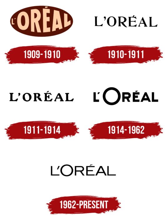
1909 – 1910
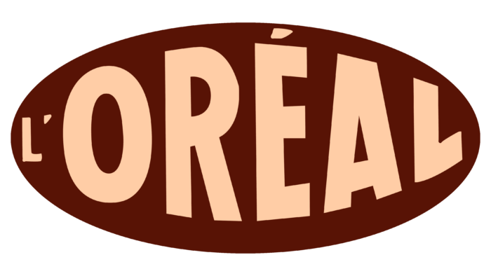
In the original logo, the word “L’Oreal” is placed in a brown oval and made of beige letters, reminiscent of the color of powder or foundation. The first letter, “L,” is tiny and inconspicuous. The inscription is evenly distributed throughout the oval space.
1910 – 1911
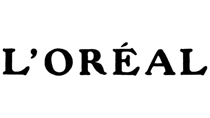
A year after its foundation, Loreal began using a simple logo with black letters on a white background. It was the word “L’ORÉAL,” written in uppercase. It looked unusual, thanks to the contrasting geometric font with thin serifs. The most non-standard was the letter “R,” which went beyond the line of the right leg.
1911 – 1914
After the redesign, the font changed. The letters became more rounded and bold. At the same time, their edges blurred, including due to rounded corners. Designers shortened the protruding leg of “R” to align the inscription horizontally.
1914 – 1962
In 1914, the Loreal logo changed again. Maintaining the general concept (black inscription on a white background), the developers replaced the contrasting serif font with a bold sans-serif font. At the same time, they shortened the accent mark above “É” and the apostrophe after “L,” turning them into small skewed trapezoids. But the main feature was the letter “O,” which turned into a large, perfectly round ring.
1962 – today
The font chosen for the updated wordmark is simple, legible, and expressive. It has no serifs, and the letter “O” is larger than the rest, although they are all uppercase. The primary color is traditionally black, and the background is white.
Loreal: Interesting Facts
- Starting Out: Eugène Schueller created a hair dye in 1909, kicking off L’Oréal’s story.
- Growing Bigger: L’Oréal expanded by buying other brands, such as Lancôme and The Body Shop. This allowed them to offer more beauty products and reach more people worldwide.
- Creating New Things: They have a big team in over 60 countries just to come up with new beauty products. They’re always trying to find new ways to improve beauty products.
- Caring for the Planet: L’Oréal wants to be good to the Earth. They’ve set goals to use less and do less harm to the environment by 2020.
- Welcoming Everyone: The company works hard to ensure that its team and products are as diverse as its customers worldwide. It has been praised for treating men and women equally at work.
- Tech and Beauty: L’Oréal uses technology, like apps that let you try makeup virtually, to make shopping more fun and helpful.
- Fair and Kind Sourcing: They’re careful where they get ingredients, ensuring they’re not hurting the planet or people.
- Leading in Beauty Tech: L’Oréal is exploring cool new tech to make beauty more personal, like using AI to determine skin needs.
- A World of Beauty: Their products are available in over 150 countries and are designed to suit many people’s tastes and beauty standards.
- Helping the Community: They support science education for women and believe it’s important to help everyone get the chance to do great things in science.
L’Oréal has come a long way from just selling hair dye. They’re all about new inventions, being kind to the planet, including everyone, using tech in beauty, and helping out in the community.
Font and Colors
Thanks to the conciseness, the brand’s symbolism is recognizable and universal: it is suitable for both advertising and commercial purposes. The emblem looks equally good as a label on the products and official stationery on official documents. The logo is often supplemented with the words “Professionnel” or “Paris.” The first is placed at the bottom, the second – in the center under or on the leg of the last letter, “L.”
The color palette represents a classic combination of light and dark. In the corporate version, the background is black, and the official label is white and resembles a film negative. However, the opposite arrangement is also acceptable. This elegant combination symbolizes innate style sense and also purity (white) and mystery (black). It’s worth noting that the logo can be done in another palette based on specific adaptations. But most often, it’s dark maroon and shades of gold, sometimes with a 3D effect.
At the dawn of its career, the perfume and cosmetics company used a logo with a unique hand-drawn font consisting of large letters of different sizes. The central symbols were the largest, the outer ones the smallest. The modern version is a smooth, grotesque sans-serif font. The color is restrained and monochromatic, consisting of black letters on a white background.
Loreal color codes
| Black | Hex color: | #000000 |
|---|---|---|
| RGB: | 0 0 0 | |
| CMYK: | 0 0 0 100 | |
| Pantone: | PMS Process Black C |
FAQ
What does the LOreal logo mean?
At first glance, LOreal has a very simple logo without hidden meanings, as it contains only the brand name. But even this minimalist design has special significance: the elegant letters symbolize balance, style sense, and true beauty that lies in simplicity. Black color embodies mysticism, and white represents naturalness and purity.
What does the L Oreal logo represent?
The logo of this brand contains only the inscription “L’ORÉAL.” The text of the sign is executed in black sans-serif font. All strokes are approximately the same thickness. The letters are uppercase, with the letter “O” slightly enlarged. The company name may be complemented by the words “Paris” or “Professionnel,” but they are not in the main variant.
