With COVID-19, humanity continues to look for ways to reestablish a familiar, comfortable existence. This includes the real estate industry, where New York Hadar Landau and Omri Klinger, founders of RealFriend, recently launched an artificial intelligence that allows you to connect those who are busy looking for real estate with the homes of their dreams. A chatbot named Luke searches for a property by specified parameters among a huge number of offers, providing detailed lists to thousands of users each month. The service is free at the initial stage of implementation. One of the advantages of using the bot is that the latter does not have to rest and the convenience of always having the required information at hand. It quickly and efficiently filters out false or irrelevant information, saving users time and money.
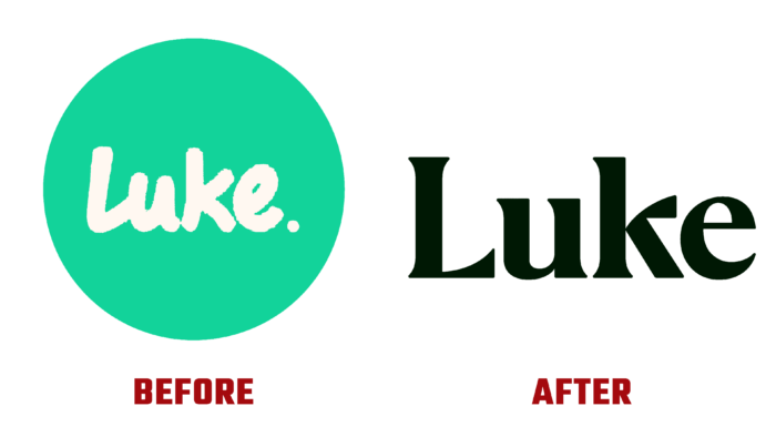
In the use process, the platform experienced some adjustments in further expanding its capabilities. This required changes to the visual identity. The strategy was revised, supported by a new visual identity that effectively reflected the confidence and experience of New York’s most forward-looking and advanced electronic real estate assistant. The entire system was built around a schematic floor plan image that was able to combine bold typography with the mechanics of the chat itself. The effective combination of traditional innovations and the power created by the chatbot with artificial intelligence, which was successfully embodied in a neighborly and accessible to all avatar characters named Luke, ensured the attractiveness of the service and its user-friendliness of it.
In the new logo, a serif font was used, gaining high clarity and quality, making it readable in all sizes, both in classical typography and modern digital media. Its letter “k,” as well as the GT Alpina and Object Sans fonts, ensured the attention attracted to the text part of the logo. The appealing effect was reinforced by creating a beautiful rhythm between the vowels and high consonants. The atmosphere created by the logo creates a feeling of the company’s presence, the possibility of giving it boundless credibility.
The updated character has also become less hipster and more appealing. The image itself provides ample opportunity for its further development. The beautiful choice of hues, featuring bright and saturated colors, placed throughout the space from the avatar to the layouts only increases the effect of the brand’s appeal and memorability. This makes the platform a high-end user experience tool.
