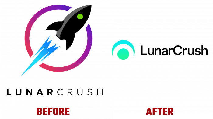
Introduced an updated version of the service for financiers making transactions on and off exchanges, made clearer and more enjoyable to use. All of this applies to LunarCrush, developed as an automated data collector of cryptocurrencies, bitcoins, crypto exchanges, and real-time actions performed on social networks by economic influencers. Over the years, the service has demonstrated its effectiveness and necessity for those who want to be constantly aware of the daily events of the financial world. With the help of this service, not only are any actions tracked but also possible changes and situations in the financial world are monitored and analyzed. Given the modern speed of information processing, the emergence of reactions to certain actions, LunarCrush has become the best way to use the data obtained quickly. It gathered the best practices that encapsulated this experience, providing changes at warp speed, which became the basis for the formation of the visual identity of the brand. Together with it, everything happens at crazy “space” speeds, providing users with state-of-the-art technologies on the verge of future technologies. Naturally, this approach has led to the need to create a new world that overflows with passion, curiosity, wit, and action, in its speed and power, comparable only to the effectiveness of a laser beam.
The logo designed for the service was an original combination of its purpose with its virtual interpretation. It harmoniously combined two basic concepts contained in the very actions of the software – the moon and the human eye. The planetoid was applied in more ways than one. First, it echoed the brand name. Second, it was possible to reach the lunar surface in three years. The eye is the main symbol that characterizes the brand as a whole. Its main task is to observe, study patterns, look for trends, and broadcast the result to take informed investment actions.
For a more effective influence of the logo and the whole visualization of the brand on the user and to reduce distracting factors, we decided to reduce the number of color palette elements significantly. Reducing the number of hues by nearly four times allowed the graphic compositions to be better grouped, making their visual impact on the viewer more focused. Retaining the basic colors – shades of green and purple, the brand gained the necessary diversity and conformity with the created world of the Moon Universe. The main part of the new world was the illustrations used in its formation, a unique iconography that distinguished the brand among the millions of inhabitants of social networks. It was very successfully used to demonstrate optimism and concern for one’s future and pride in participating in such a key moment, which is shaped directly by the platform itself.


