Modernity is characterized by constant movement, development in all spheres of human life. This is especially true for business and fashion. Any slowdown in these areas is a decline in profits, profitability, a direct path to collapse. Sisters Amalia and Manuela Sierra, co-owners of the popular brand for the design and production of stylish beachwear and sportswear for all ages, Colombian company Maaji from Medellin, are well aware of this. Thanks to their unique vision and creativity, the company owners were able to create inimitable lines of beachwear, distinguished by original color compositions, a variety of shapes, and textures, which has become a characteristic feature of all the brand’s products.
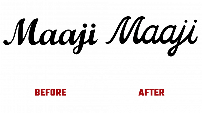
But despite all the attractiveness and eclecticism of the models, excellent quality, and unique product design, the company must continue to move forward and develop successfully. To keep up with the times, it must pay special attention to its image and promotion; Maaji decided to change its design and logo. This should serve to strengthen ties with regular customers, expand the number of buyers, strengthen positions in the market, and demonstrate adherence to their ideals in the development of new model lines.
The logo font has become thinner and more attractive. The capital “M” has been smoothed out to resemble the waves crashing onto the beach visually. She becomes the central element of the logo, a reflection of the spirit and goals of the company. In this design, this name element looks very good as a single monogram – a monogram, with an asserting dot in the upper left corner of the letter symbol.
To convey all the magic of beauty and riot of colors characteristic of Maaji products, to create the required atmosphere, elements were developed and applied to create a visual identity, reminding everyone of the true purpose of the company’s offerings. Sun and water, wind and beach – all this against the background of a changed color palette, designed for packaging and image advertising products, tags and bags, stickers and cans create an indescribable beach atmosphere. The work on color created the desired atmosphere, in which neon yellow coexists with hues characteristic of past designs but in a brighter performance. The addition of accent black to this palette was an ingenious solution, providing a sense of disconnection with time while simultaneously softening the visual impact on the consumer.


