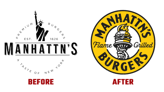
The brand’s history began in 2011 when Jerry Vandermeulen decided to start selling Belgian waffles in New York. For two years, he has been offering national “goodies” in the concrete wilds of the “Big Apple.” In 2013, Jerry was joined by his brother, Phil, to bring the “enchanting vibe” of New York to the world by introducing original New York cuisine to the people of Brussels. Starting with the original mixing of hamburgers, as is the case with blending elite Bordeaux wines. The new recipe, which has been developed for two years, has created an original mixture of beef obtained from grass-fed Irish Angus. At the same time, only fresh Belgian potatoes are used in the recipe and a delicious bun, the preparation of which was based on the original Little Italy recipe. All products are handmade and made to order. The bun is delivered by couriers every day after morning baking, which characterizes the brand only from the favorable side. Considering the possibility of expanding the range and service areas, the brand rebranded the company, making significant changes to the company logo and identity.
Using the previous sign’s round shape as a basis, the developers made it more informative and attractive. The two circles, one inside the other, reflect the essence of the brand, offering an introduction to two different histories and cultures in the catering industry. At the same time, it is a symbolic way to convey a connection with one of the brand’s most attractive products – the New York hamburger, which has become the main symbol of the brand, filled in the form of an integral part of the torch of the Statue of Liberty.
In a large circle around the circumference is placed the company’s name, made in bold black. Yellow was chosen as the brand’s main color to enhance its attractiveness, against which the execution of the text in contrasting black ensures its lightness of reverence, regardless of its size. The small circle has no color filling, and the same shade of yellow is used in the torch depicted in it, highlighting the flame itself and its reflection. Both circles are crossed in the center by the inscription Flame Grilled, made in capital letters, typical for writing advertising blocks of the middle of the last century.
Being a small, dynamic, but the fun company, the brand has tried to reflect these important features in its own identity. In addition to its main direction – the creation and sale of original and delicious dishes, the brand offers employment opportunities for everyone who is ready to join the small but friendly family of the company. At the same time, the brand is distinguished by its conciseness and ease of remembering, which makes the logo especially interesting.


