


 Marist Red Foxes Logo PNG
The Marist Red Foxes logo symbolizes intelligence, agility, and flexibility. These qualities, valued in both sports and academics, enable the university’s teams to triumph over their opponents. The emblem highlights reliance on instincts combined with athletic skill and determination.
The Marist Red Foxes athletic program began with the founding of Marist College in Poughkeepsie, New York, in 1929. The Marist Brothers, a Catholic religious order of French origin, established the school. Students organized early competitions, and the Red Foxes nickname reflected the Hudson Valley’s wildlife.
During the 1950s and 1960s, Marist remained a small college with limited athletic resources, and basketball became the main campus sport. The opening of the McCann Recreation Center in 1977 gave the teams a permanent modern venue. In 1981, Marist joined the NCAA at the Division III level and formally entered the national college sports system.
In 1994, the college entered the Metro Atlantic Athletic Conference (MAAC), creating regular rivalries with Iona, Rider, Fairfield, and Siena, along with access to automatic national tournament berths. Women’s basketball produced the program’s leading results under coach Brian Giorgis. The Red Foxes reached the national tournament for the first time in 1997. They advanced to the Sweet 16 in 2007 after defeating higher-profile opponents.
Men’s basketball continued to compete for league titles, with Siena becoming a frequent rival. Marist expanded its facilities again in 2011 with the opening of Tenney Stadium, built for football and lacrosse. The project broadened the college’s athletic base, supported a wider varsity schedule, and kept basketball as its most visible sport on campus in later competition.
Meaning and History
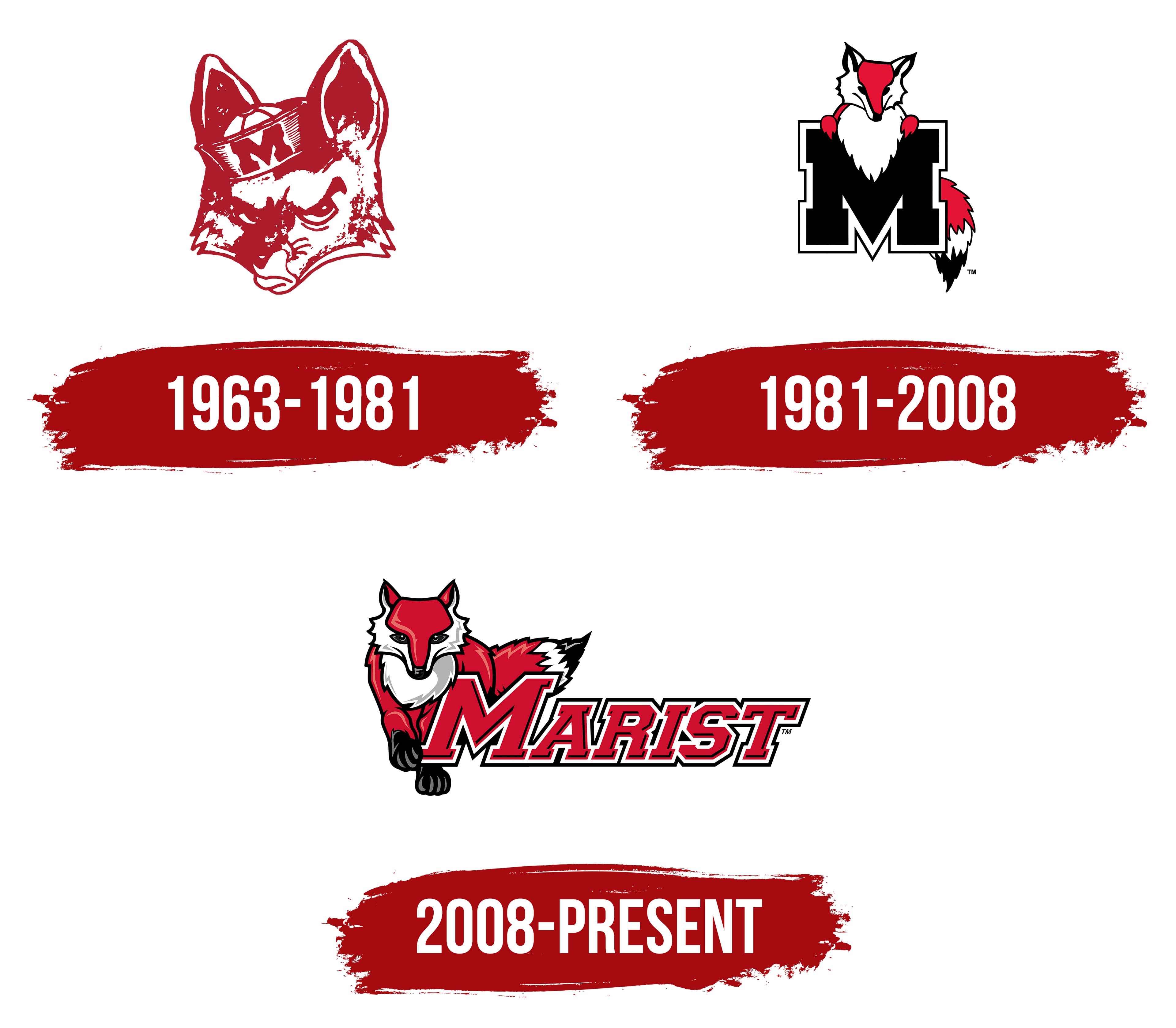
What is Marist Red Foxe?
These teams represent a college in Poughkeepsie, New York, that plays in the NCAA Division I Metro Atlantic Conference. Basketball games are played at the McCann Arena, football games at Tenney Stadium, and baseball games at the McCann Baseball Field. Their competitions, especially women’s basketball and athletics, are accompanied by red and white colors and the Frankie the Fox mascot.
1963 – 1981
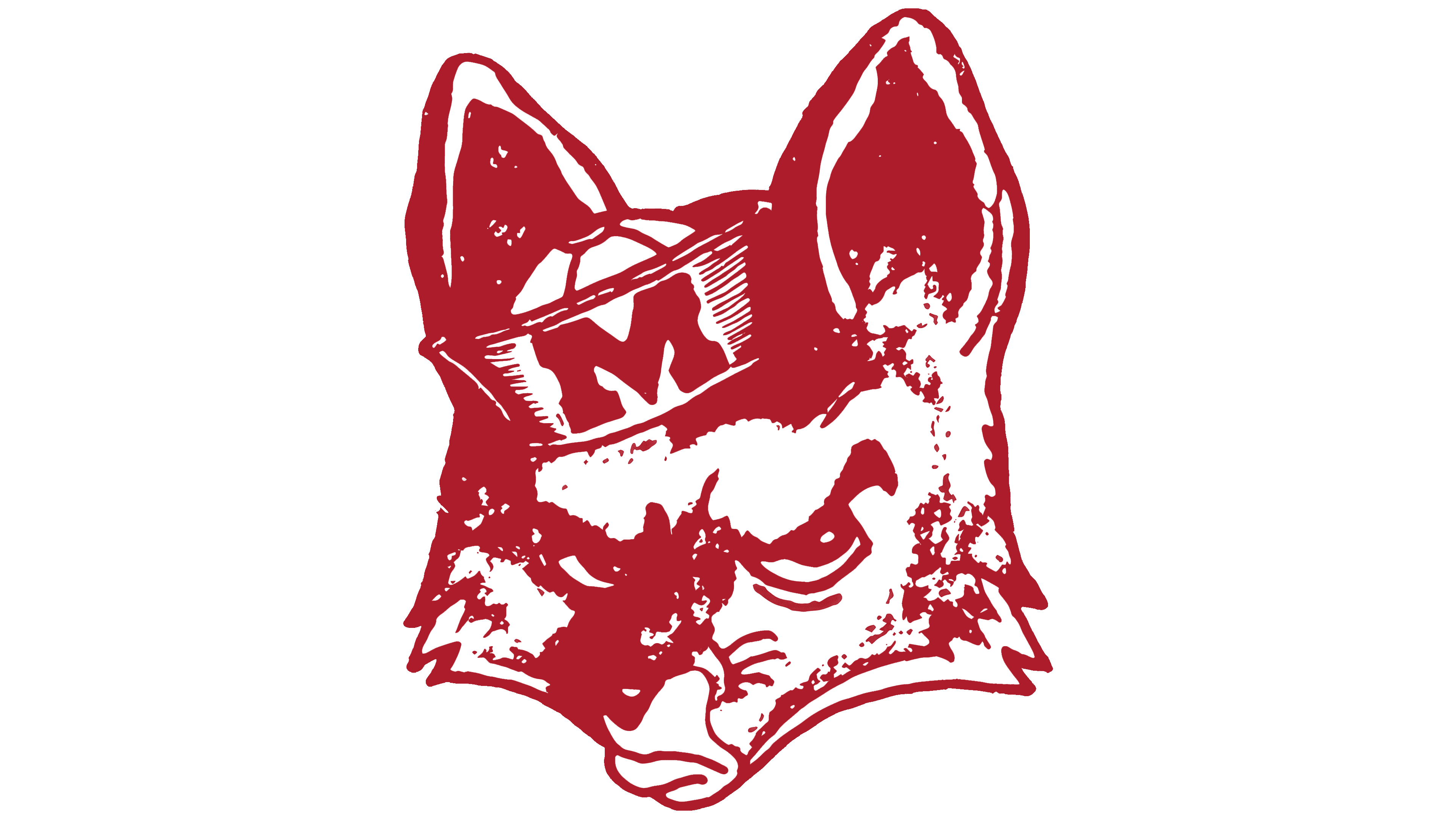
The emblem, created for the campus opening, features a fox’s head that conveys alertness and tension. The gaze is designed to resemble a human’s expression. The team mascot is named Frankie in honor of the foxes native to the area. This animal embodies cunning and intelligence, qualities aligned with the spirit of athletic competition.
The fox’s head is depicted with a sailor’s cap with the letter “M,” representing the first letter of the institution’s name. The university and team name are associated with the Catholic brotherhood, the Marist Brothers, which focuses on youth education and was founded by the college. The cap on the mascot complements its image, reflecting the team’s achievements in rowing, a sport that holds a significant place in the institution’s athletic history.
1981 – 2008
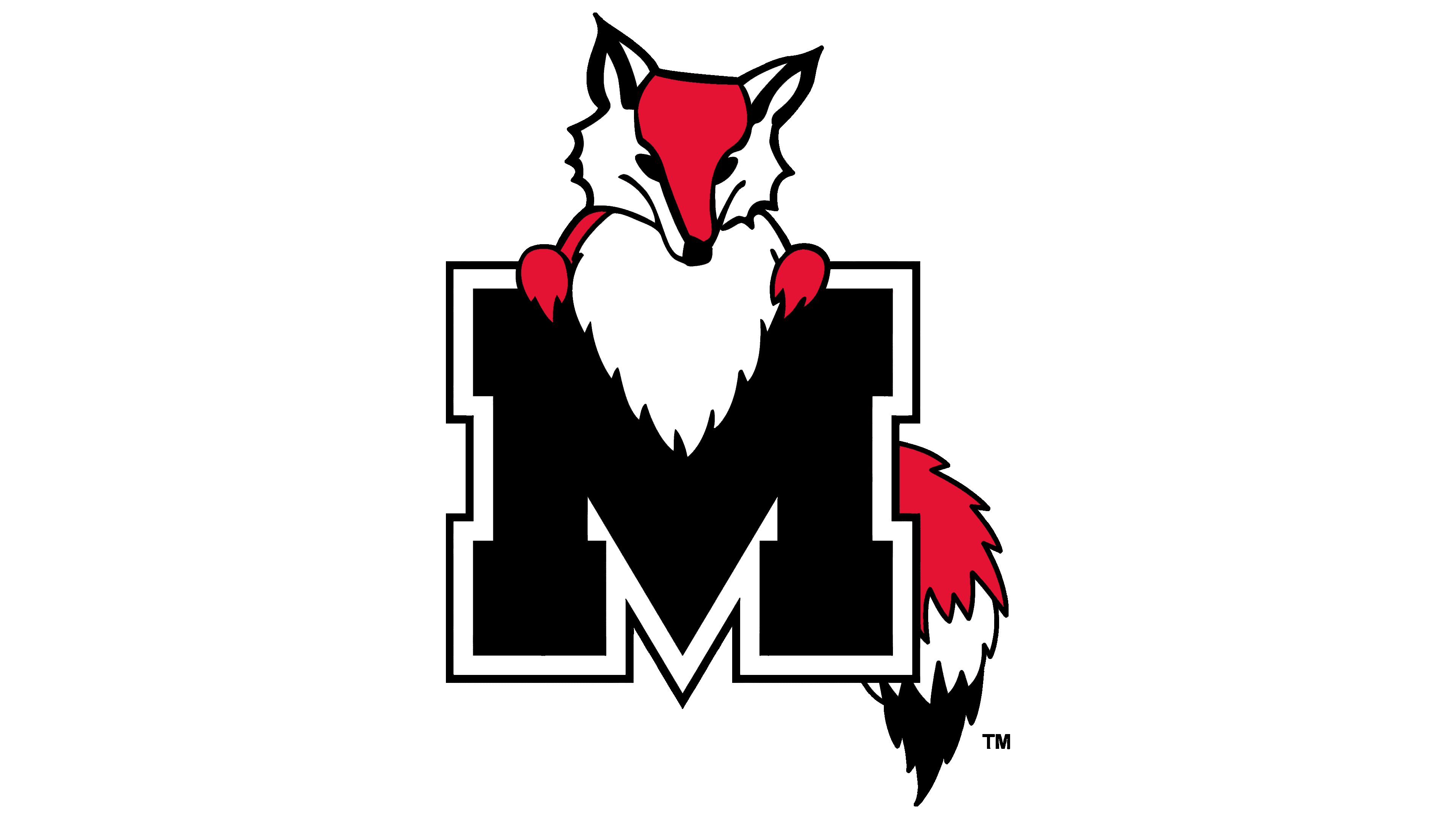
The emblem features the letter “M,” designed in a solid, reliable style. The black color emphasizes power and confidence, distinguishing the team from its competitors. At the top center of the letter, a fox is depicted, resting its paws on the vertical lines of the symbol. Its tail, shown in profile, adds an element of playfulness and dynamism to the image. The animal appears to be coyly peeking out from behind the massive structure, resembling a protective fortress.
The updated logo emerged as part of changes associated with the appointment of a new university president and the campus’s modernization. These updates highlight progress and renewal while preserving the institution’s core principles and symbols.
2008 – today
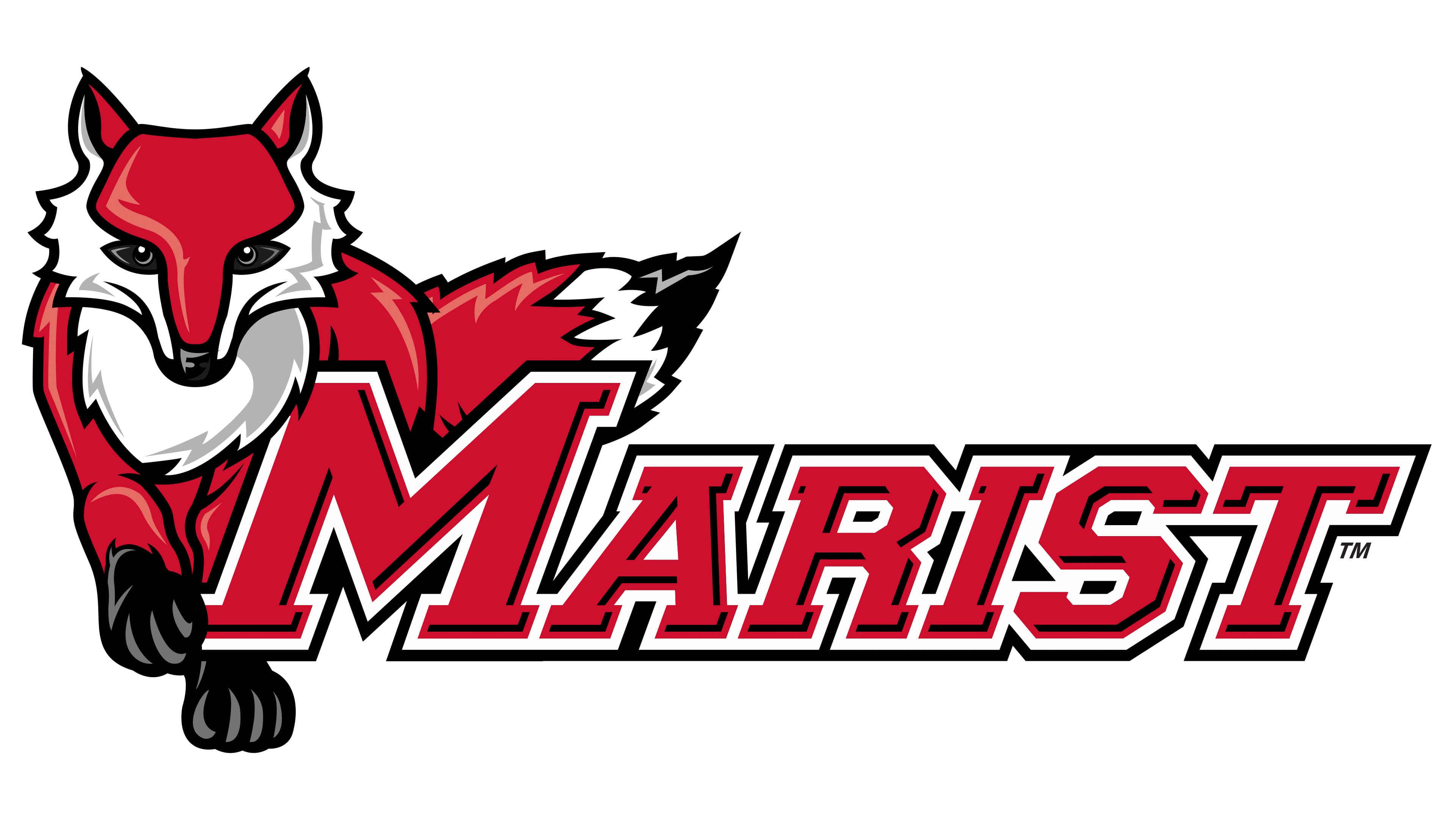
The logo has been updated with new features that emphasize speed and determination. The fox is depicted in motion, with a more realistic appearance, losing its cartoonish and anthropomorphic elements. The predator moves across the space, encircling the team name, rendered in bold red lettering with sharp lines, accented by contrasting white and black outlines.
The emblem’s composition showcases confident forward motion and goal achievement. Each element highlights the team’s resilience and perseverance, reflecting determination and readiness for any challenge.