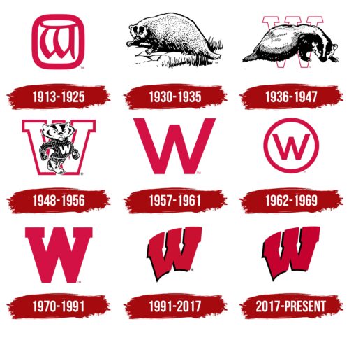
The Wisconsin Badgers logo consists of visually heavy elements, but this does not prevent it from appearing airy, flexible, and flying. So the designers showed the ease with which athletes win competitions and defend the honor of their university. And the color scheme of the emblem expresses vivid emotions: a passion for sports and aggression towards competing teams.
Wisconsin Badgers: Brand overview
| Founded: | 1889 |
| Headquarters: | Madison, Wisconsin, U.S. |
| Website: | uwbadgers.com |
This athletic department is owned by the University of Wisconsin and competes in 25 sports. Its most successful teams are soccer, basketball, and hockey. The Wisconsin Badgers logo was adopted in the early 20th century, although the university dates back to the 19th century. Its students play in NCAA Division I and the Big Ten Conference. The head of the division is Chris McIntosh (as of 2022).
Wisconsin Badgers representatives have competed in the Big Ten Conference in all sports since the 1896-1897 season. Women’s ice hockey players are also members of the WCHA (Western Collegiate Hockey Association), and rowers compete in the EARC (Eastern Association of Rowing Colleges). University of Wisconsin students have won 31 national championships and captured 50 Olympic medals, 13 of which were gold. They compete at several venues: Camp Randall Stadium, UW Field House, and Kohl Center.
Meaning and History
The teams are called Wisconsin Badgers because of the nickname of the local miners. In the 1820s, their families lived in “dens,” hiding from the cold in tunnels like badgers. The life of the members of this state was spent in the mines, which was the reason for this nickname. Over time, people were given normal above-ground homes, but the nickname remained. For a time, the UW had a real badger, a willful and unruly animal. He was then replaced by another character – a disguised animator.
The team mascot appeared in 1889 and was given a nickname later, in 1949. As a result of the contest, he became known as Buckingham U. Badger or simply Bucky Badger. This official symbol is used in several variations of the sports team logo. It is also allowed for non-purpose uses – on various university-related items, clothing, and other prints. In all, the Wisconsin Badgers have changed nine logos.
What are Wisconsin Badgers?
The Wisconsin Badgers is the name of the University of Wisconsin athletic department. It has 23 teams that compete in 25 sports. They compete in the Big Ten Conference and are in NCAA Division I.
1913 – 1925
The first emblem features a monogram of the letter “W,” which, upside down, looks like a “B.” That is, the logo encodes the name of the Wisconsin Badgers athletic department. The glyphs are made with thin and light strokes, gracefully curved in the signature red lines. The stylized monogram is placed in a square with rounded corners.
1930 – 1935
For the next five years, the Wisconsin Badgers logo featured a badger drawn in a realistic style and its natural habitat. It has long hair, sharp claws, a massive body, and an attentive look. The animal is positioned sideways, and its head is turned directly toward the beholder. This emblem is in black and white.
1936 – 1947
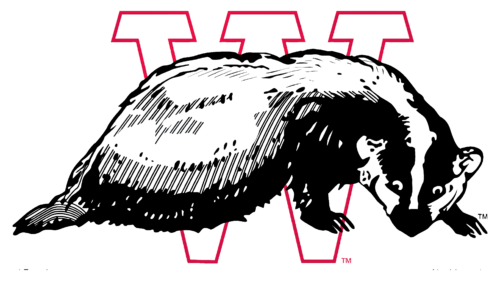
The designers changed the position of the badger’s body, turning it the other way around. The artists made the animal more ferocious and menacing. They lengthened its claws, highlighted its ears, and emphasized its nose and eyes. Bucky Badger’s body is pressed to the ground, and a black stripe runs along the bottom of the fur that hangs to the ground. Behind it is a large “W” fragment with trapezoidal serifs. The middle of the glyph is white and broad, and the edges are red, outlined with a thin line.
1948 – 1956
The image in this Wisconsin Badgers logo is by the artist Art Evans. He is the author of the pouty and scowling badger in the black and white striped sweater. The anthropomorphic animal walks forward on two legs, proudly spreading its chest and threateningly clenching its fists as if it wants to attack the enemy. The background letter “W” is now much larger, and its lines are wider. The emblem is executed in a monochrome palette.
1957 – 1961
From this time, the era of the block “W” began. In this version, the letter is bold and tall, with the sides extended upward, while the middle fragment is omitted: it does not reach the level of the neighboring stripes. There are no serifs in the single glyph.
1962 – 1969
The designers reduced the “W” in the Wisconsin Badgers logo and took the letter in a ring of the same thickness. They also made the color the same – red.
1970 – 1991
In this version of the logo, the block letter is solid and bold, with rectangular serifs on the right and left. The center element is aligned with them in height.
1991 – 2017
The logo remained text-based. The block “W” received a modernized design: it became slanted, graceful, and slightly curved. In the gaps between the three legs (in the negative space), we can see “spears” – stylized peaks pointing downwards. They show that sports teams are not as simple as they may seem and that they have hidden tools to influence their opponents. The color scheme has also changed: red is shifted to a darker palette and combined with black, which emphasizes the volume of the letter. The contrasting shadow makes it look three-dimensional. The serifs are retained but extended upwards.
2017 – today
The current Wisconsin Badgers logo differs little from the past version: they have identical colors and shapes. Only the width is different: the block “W” is wider now than it used to be. But this is not conspicuous because of the sharp elements, which remain in the same places: at the ends of the serifs, in the intra-letter spaces, and at the bottom at the base. The letter is still located diagonally.
Font and Colors
The team’s visual identity evolution from the University of Wisconsin has been gradual. Abrupt changes occurred only twice, in a major redesign: in 1930 and 1957. In the first, there was a shift from textual to pictorial design; in the second, graphic to textual.
All of the Wisconsin Badgers logos have an individual font. The letters are drawn rather than printed. There are no complete analogies to existing typographic styles: small adjustments are taken throughout. The university palette consists of two colors: neutral white and Cardinal red.
Wisconsin Badgers color codes
| Venetian Red | Hex color: | #c5050c |
|---|---|---|
| RGB: | 197 5 12 | |
| CMYK: | 0 97 94 23 | |
| Pantone: | PMS Bright Red C |


