![]() Ohio Bobcats Logo PNG
Ohio Bobcats Logo PNG
The Ohio Bobcats’ progressive and assertive logo serves the paramount purpose of intimidating competitors. A potent imagery radiating strength, determination, ambition, and boldness is incorporated into the design. With such a symbol, the university teams feel under steadfast protection, as demonstrated during competitions.
Meaning and History
![]()
Although the university was established in the early 19th century, its sports department only emerged towards the end of the century. It involved assembling various teams for a long time, seeking a visual identity that would stand out from competitors, experimenting with colors, and contemplating its emblem. For instance, student-athletes currently compete in hunter green and white, whereas previously, they played under blue and white. However, a coach later suggested replacing the blue with olive because Dartmouth College, where he studied, used this specific combination. Later on, the olive transitioned to dark green.
The official name underwent a similar evolution. It didn’t exist in the early years, so baseball and football players wore no distinctive insignia. However, as the number of teams grew, the university considered establishing a personalized name and symbolism. Consequently, in 1925, the institution organized a contest to name the animals and choose a catchy nickname for the athletes. The bobcat, suggested by alumnus Hal H. Rowland, won. He received $10 for his contribution. Much later, the cunning and bold lynx became known as Rufus and eventually served as the mascot, adorning the entrance to Peden Stadium.
What is Ohio Bobcats?
The Ohio Bobcats refers to 16 collegiate teams made up of Ohio University representatives. The sports program was launched in 1894, but later received its current name. Initially, it was called Green and White by the colors used. In 1925, a lynx was introduced as the mascot, chosen for its natural cunning and audacity. In 2006, the animal was named Rufus, a suggestion that emerged from a student-wide competition with over 500 entries. The university athletes are founders of the Mid-American Conference and participants in the NCAA.
1907 – 1940
![]()
The logo features a monogram composed of the initial letters. It showcases the abbreviation “OU,” derived from the institution’s name, Ohio University. Both letters are uppercase, but despite their size difference, they remain identical in dimension: the height of the vertical “U” is the same as the width of the horizontal “O.” The glyphs are colored green and outlined in a goldish hue. This emblem primarily adorned the jackets, sweaters, and T-shirts of the initial teams.
1940 – 1958
![]()
The logo from these years has a sporty look since it resembles a ball. At first glance, it might seem to feature a geometric pattern, but it’s a coded palindrome of the word “Ohio.” The white stripes represent letters arranged in a specific order. They occupy two light-green semi-circles, united by a common golden frame. This symbol was once used on the men’s basketball team jackets and displayed on their Grover Center court. All lines are smooth, straight, and of medium thickness.
1958 – 1978
![]()
For the next 20 years, the Ohio Bobcats athletes rallied under a logo with a roaring lynx head. Back then, it adorned the center court of Convo and gained widespread recognition thanks to basketball player Walter Luckett, who appeared alongside him on the cover of Sports Illustrated in 1972. Sharp fangs protrude from the animal’s open mouth, indicating its fierce nature. Although the face is centered, the ears extend beyond the circle’s boundary. The lynx’s eyes are golden with a green pupil. The sports department’s name is positioned at the top and the bottom, with ample spacing between the characters.
1978 – 1996
![]()
Designers featured the imprint of a lynx’s paw, signaling that the Ohio Bobcats teams could leave their mark on American sports history. And it truly resonated: In 1994, Gary Trent led the basketball team to the NCAA Tournament and the NIT Championship. The emblem showcases a genuine imprint of the predatory animal. It’s colored in the signature green shade and tilted to the right.
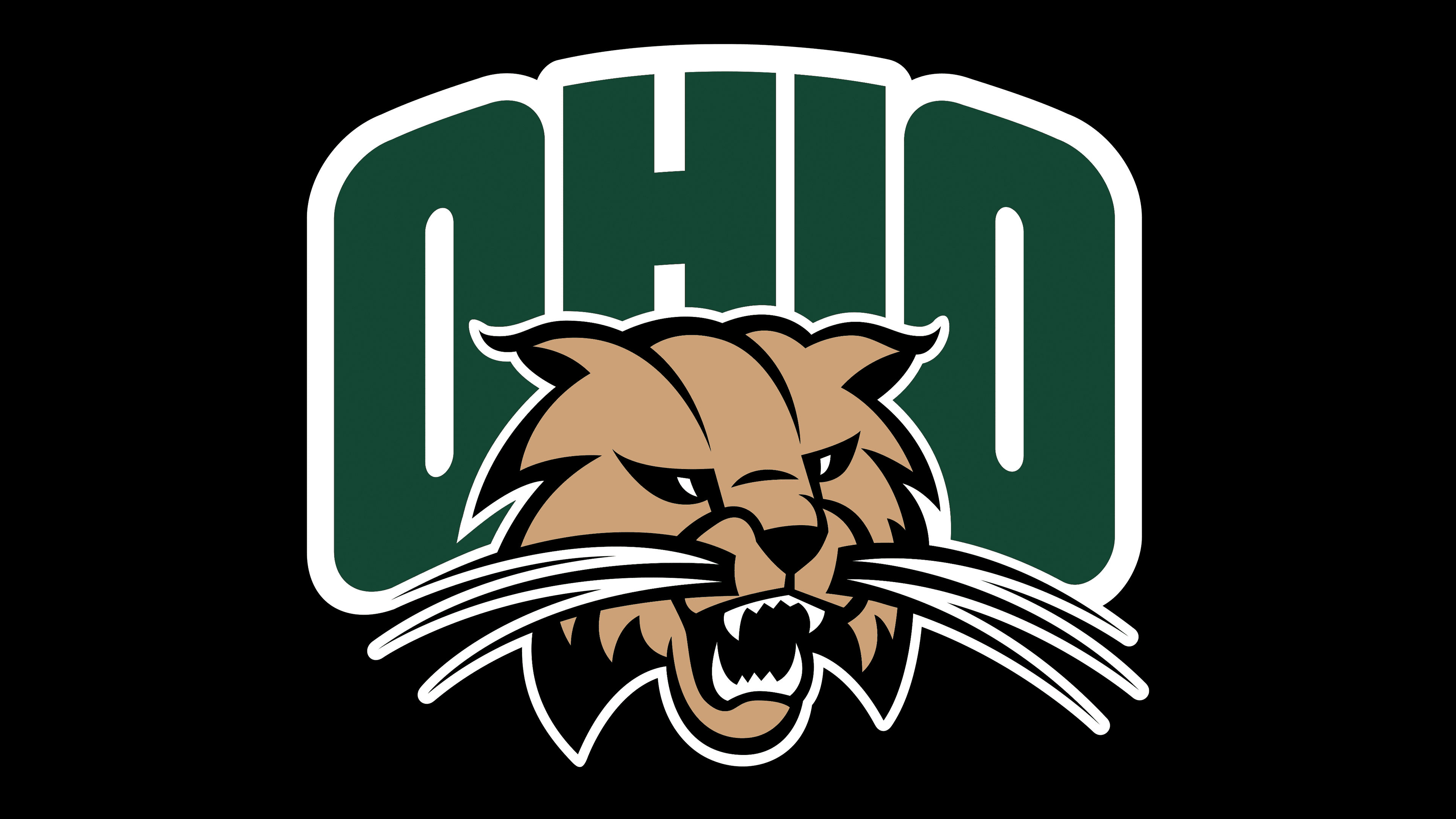
1996 – 2011
![]()
The logo now features a gold-brown bobcat head with a menacingly bared face. The beast snarls, ready to pounce on its opponent. To create depth in the image, designers added black shadows, which effectively highlighted the silhouette. The animal’s teeth and eyes are colored white for a better visual effect. In the background is the state’s name from which the sports department originates. The word “Ohio” is in large, uppercase font. It doesn’t have serifs; it has smooth, straight edges. Below, the word “Bobcats” is in the same style as the first part.
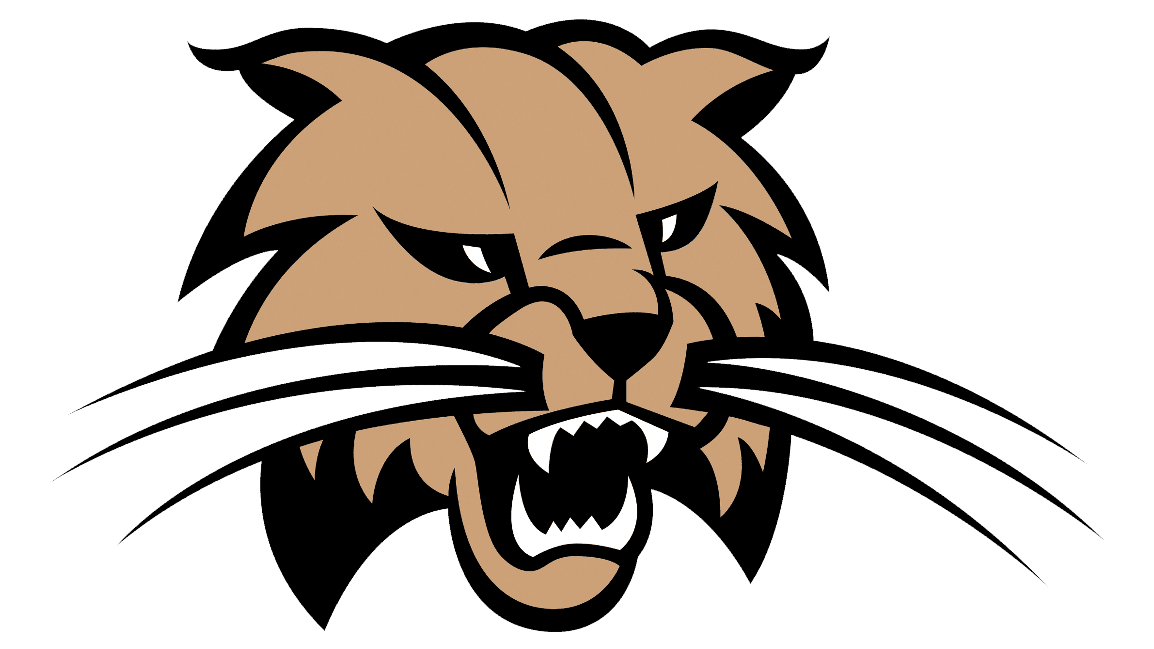
2011 – today
![]()
Changes in visual identity were minimal. The bottom word was removed from the logo, the green color took on an olive shade, and the angular font was replaced with a rounded one. Also, the inscription is arched above the snarling bobcat.
Font and Colors
The typography in the Ohio Bobcats logo aligns with Ohio University’s requirements. Hence, fonts identical to Termina, Industry, and Proxima Nova are used. They’re modern, youthful, and sans-serif. The colors are also official: PMS 342 Cutler Green and Cupola White, complemented by gold, black, and white.