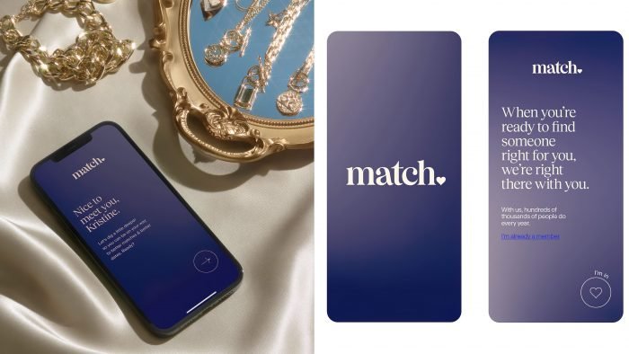
To highlight the impressive experience in the market, the company decided to update the corporate design and add details.
COLLINS and executives studied the brand’s marketing activities, available products, and previous designs. They managed to highlight the strengths and create a new look for the giant.
The team changed the way they used colors and opted for soothing, pastel colors. The new logo consists of the company’s name and is made in light pink and blue shades. The designers decided to add a heart-shaped detail or rather move it down. The dot symbolizes the confidence of the brand, which has been providing its services for 25 years.
Match experts analyzed that for most people, the first date is associated with panic and anxiety. The design studio has focused on pastel colors and gradient transitions, which will help you calm down and become more open to all possibilities. COLLINS also developed several fonts: classic, serif, italic and bold.
A new corporate identity is designed to emphasize the brand’s experience and give customers confidence in service quality. According to the COLLINS designers, they have worked out all the application details so that they look harmonious and good. There are many other competitors on the market now, but the new style should make Match stand out from the rest.
The company said that before the official launch of the update, they tested the beta version. The result is an increase in key indicators by 13% after using real customers. The brand also added new features to turn the service into “finger gymnastics” with swipes. Now the user needs to prescribe information about themselves, their hobbies, interests carefully, and even indicate the activities that they like to do in tandem with the soul mate.


