The logo was developed by Senior Brand Manager Leo Hageman and Tendril Studio.
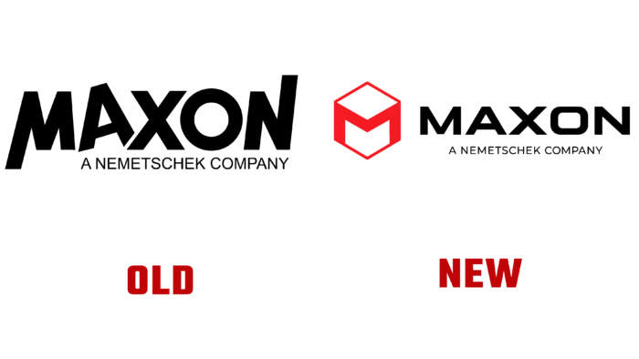
Rebranding became a necessity after Maxon merged with Redshift and Red Giant. The company’s CEO David McGavran said the rebranding should reflect all of the company’s lines and products, the company’s capabilities, and emphasize the desire to empower creative people.
The logo is depicted as a cube, and the front of the design is complemented by a red “M” as part of the figure. Creative studio Tendril from Toronto took part in the design development. Experts have developed an animated version of the logo for 3 and 15 seconds. The company used Maxon’s renowned Cinema 4D and Redshift products.
The color palette is presented in red, black, and white in different variations and combinations. The main logo is made in red on a dark background. The font for the lettering was simple, sans serif, and the title is in white. In the videos, the designers additionally used shadows and light to create a natural and believable picture.
Maxon is a company that specializes in software development related to 3D design and animation. The brand was founded in 1986 and is headquartered in Germany in Friedrichsdorf.


